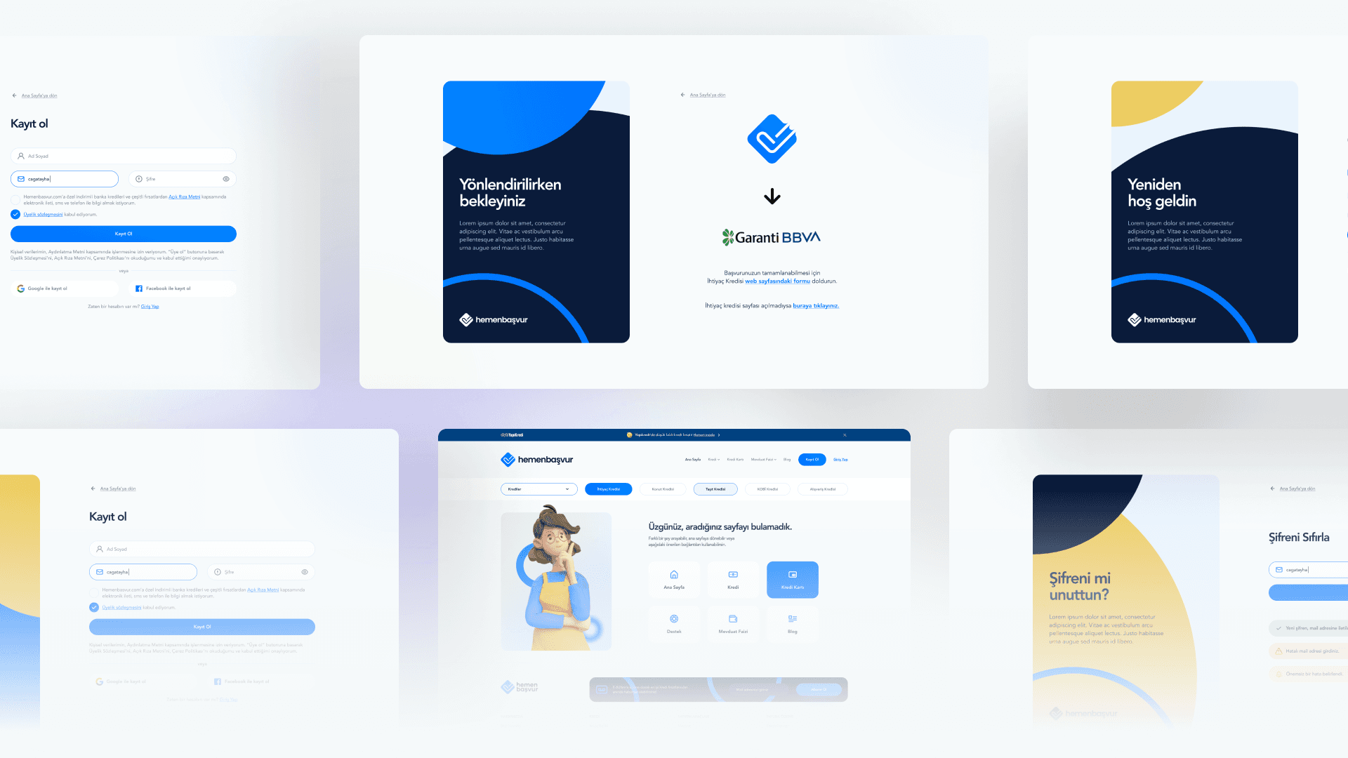
Hemen Basvur – Bank, Loan, and Credit Card Comparison Platform

Project Details
Client
Hemen Basvur
Services
UI/UX Design & Branding
Project Duration
6 Weeks
Role
Founding Product Designer
Tools
Figma, Miro
Project Type
Landing and Subpages, Light Mode
TL;DR
Designed a responsive financial comparison platform for bank loans and credit cards.
Focused on easy navigation, intuitive UX, and seamless experience across devices.
Developed over 50 responsive pages with clear, user-friendly designs and layouts.
Extensive UX research and competitor analysis guided design decisions for optimal usability.
Challenges included simplifying complex financial data and building user trust through design.
Delivered a mobile-friendly, responsive platform that allows effortless financial product comparisons.
The project resulted in a visually appealing, user-centric, and highly functional platform.
Project Overview:
Hemen Basvur is a platform designed to help users easily compare financial products such as bank loans, credit cards, and other credit options. The challenge was to create a responsive, user-friendly design that allows users to quickly find and compare financial products across different devices. My role included conducting in-depth UX research, competitor analysis, and designing over 50 responsive pages to ensure an intuitive, seamless user experience.

Project Objectives:
Design a responsive, easy-to-navigate platform for users to compare financial products.
Ensure a smooth and intuitive user experience through thorough UX research and competitor analysis.
Create a visually appealing interface that builds trust with users seeking financial products.
Optimize the design for mobile, tablet, and desktop devices, ensuring consistency across all platforms.

Challenges:
Designing an interface that accommodates complex financial data while remaining user-friendly.
Ensuring a seamless user experience across more than 50 pages and multiple device sizes.
Building trust with users through clear and engaging design, particularly for financial products.
Offering users the ability to compare multiple products without overwhelming them with information.

Process & Solutions:
UX Research & Competitor Analysis:
I began with extensive UX research and competitor analysis, studying how other financial comparison platforms present complex data and offer comparisons. This helped identify key features to include, as well as areas for improvement in terms of usability and design.Wireframing & Prototyping:
I created wireframes for over 50 pages, ensuring a consistent layout across different sections, such as loan comparison, credit card details, and application processes. The prototypes were developed to be simple and clear, helping users navigate the complex information with ease.Responsive UI Design:
The design was developed with responsiveness as a top priority. Whether on desktop, tablet, or mobile, users would experience the same intuitive navigation and functionality. I incorporated clean, professional visuals that aligned with the financial nature of the platform, building user trust.Usability & Accessibility:
To ensure ease of use, I simplified data presentation, making it easy for users to compare financial products side by side. I also included helpful filters and sorting tools, allowing users to refine their options based on their personal criteria.

Results:
Successfully designed a responsive, user-friendly interface for a complex financial comparison platform with over 50 pages.
The UX research and competitor analysis informed a design that is intuitive, clear, and easy to navigate, providing users with a seamless experience.
The visually appealing and consistent UI helped build trust with users, encouraging engagement and interaction.
The platform's responsive design ensured that users could compare financial products effortlessly across any device, enhancing accessibility.


