Efficense · Case study · 4 min read
Efficense: a bilingual SaaS website for software license and hardware usage tracking
Efficense helps companies see which software licenses and devices their teams actually use, so they can cut unused seats and wasted IT spend. I designed and built their 15+ page website in Framer, in English and Turkish, to turn a technical monitoring tool into a clear cost-saving story for IT managers and business leaders.
- User Experience Research
- User Interface Design
- Framer Development
- Design System
At a glance
Challenge
Explain real-time software and hardware monitoring to IT managers and business leaders across 15+ pages, in English and Turkish, without losing consistency or performance.
Solution
A bilingual Framer website built from one design system: real product UI in every section, cost breakdowns that translate usage into money, and clear paths to a demo or free trial.
Outcome
A 15+ page interactive website in English and Turkish, with a reusable design system that makes new pages faster to add.
Deliverables
- 15+ page website design
- English & Turkish versions
- Framer development
- Design system
- Product UI components
- Interactions & animation

Overview
Efficense is a software license optimization and usage tracking platform. It tracks desktop and browser app usage alongside license assignments, costs and renewals, so companies can find unused seats and see how much they could save, and it adds modules for hardware utilization and application monitoring. [1] A Chrome extension reports how employees use web apps. [3] The company is led by CEO Fatih Seven and CTO Şakir Şensoy and lists a San Francisco address. [2]
I designed and developed the company website through my studio, Beew, over about three months in 2024: more than 15 pages in English and Turkish, a design system, and the full Framer build with interactions and animations. The site is still live in both languages. [1]
The challenge
Efficense needed a complete digital presence for a product that works in the background. Usage data, licences and devices are not exciting on their own; the site had to make their value obvious to people who sign off budgets.
- Audience: an intuitive web UI for IT managers and business leaders, in English and Turkish.
- Scale: a cohesive, scalable design across more than 15 pages with complex interactions and animations.
- Engagement: an interactive experience that shows real-time capabilities while staying fast in both languages.
Goals
- Position Efficense as an essential enterprise tool for cutting software and hardware waste.
- Design a clear UI that shows real-time monitoring and optimization benefits in English and Turkish.
- Build a design system for consistency across every page and both languages.
- Develop the site in Framer with animations and interactions that make the product feel tangible.
Approach
1. Show the product, not a metaphor
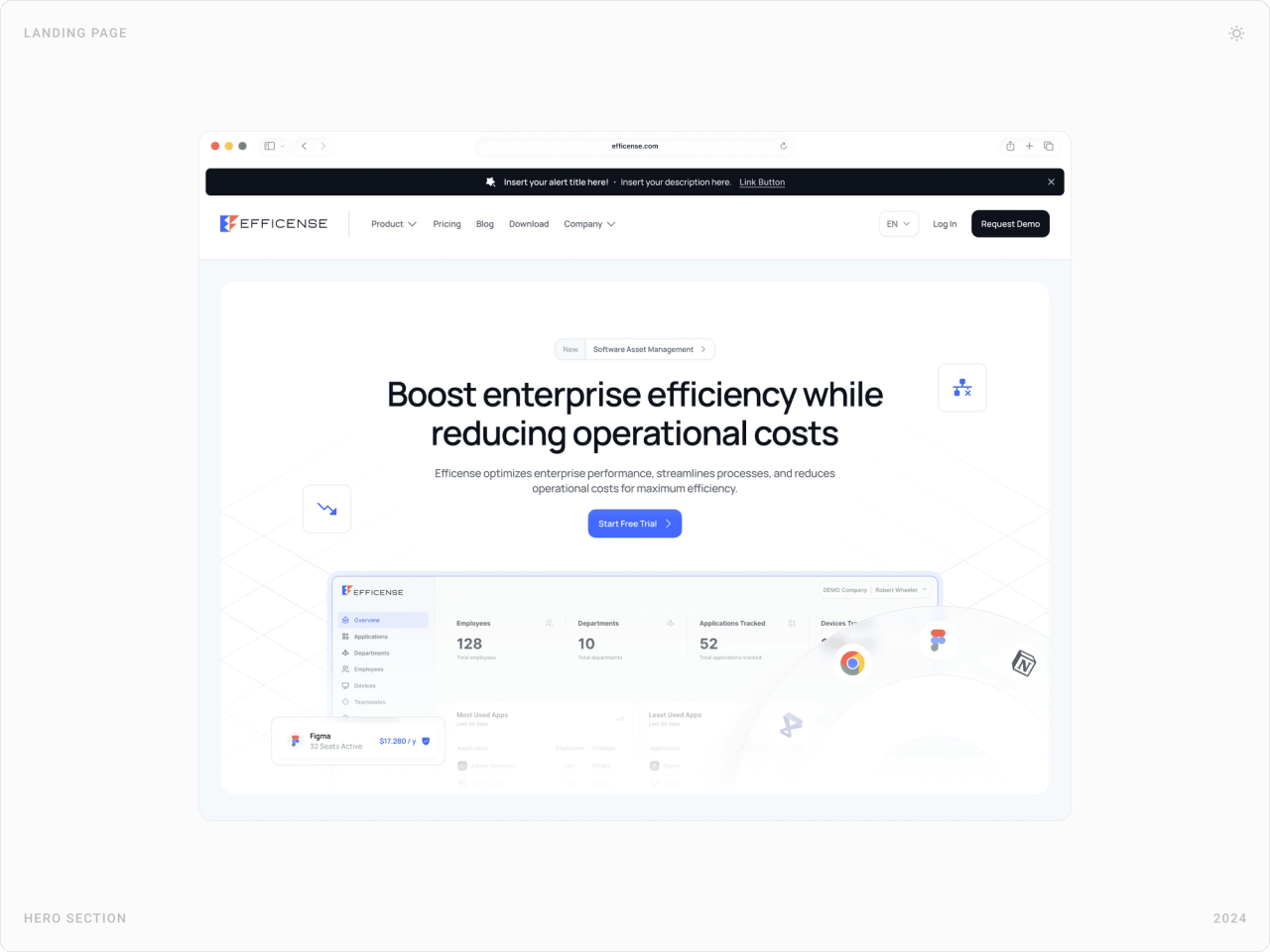
The homepage hero embeds the dashboard itself, employees, departments, applications tracked, and every feature section is built from real UI cards: usage charts, licence lists, device tables. Visitors see what they would use, not an illustration of it.
2. Translate usage into money
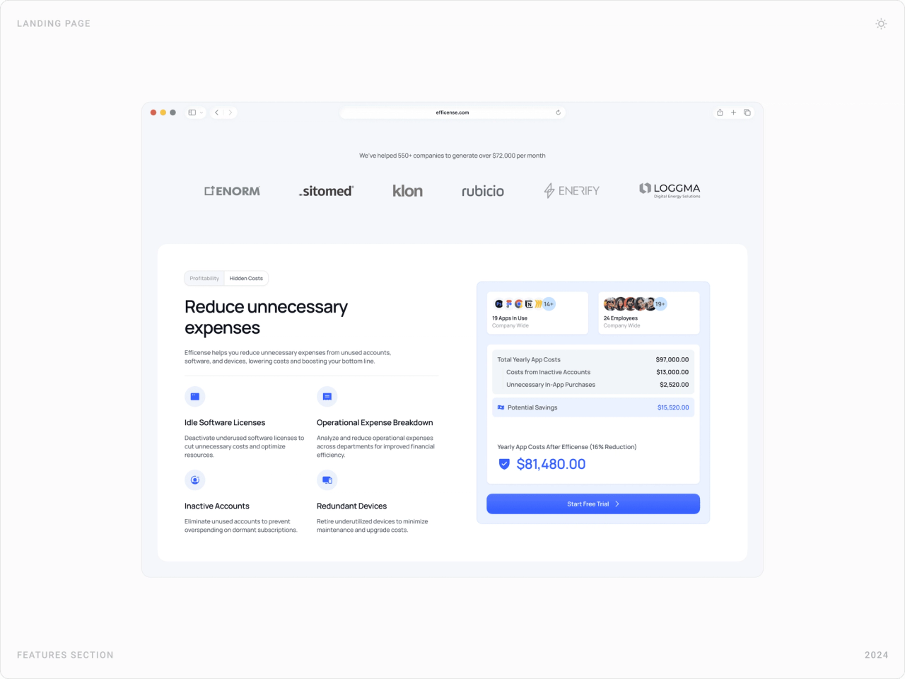
Budget owners think in costs, not in seats. A breakdown card walks from total yearly app costs to inactive accounts, unnecessary purchases and potential savings, so the value of monitoring is visible in one glance.
3. Light for software, dark for hardware
Software features sit on light, airy cards; hardware sections, device inventory, usage insights, performance gauges, use a darker palette. The two product lines stay distinct while sharing one component kit.
4. Bilingual from day one
The design system includes reusable components, a unified style guide and typography settings for both English and Turkish, so layouts hold up when text length changes and every page has a language switch.
The solution
Homepage
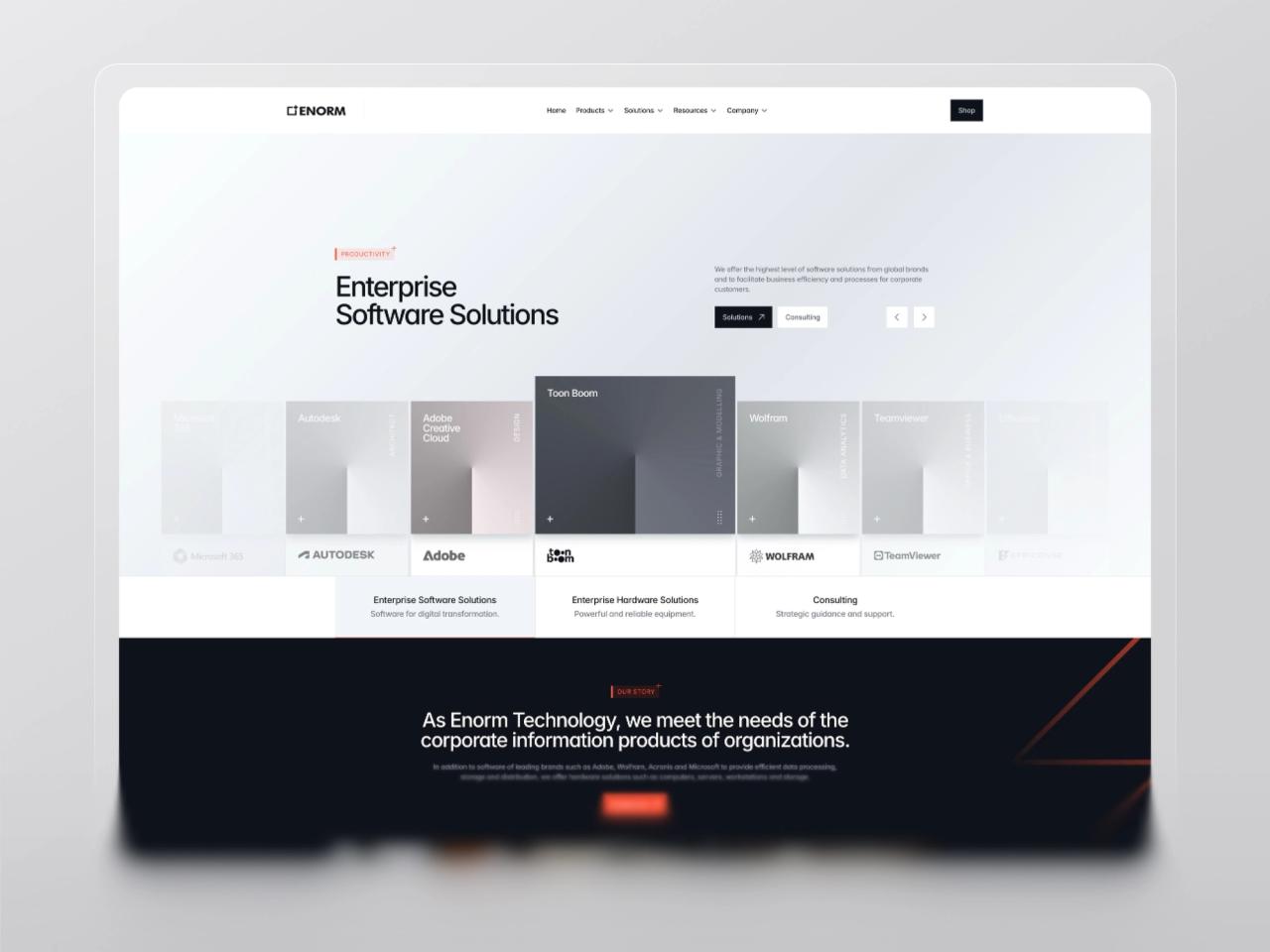
The homepage leads with one promise, boost efficiency while reducing operational costs, and the product dashboard right under it. Below, a logo strip, the cost breakdown and a customer story card build the case before the visitor reaches a call to action.

Software asset management
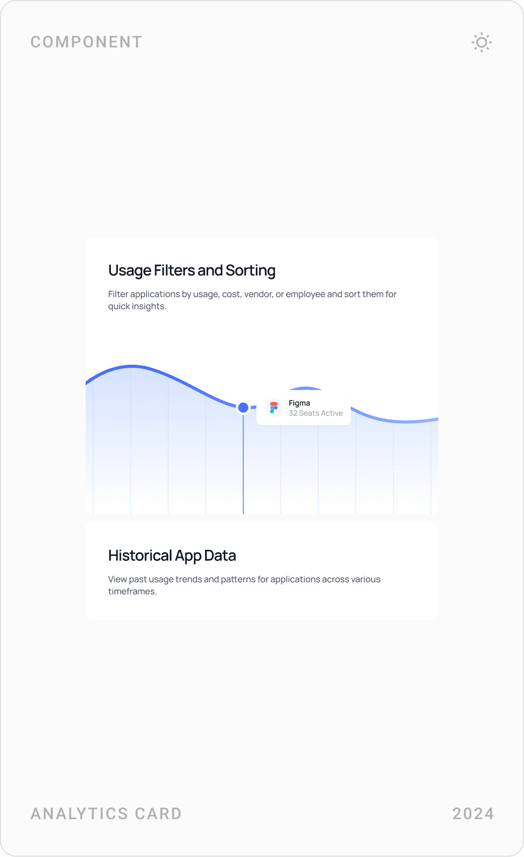
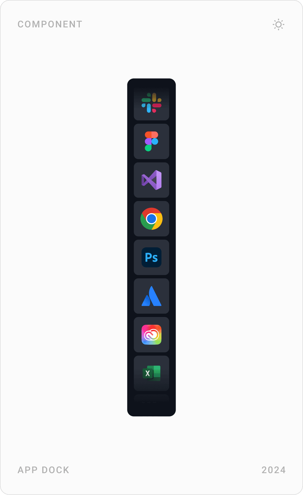
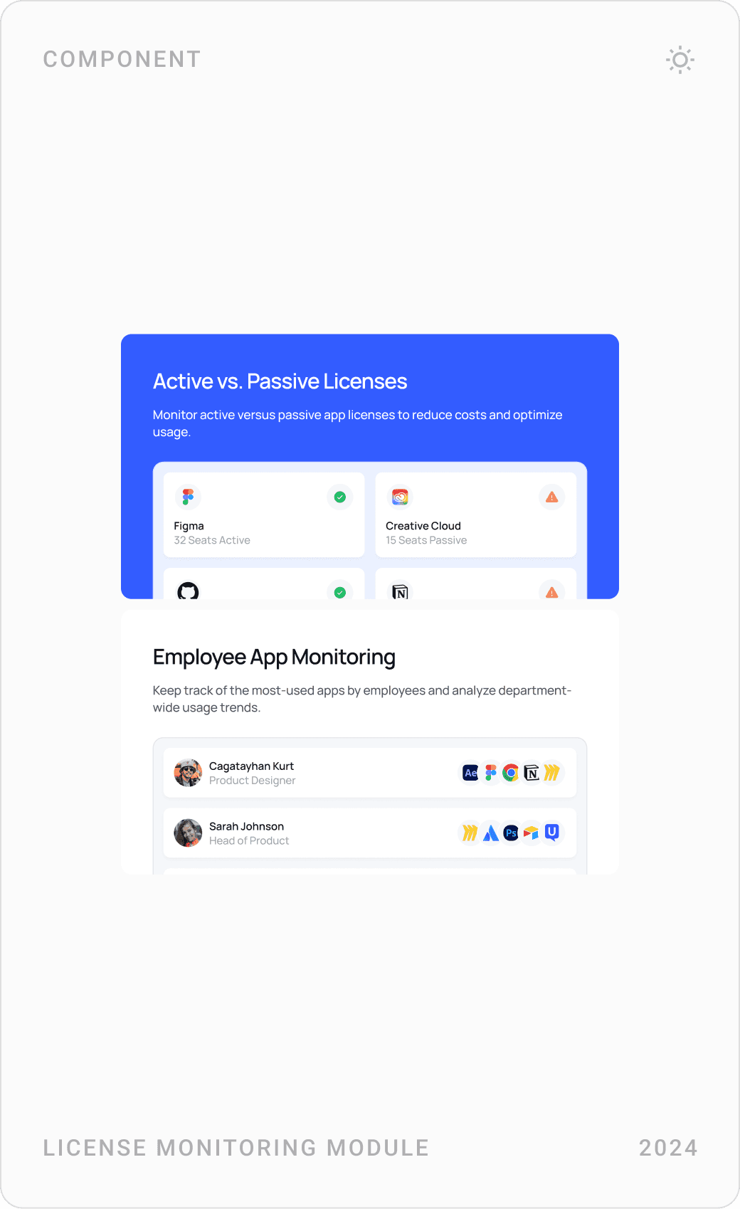
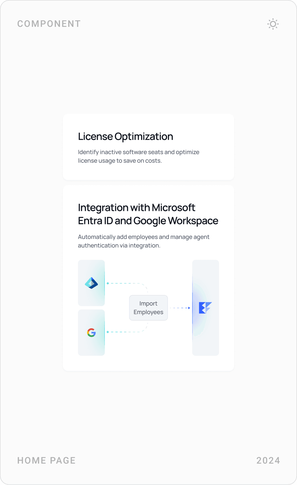
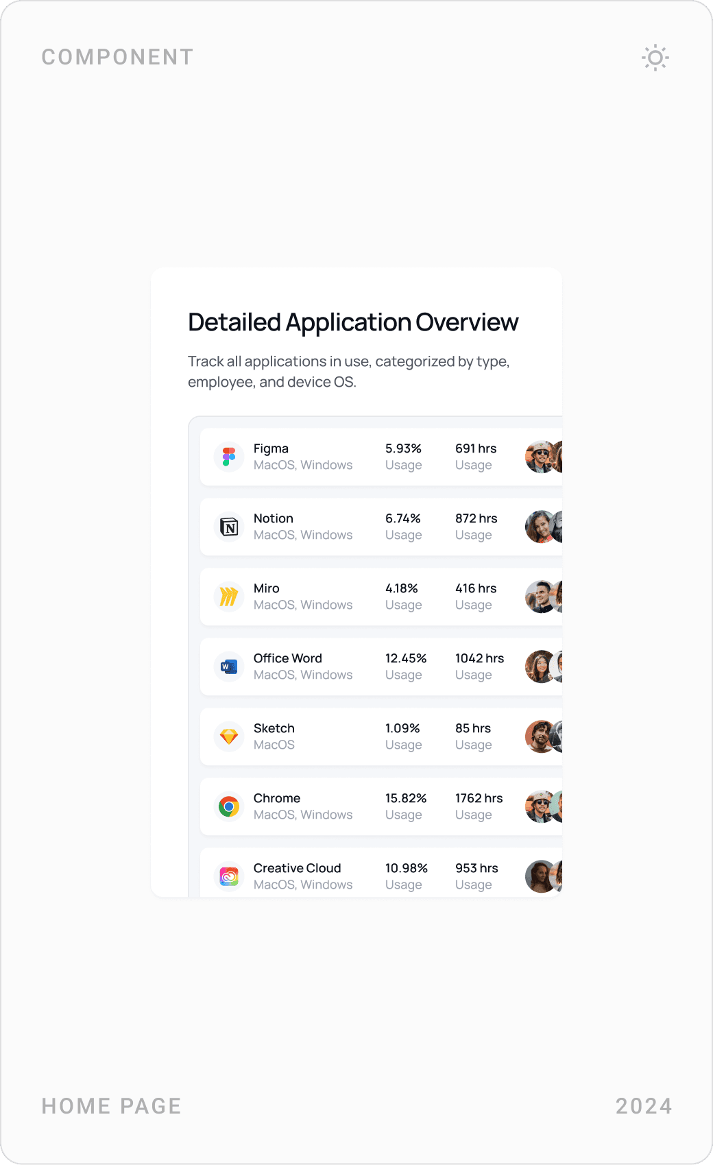
The software features are explained as small product cards: usage filters and historical app data, an app dock of tracked tools, active versus passive licences, employee app monitoring, licence optimization with Microsoft Entra ID and Google Workspace integration, a detailed application overview, vendor and cost sorting and department-level analysis.

Hardware utilization
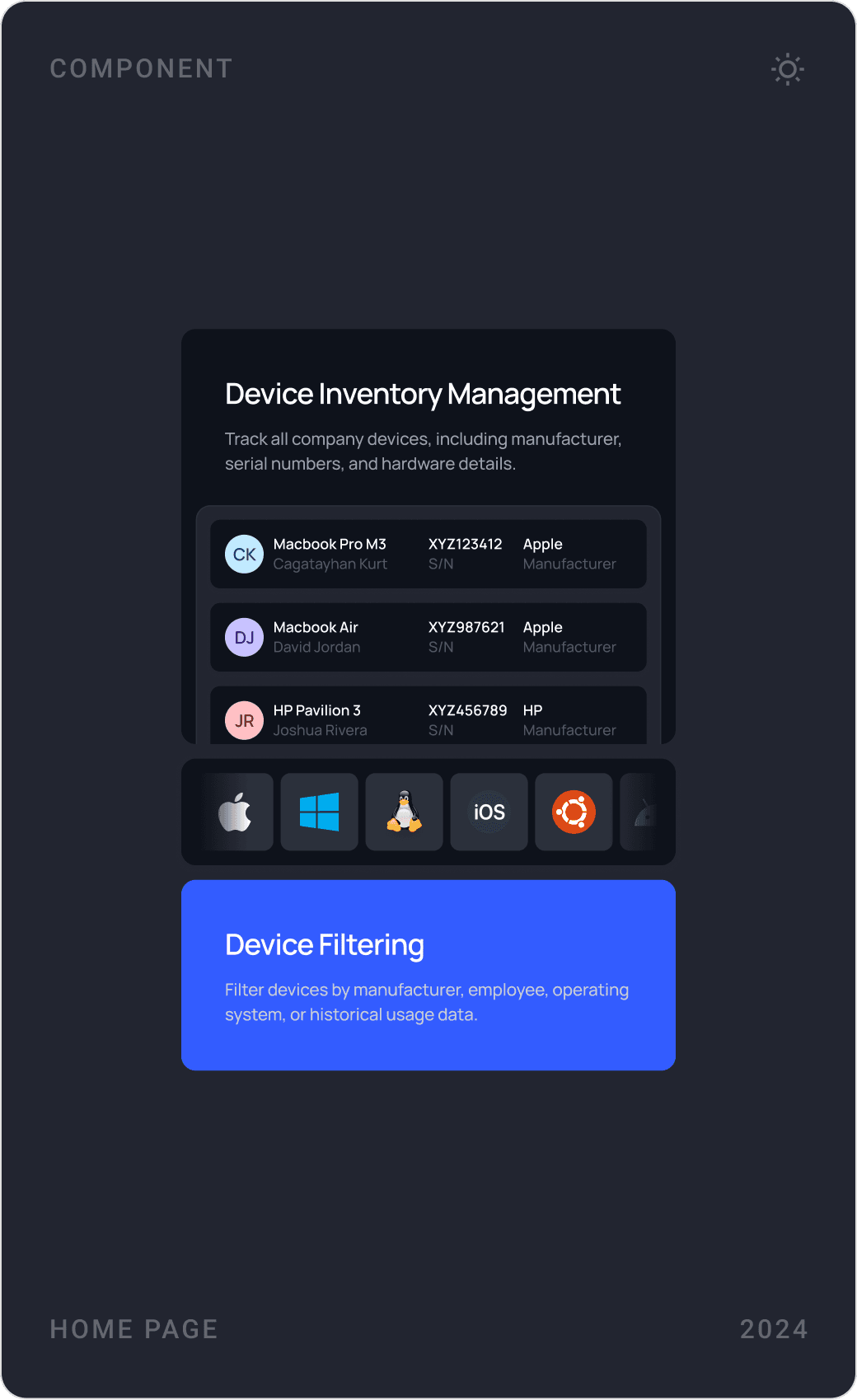
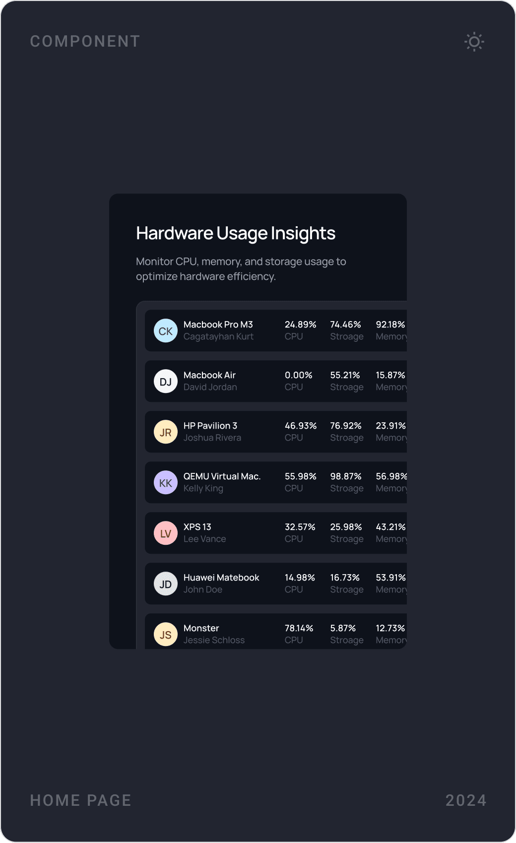
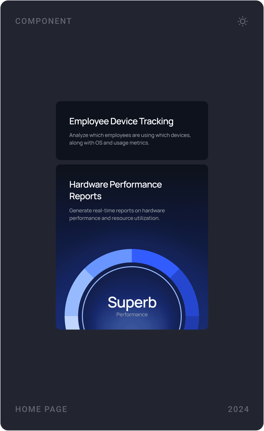
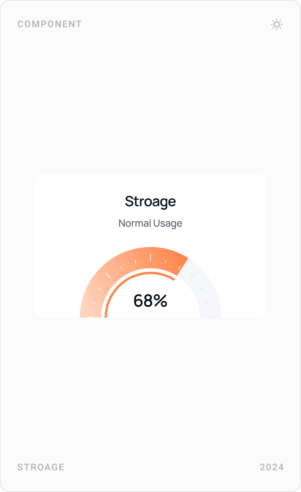
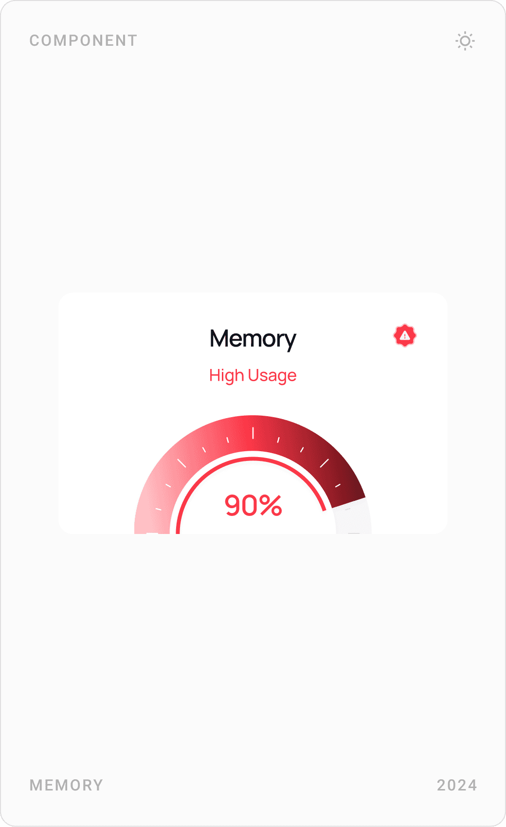
Hardware gets its own darker visual world: device inventory with filtering, a hardware usage table, employee device tracking and performance reports. Simple CPU, storage and memory gauges turn device health into three readable states, great, normal and high usage.

Pricing, use cases and demo
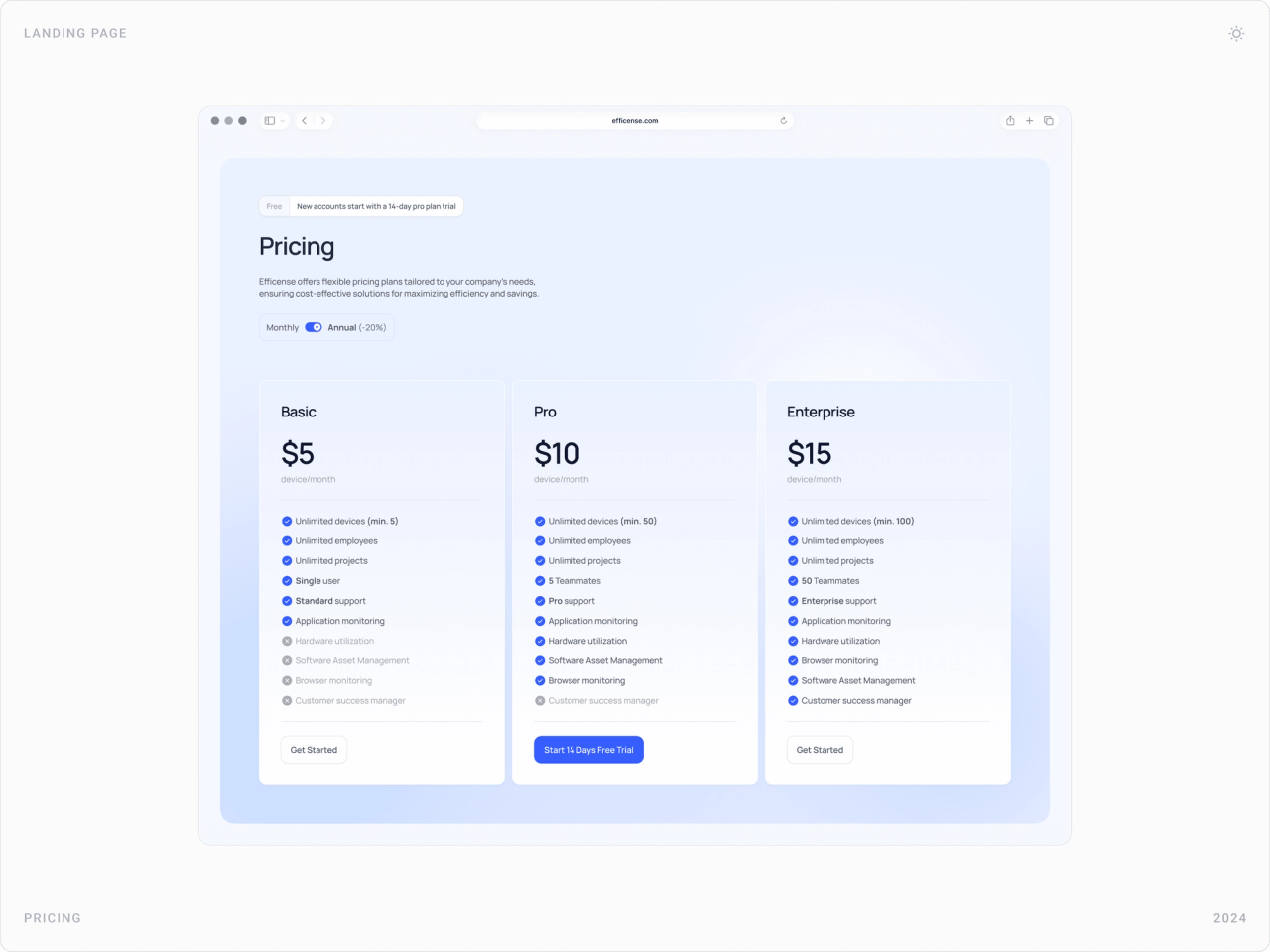
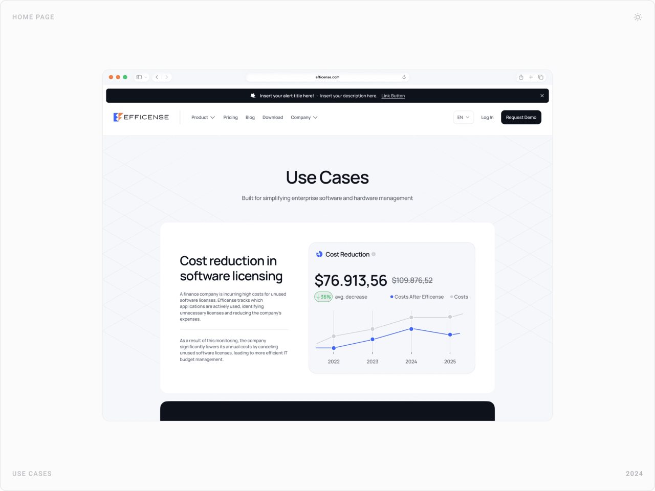
Pricing compares three plans side by side. Use cases tell short stories, such as a finance company cutting unused licences, each with its own chart. The request-a-demo page keeps the form short and sits it next to the benefits and a dashboard preview.

Download the agent
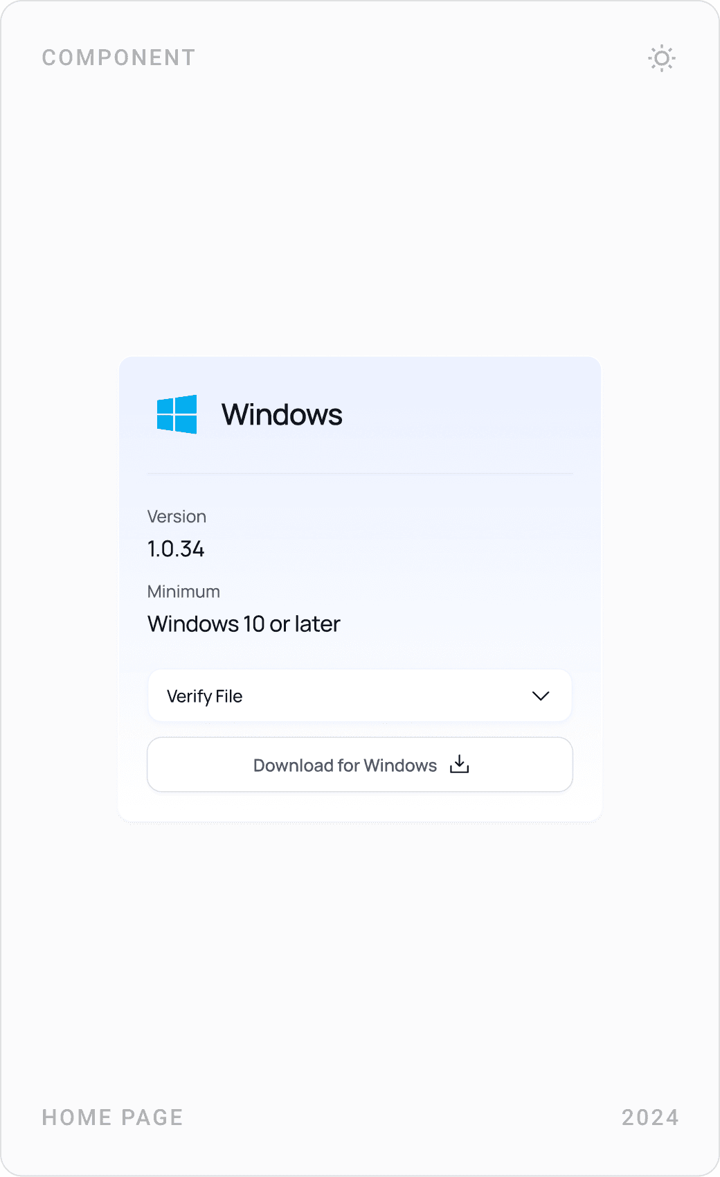
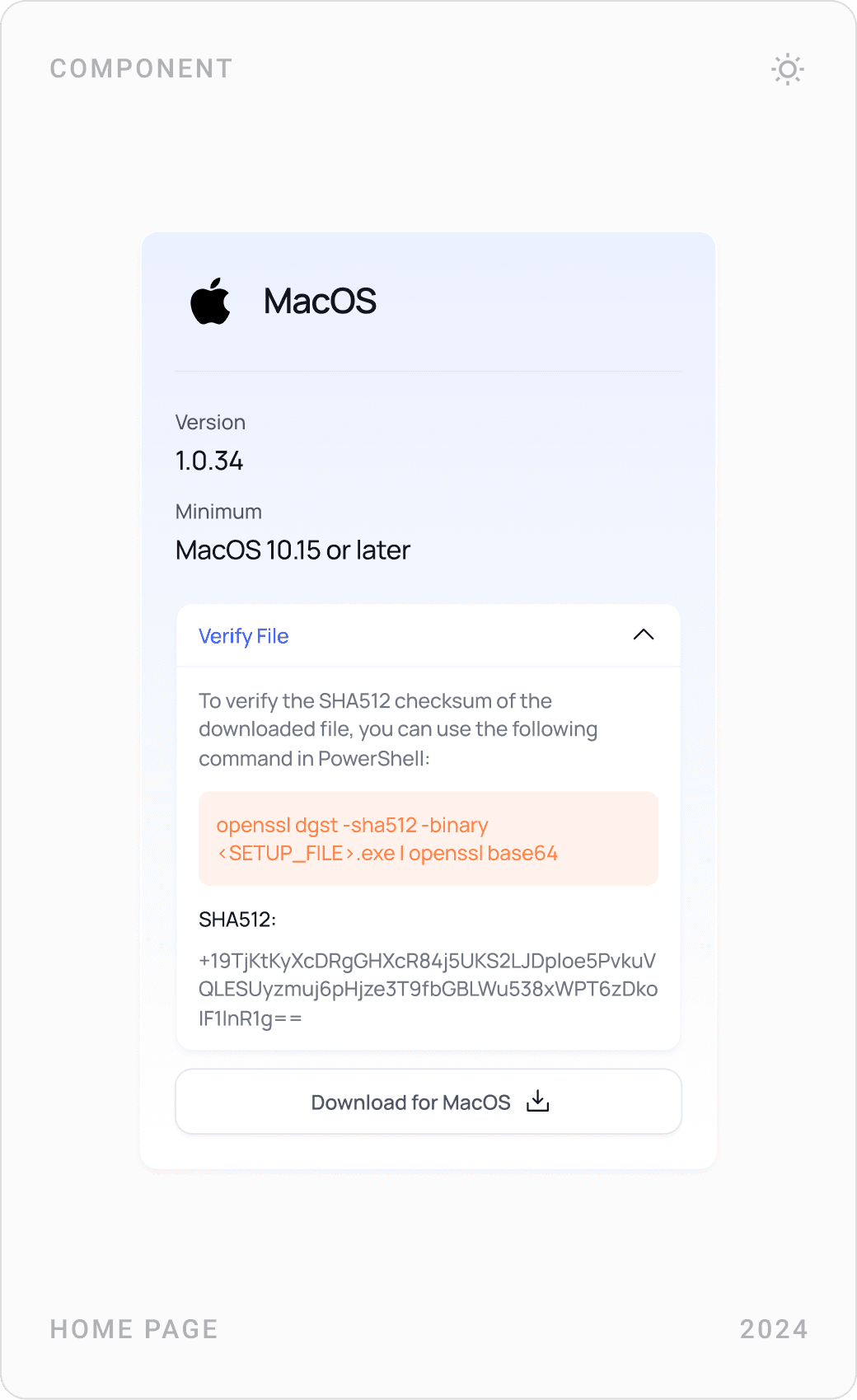
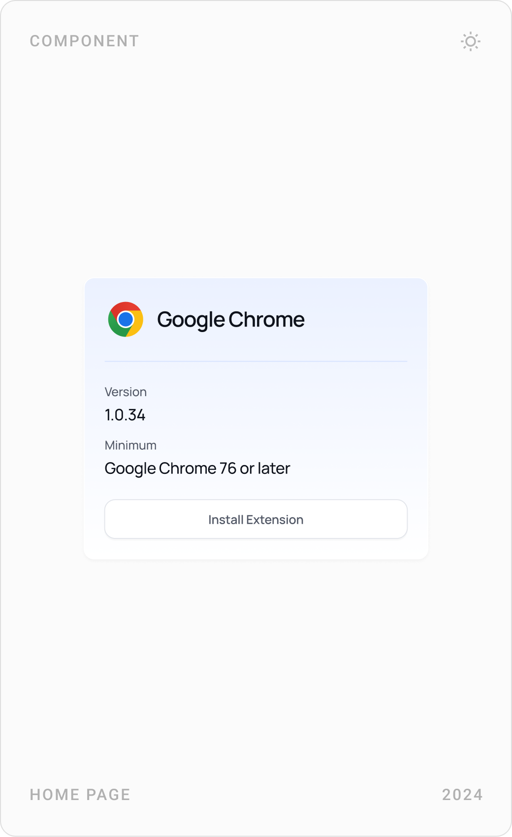
Efficense collects usage through a desktop agent and a browser extension, so the download page has one card per platform, Windows, macOS and Google Chrome, with version, minimum requirements and file verification.
Blog, FAQ and closing call to action
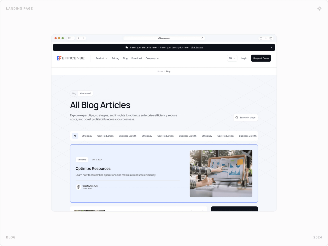
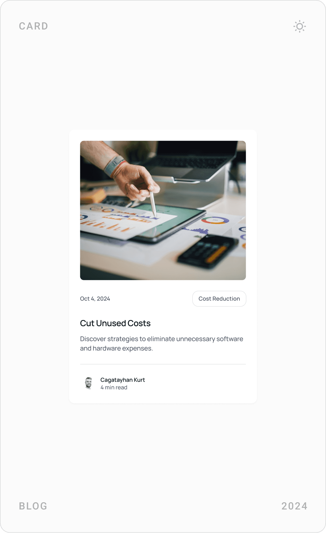
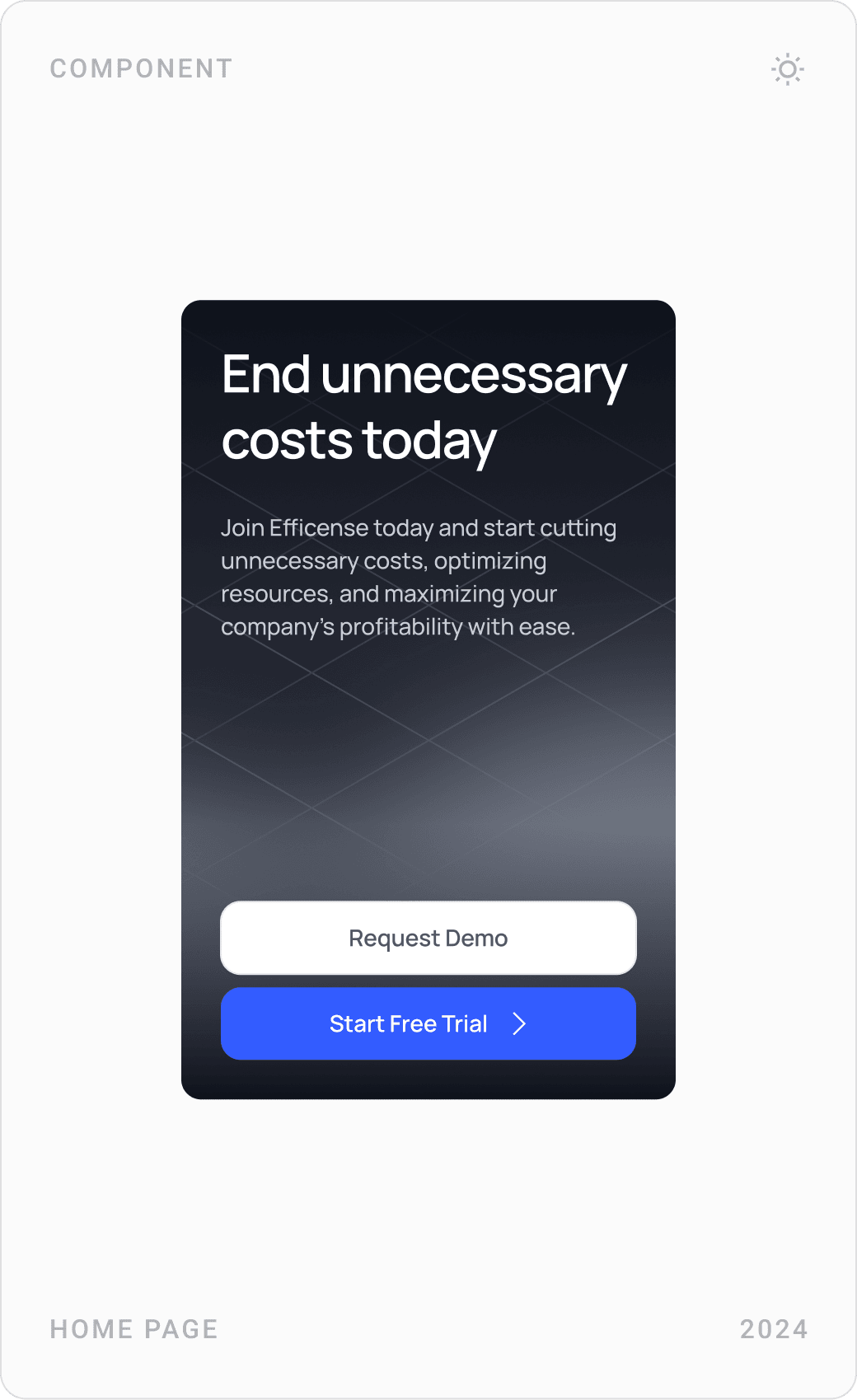
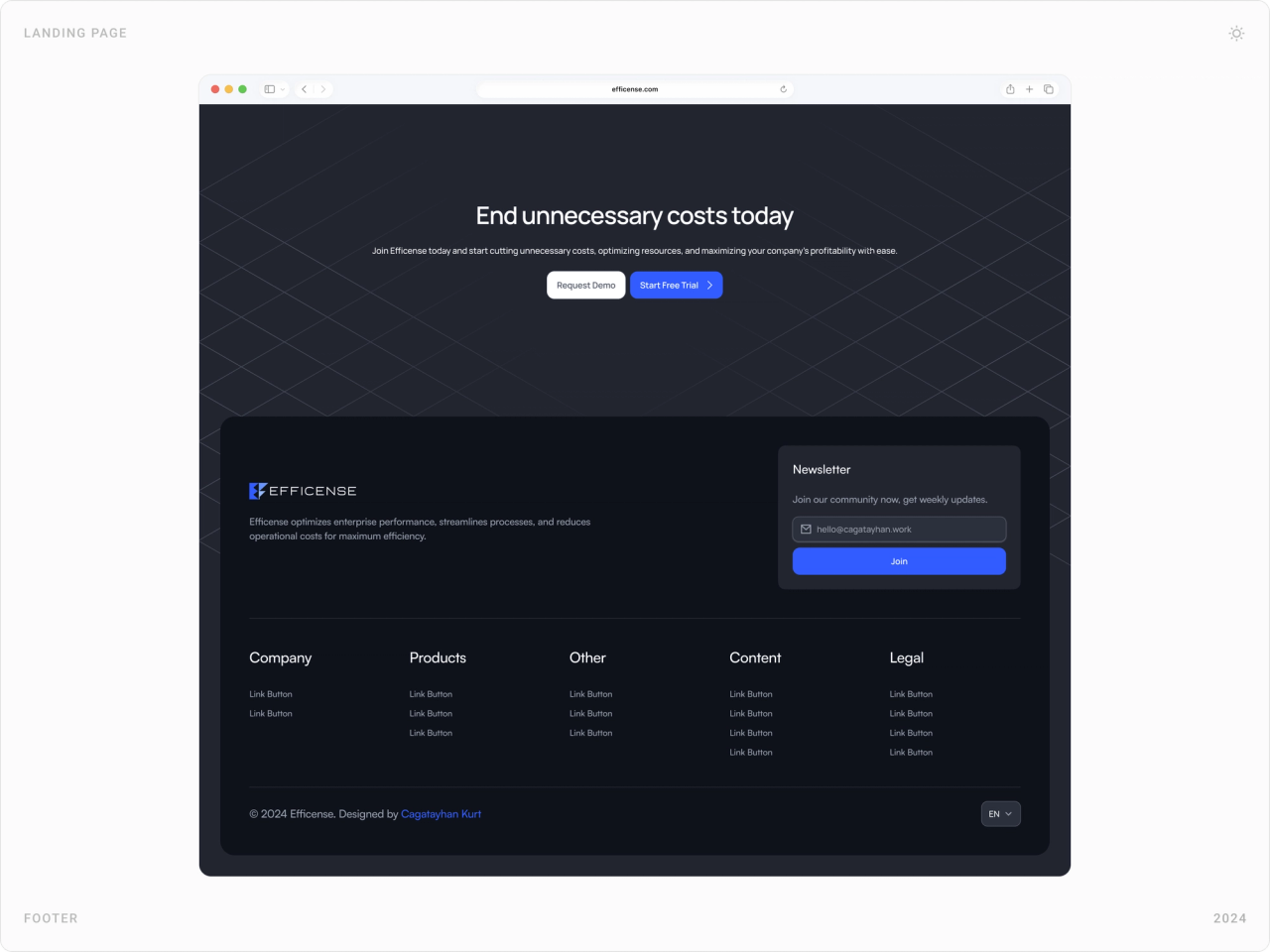
A blog with featured and card layouts gives the team room for content on IT cost management. An FAQ answers the first questions buyers ask, and a dark closing section, end unnecessary costs today, repeats the two actions that matter: request a demo or start a free trial.



Results
- A complete website of more than 15 pages, designed and built in Framer and live in English and Turkish. [1]
- An intuitive, bilingual UI that makes a background monitoring tool easy to understand and navigate.
- A design system with reusable components and bilingual typography that makes new pages faster to add.
- Interactions and animations that make real-time monitoring feel tangible and lead visitors toward a demo.
Key takeaways
- When the product runs in the background, put its UI in the foreground.
- Budget owners read money, not seats: translate usage into savings.
- Plan for two languages in the design system, not after it.
- Small, real feature cards scale better than long feature pages.
FAQ
What is Efficense?
Efficense is a software license optimization and usage tracking platform. It tracks desktop and browser app usage alongside license assignments, costs and renewals, so companies can find unused seats and see how much they could save; it also covers hardware utilization and application monitoring. [1] A Chrome extension reports web app usage. [3]
What did you design for Efficense?
The company website, end to end: more than 15 pages in English and Turkish, homepage, product pages for software and hardware, pricing, use cases, blog, FAQ, download and request-a-demo, plus the design system and product UI components, and the full build in Framer with interactions and animations.
How long did the project take?
About three months in 2024, from structure and UI design to the design system and the finished bilingual Framer site.
How do you design a website for a B2B SaaS monitoring tool?
Show the product itself rather than abstract illustrations, and translate data into what buyers care about, usually money saved. Break features into small, real UI cards, give each audience a use case, make pricing transparent, and keep one clear next step, such as a demo or free trial, on every page.
Can you design and build a SaaS website for my company?
Yes. I work with early-stage AI, SaaS, fintech and Web3 teams on websites, product UI and design systems, and I build marketing sites in Framer. Book a call or send a message from the contact page.
Sources
Have a product to design?
I help teams turn complex products into websites and interfaces people understand in seconds. Tell me about yours.