RedCyber · Case study · 4 min read
RedCyber: a cybersecurity website for government and enterprise, built in Framer
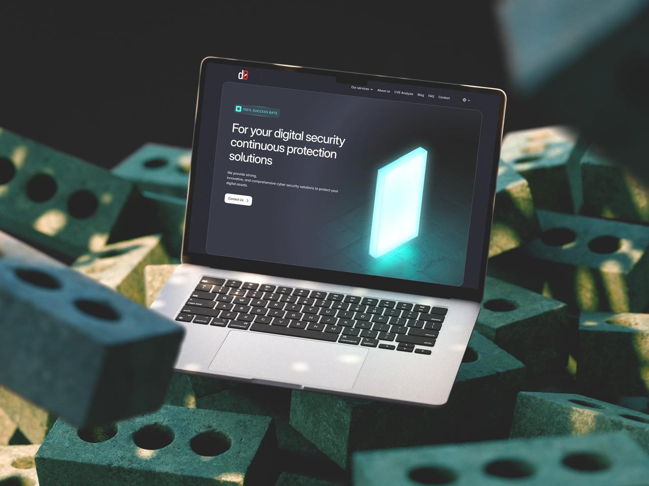
RedCyber is a cybersecurity company serving government and enterprise clients with Red, Blue and Purple Team operations, penetration testing, code analysis and consulting. I designed and built their website in Framer so that a serious, technical service reads clearly at first glance and turns visitors into inquiries.
The company now operates as RedCyber. The visuals show the branding used when this work was completed.
- User Experience Research
- User Interface Design
- Design System
- Framer Development
- 3D Design
At a glance
Challenge
Present Red, Blue and Purple Team operations, CVE analysis and source code reviews to public institutions and corporations in a way that feels trustworthy and easy to follow.
Solution
A responsive Framer website with a colour-coded 3D shield for each service, one repeatable service-page template and CMS-ready blog, FAQ and service sections.
Outcome
A clear, credible site praised by cybersecurity professionals for its structure, handed over with full CMS control in Framer.
Deliverables
- Website UX/UI design
- Framer development & CMS
- Design system
- 3D service shields
- Service page template
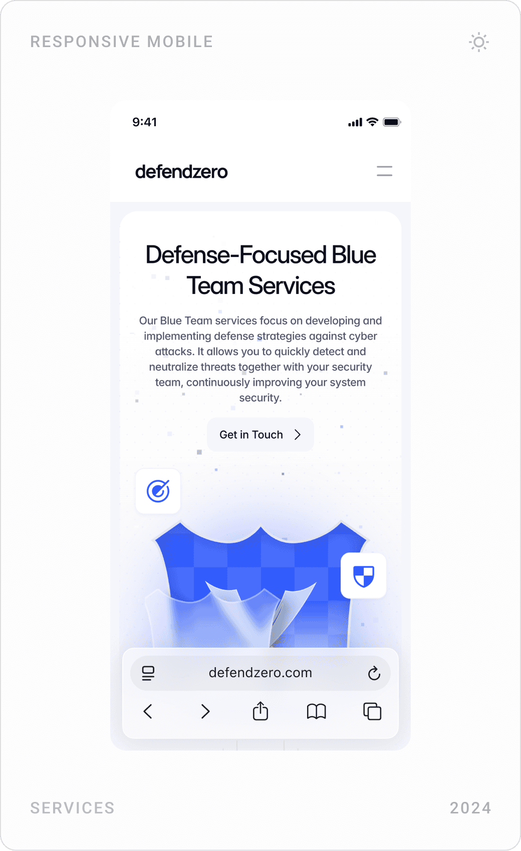
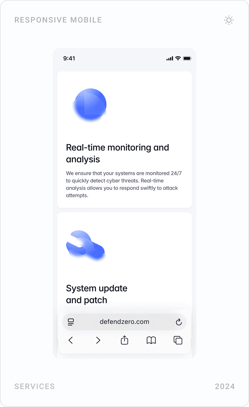
- Responsive mobile design
Overview
RedCyber is a cybersecurity company serving government and enterprise clients. Its offer ranges from offensive work, Red Team attack simulations and penetration tests, to defence, Purple Team collaboration, source code analysis and security consulting.
I designed and developed their website through my studio, Beew, over about four months in 2024: research and wireframes, UI design, a design system, 3D shield visuals and the Framer build, for desktop and mobile. The goal was a site that clients trust at first glance and that makes it easy to ask for help.
The challenge
Security buyers in public institutions and large companies are cautious. The site had to look serious and professional while explaining services that are, by nature, technical and easy to confuse.
- Trust: build a serious, professional brand presence for clients in both the public and private sector.
- Structure: turn Red, Blue and Purple Team operations into a clear, navigable journey.
- Technical content: balance CVE databases and source code analysis with modern, clean UI.
- Growth: design components that can carry ongoing content, blog posts, FAQs and vulnerability write-ups.
Goals
- Create an authoritative platform that clients trust at first glance.
- Explain the difference between Red, Blue and Purple Teams through visuals, not jargon.
- Make it easy to understand a service and send an inquiry about it.
- Show credibility and experience, and keep the site SEO- and conversion-ready without losing a professional tone.
- Lay a foundation for future threat reports, webinars and whitepapers.
Approach
I started by benchmarking other cybersecurity websites to define the user flows and where calls to action belong, then wireframed the structure before moving into UI.
1. A colour for every team
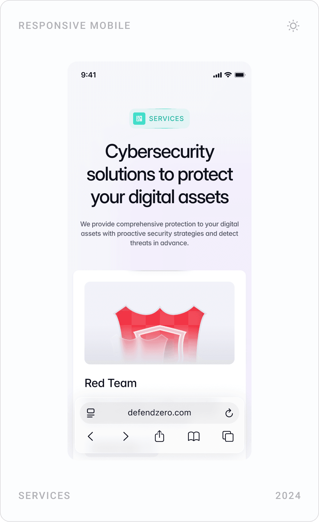
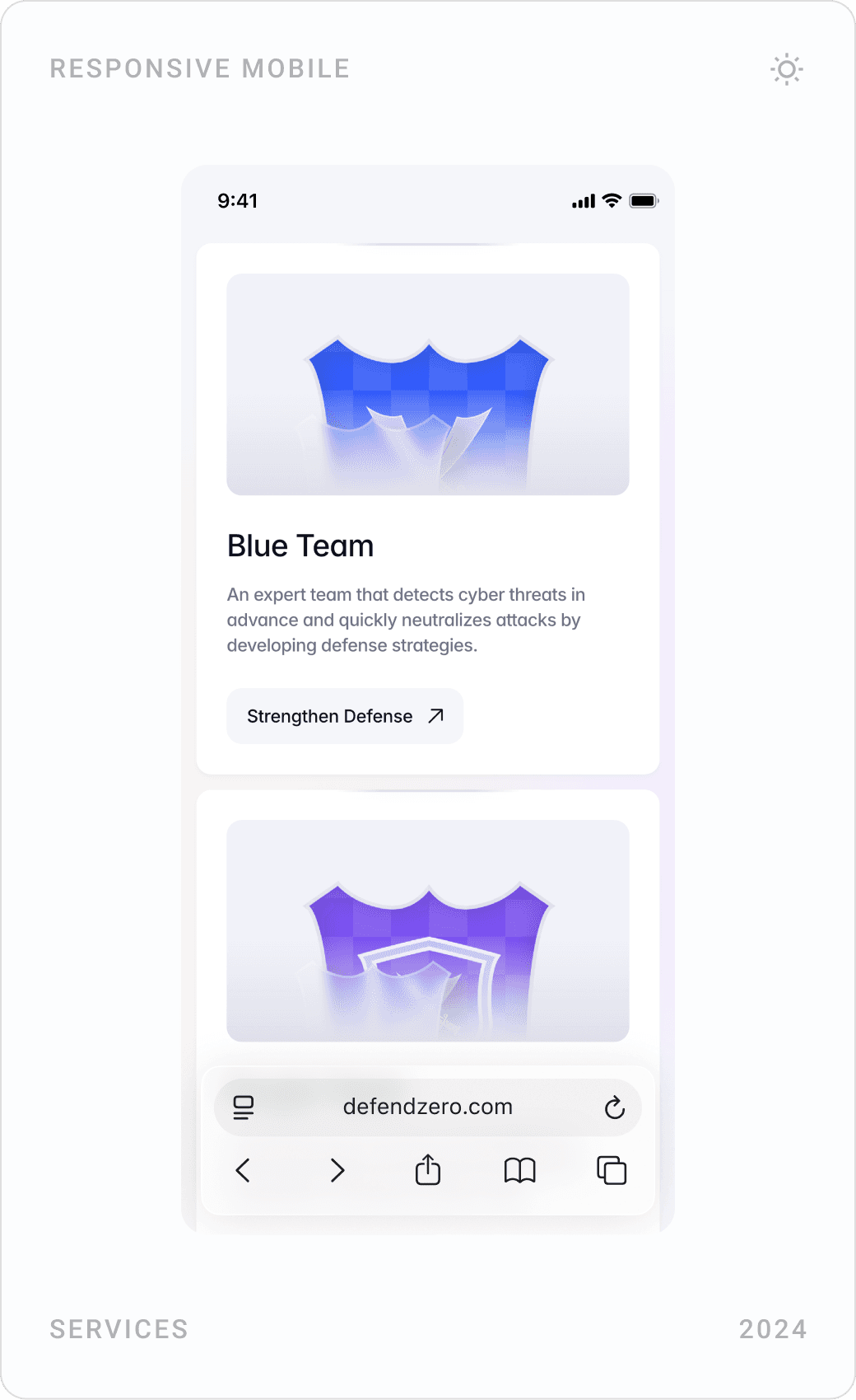
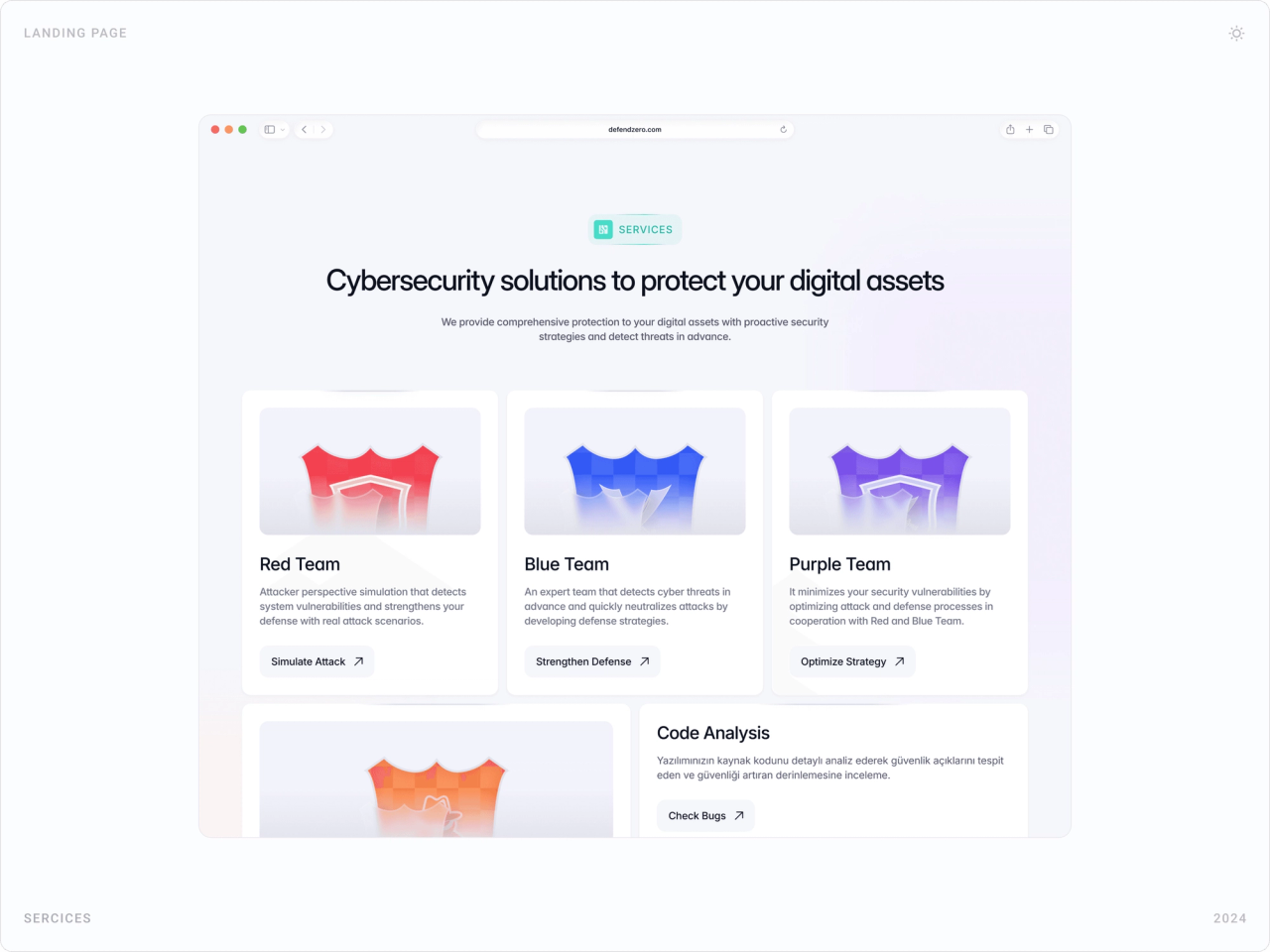
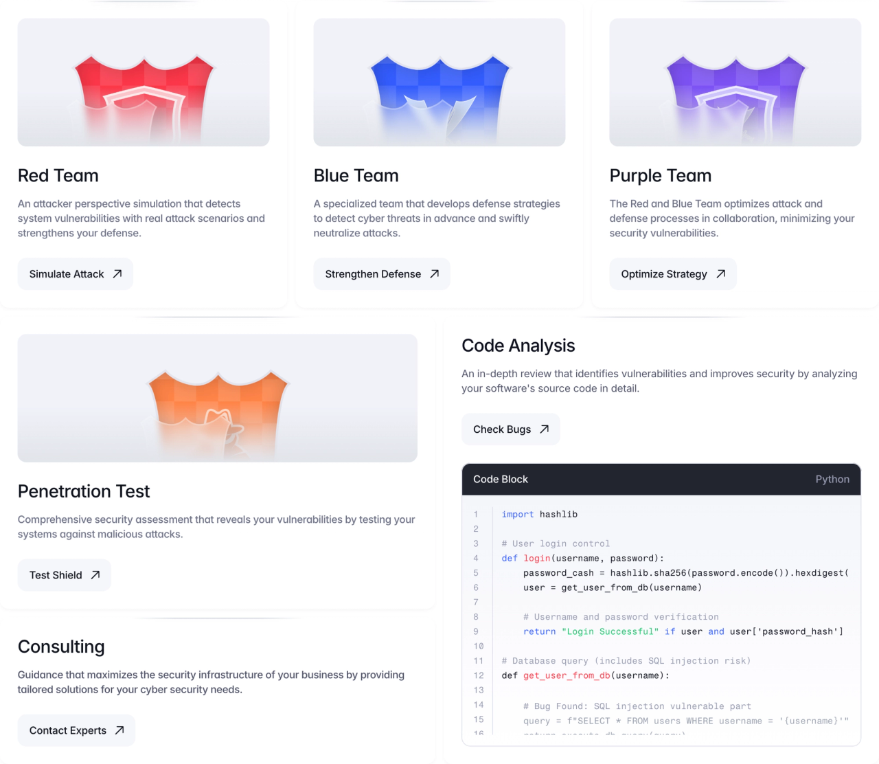
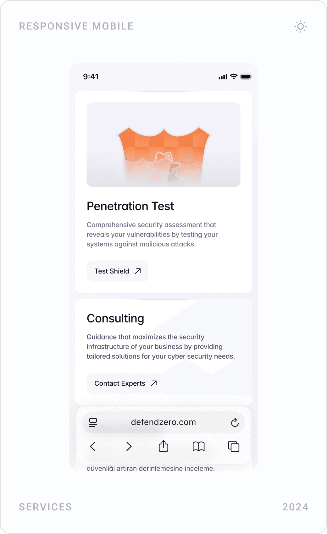
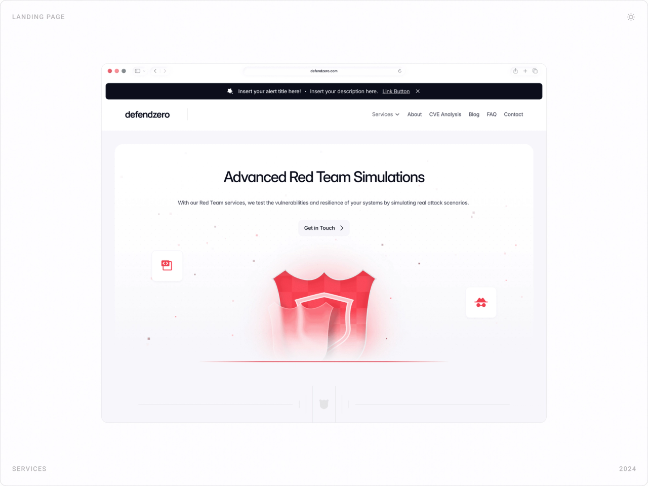
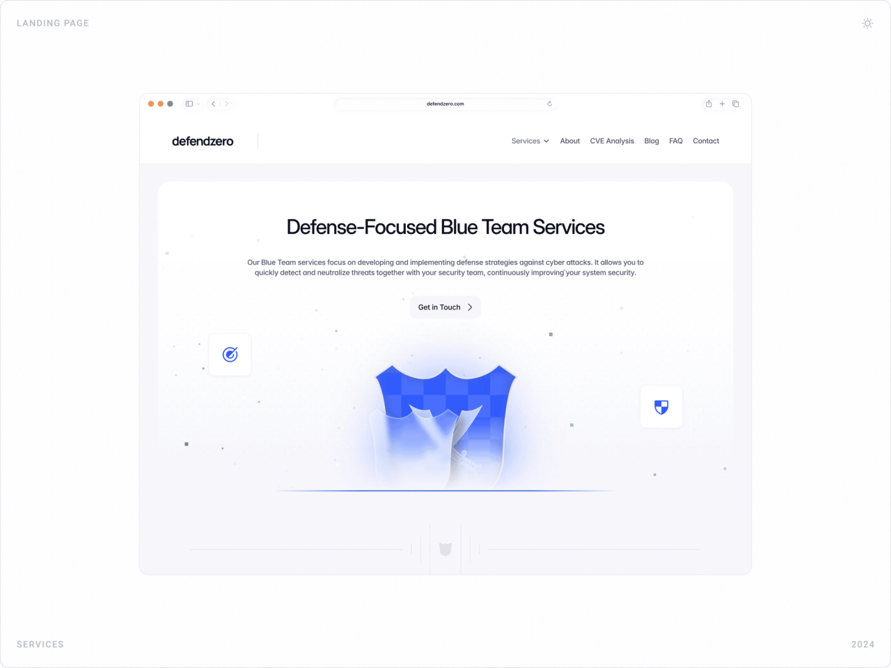
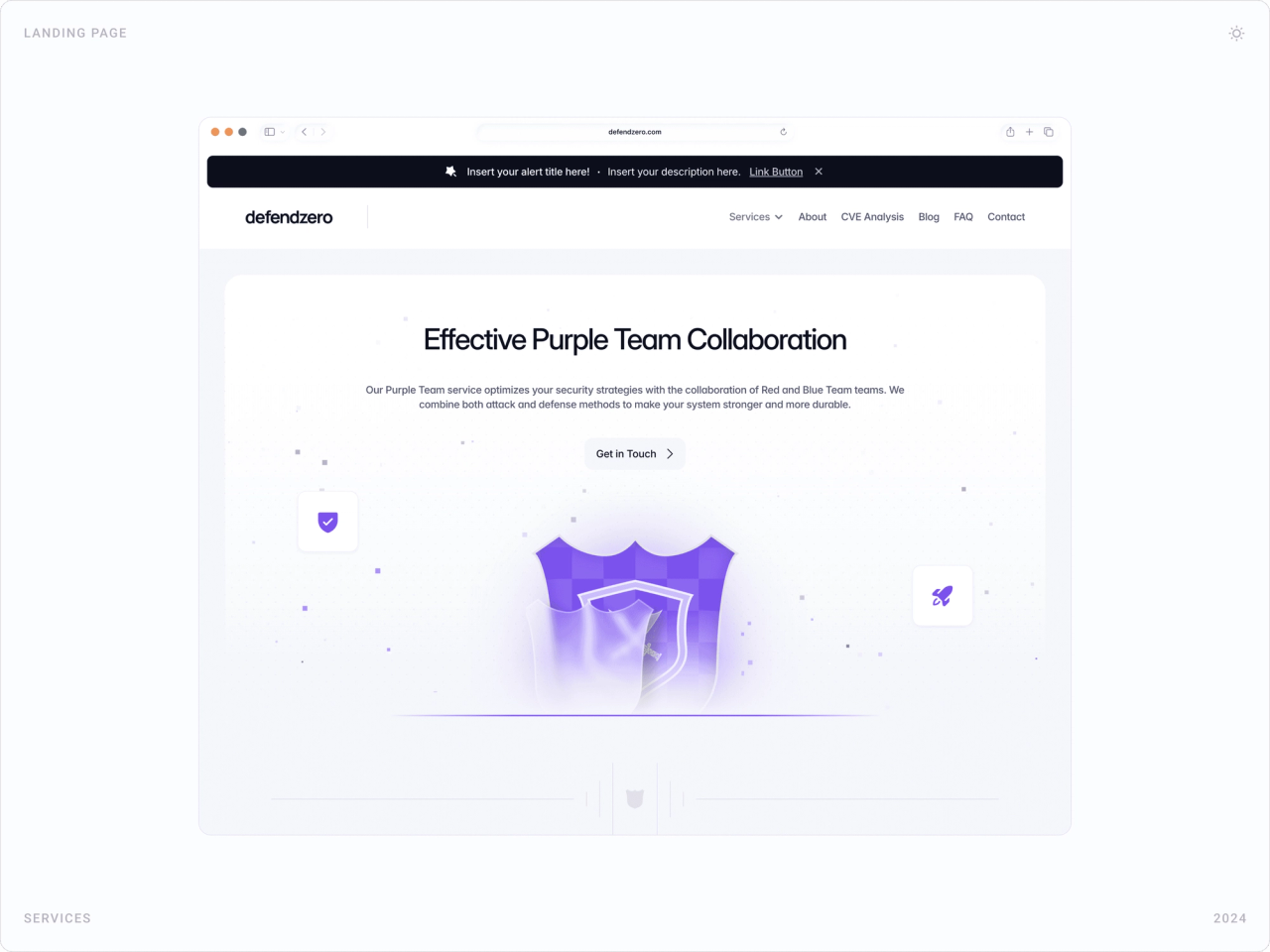
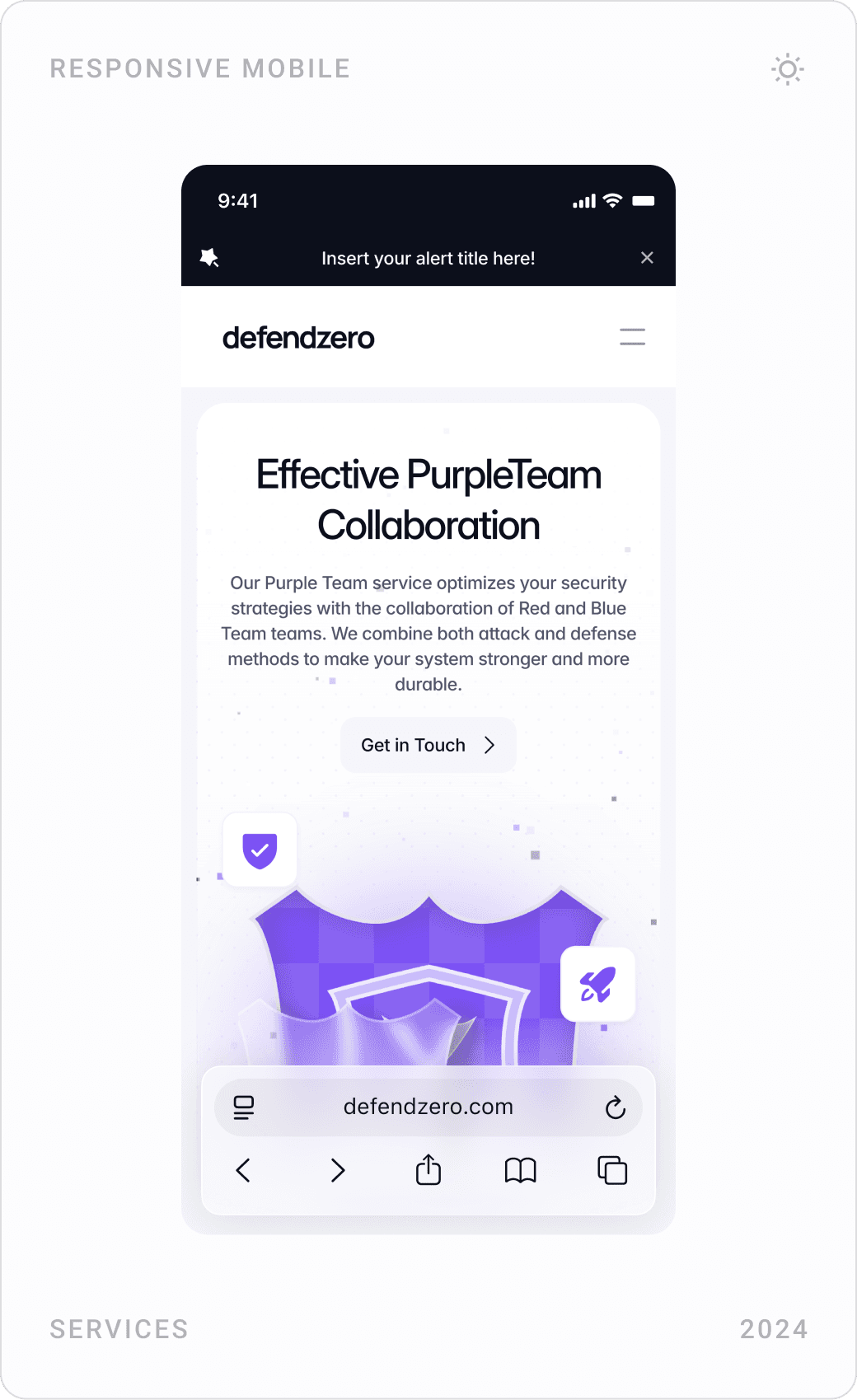
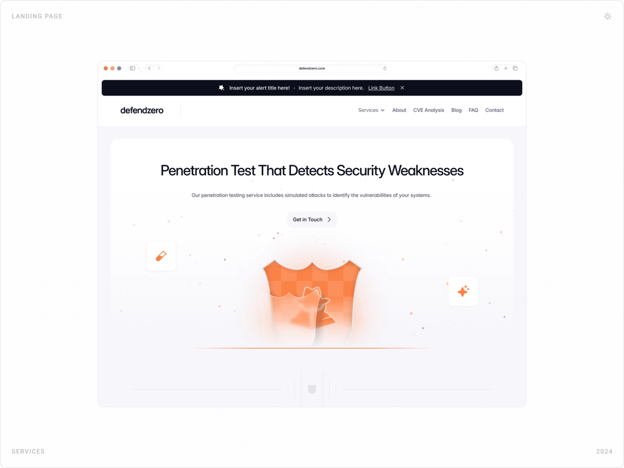
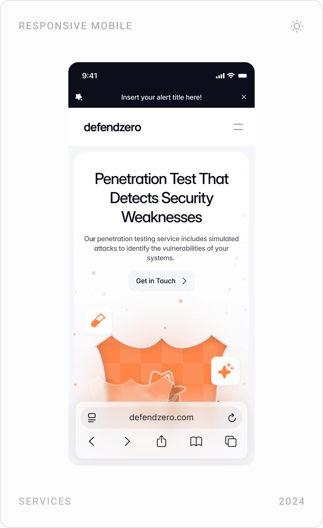
Each service has its own 3D shield: red for Red Team, blue for Blue Team, purple for Purple Team, orange for penetration testing. The colour follows the service from the overview card to its own page, so visitors learn the system without reading a definition.
2. Serious, not scary
Instead of hooded hackers and green code rain, the core pages use light, airy layouts with plenty of white space; dark surfaces are kept for the hero, blog and footer. Security badges and achievement counters add credibility without shouting.
3. Show the technical depth
Security buyers want proof that the team knows its craft. The Code Analysis card contains a real code block with a flagged SQL injection bug, and CVE Analysis sits in the main navigation next to services.
4. One template, every service
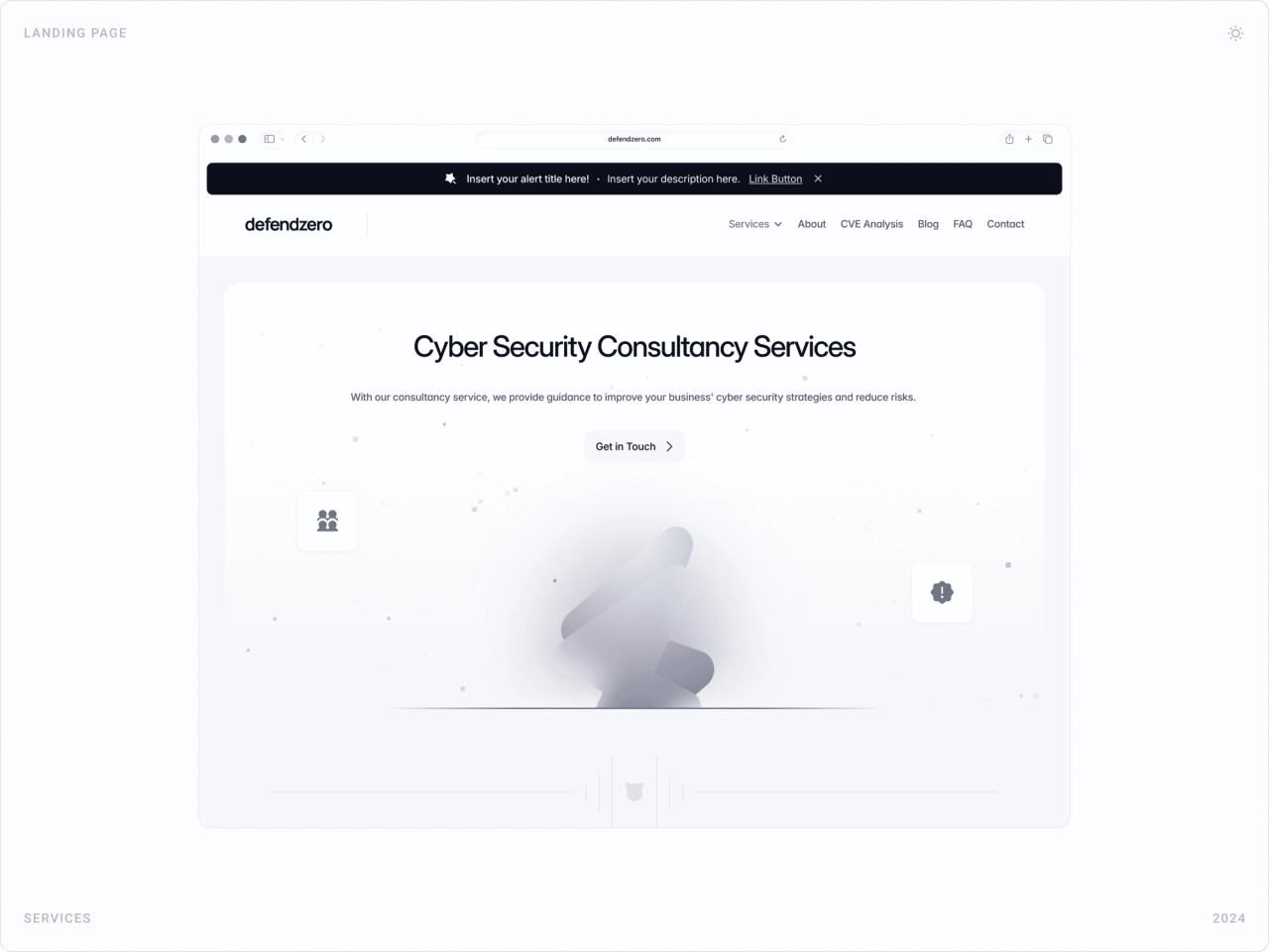
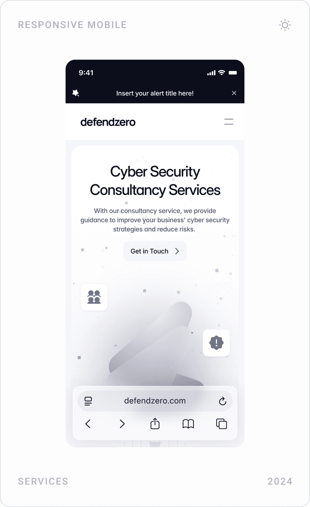
Every service page follows the same pattern: headline, one-line promise, Get in Touch button, the service’s shield, then capability cards. In Framer, these became CMS-ready components the client can extend without a designer.
The solution
Homepage hero
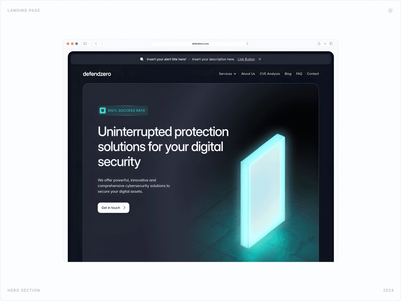
The homepage opens on a dark stage with a glowing 3D block, one clear promise, uninterrupted protection for your digital security, and a single Get in touch button. Navigation keeps services, CVE analysis, blog, FAQ and contact one click away.

Services overview
A bento grid introduces the six services. Each card has the service’s shield, a one-sentence explanation and an action named after the outcome, Simulate Attack, Strengthen Defense, Optimize Strategy, Test Shield, Check Bugs, Contact Experts. A counter section then backs the offer with the company’s experience and team size.


Red, Blue and Purple Team pages
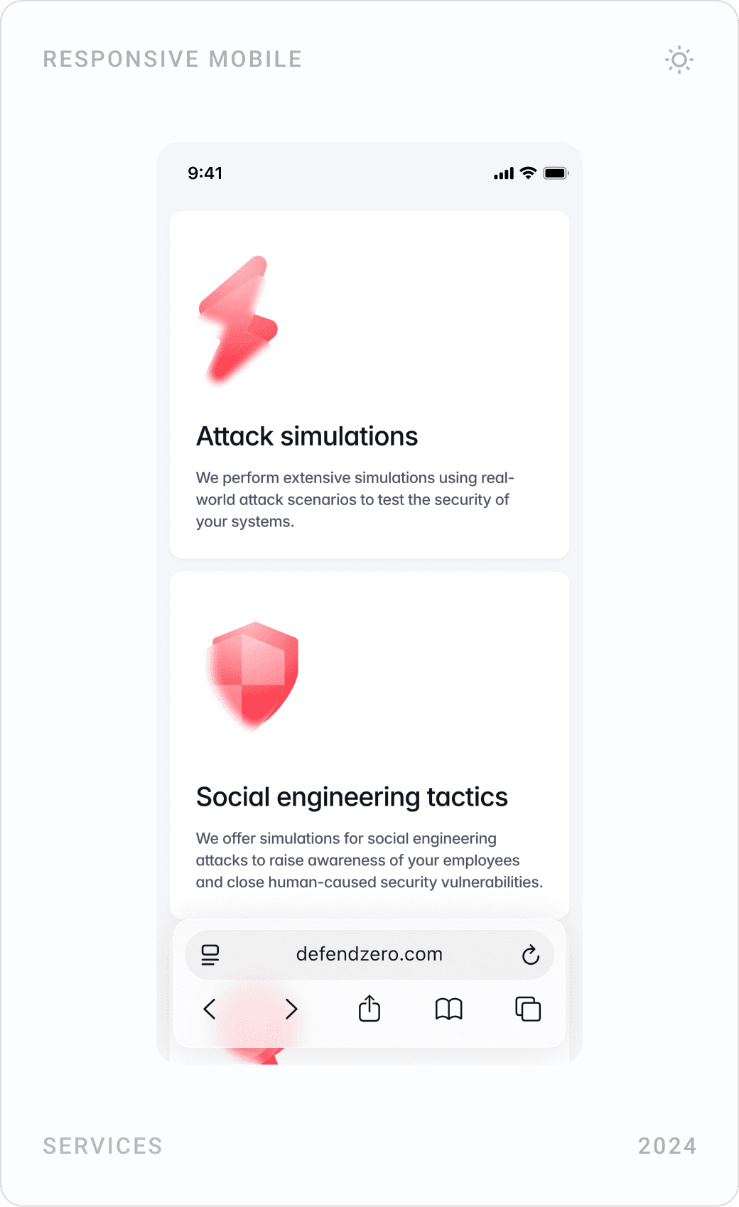
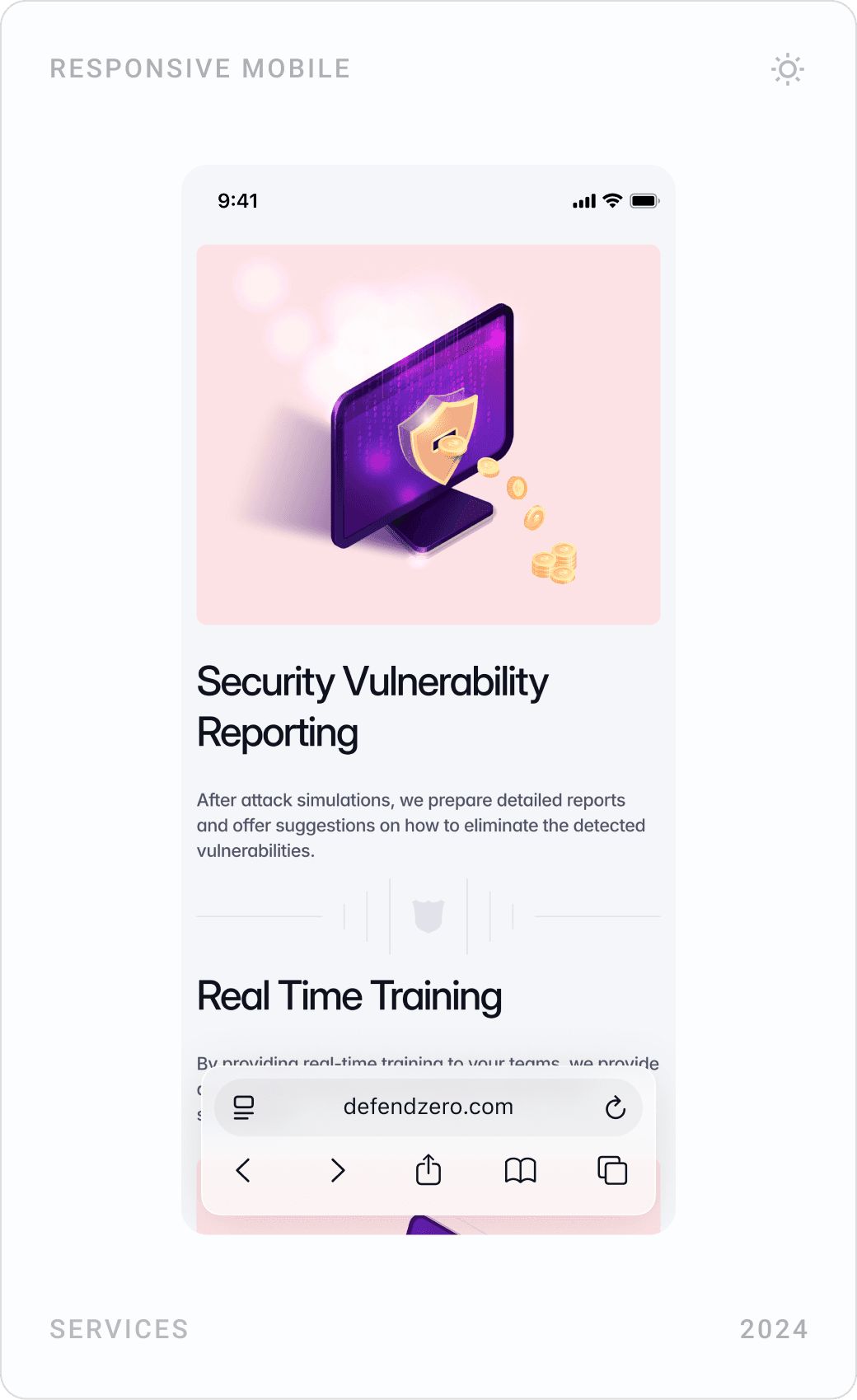
Each team gets its own page built on the same template, in its own colour. Red Team covers attack simulations, social engineering tactics, vulnerability reporting and training; Blue Team covers real-time monitoring, patching, incident management and proactive defence; Purple Team covers joint attack-and-defence testing and performance evaluation.




Penetration testing and consultancy
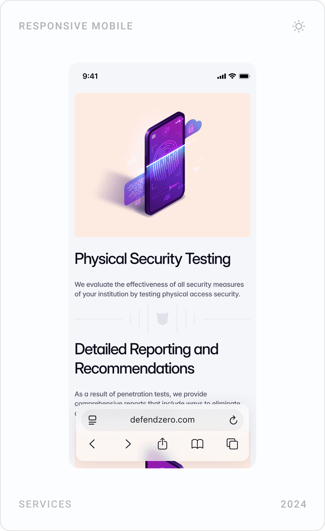
The same template carries the remaining services. Penetration testing lists network, application and physical security testing with detailed reporting; consultancy covers risk assessment, training, compliance and security architecture.



Blog, FAQ and footer
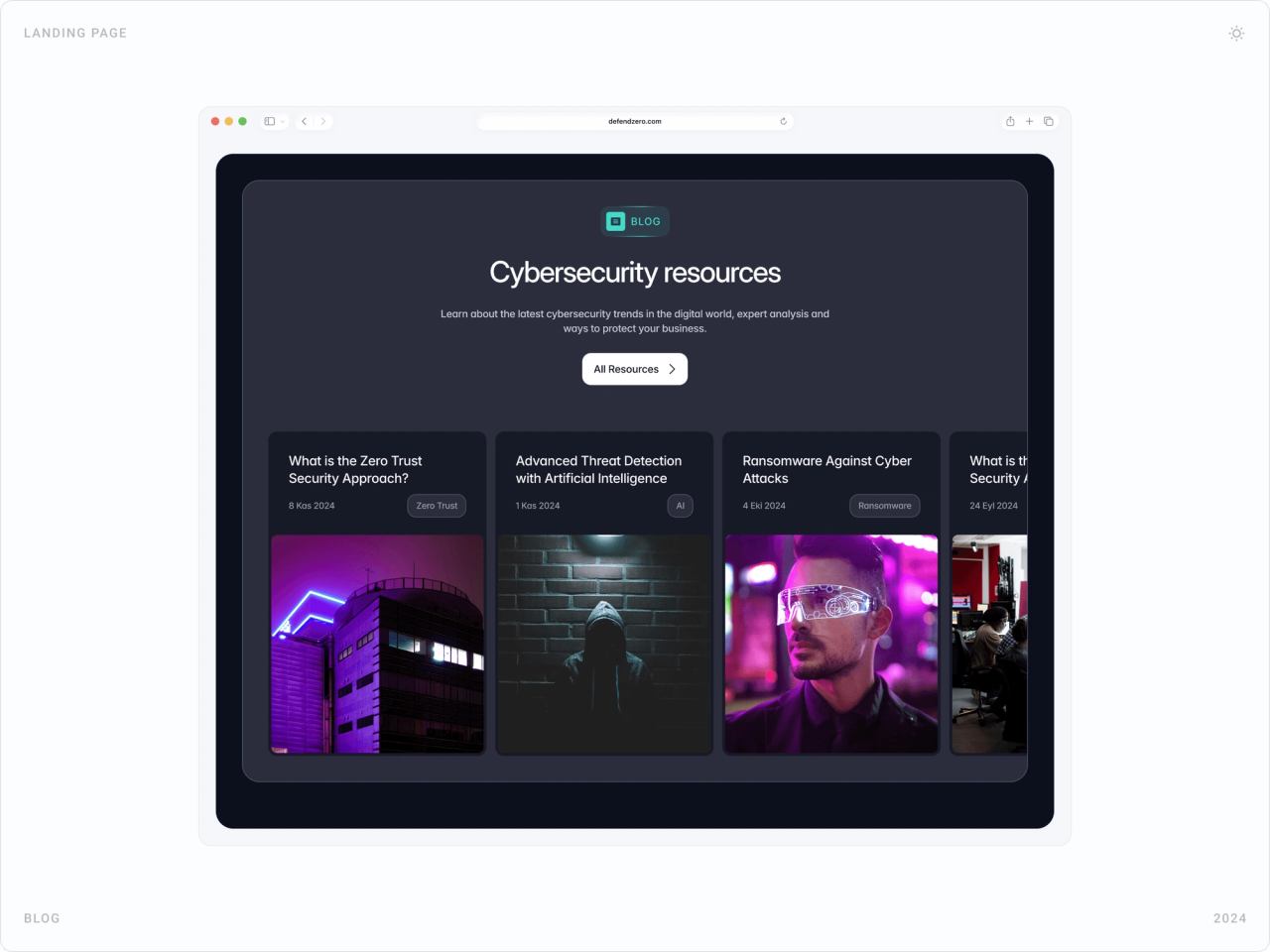
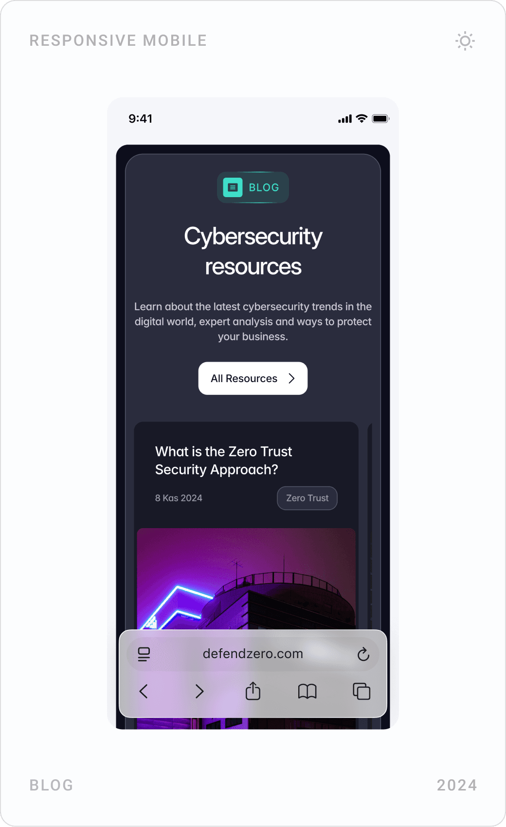
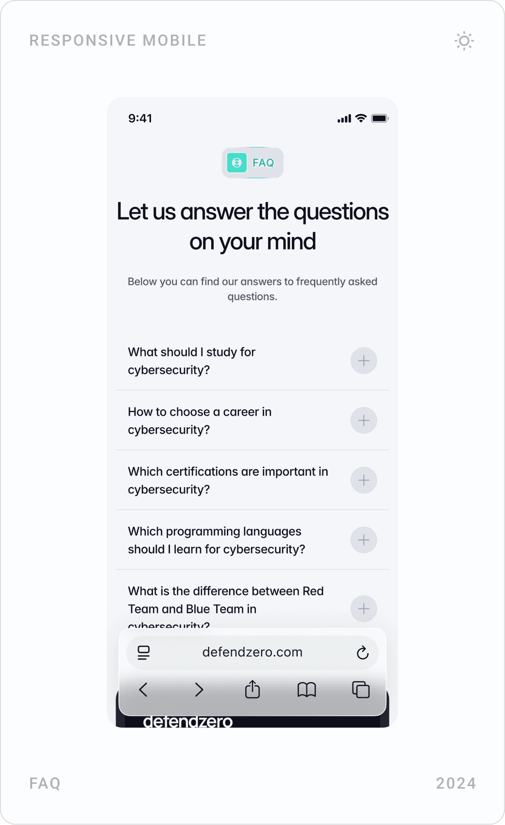
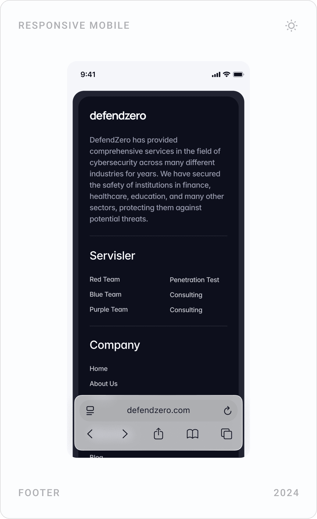
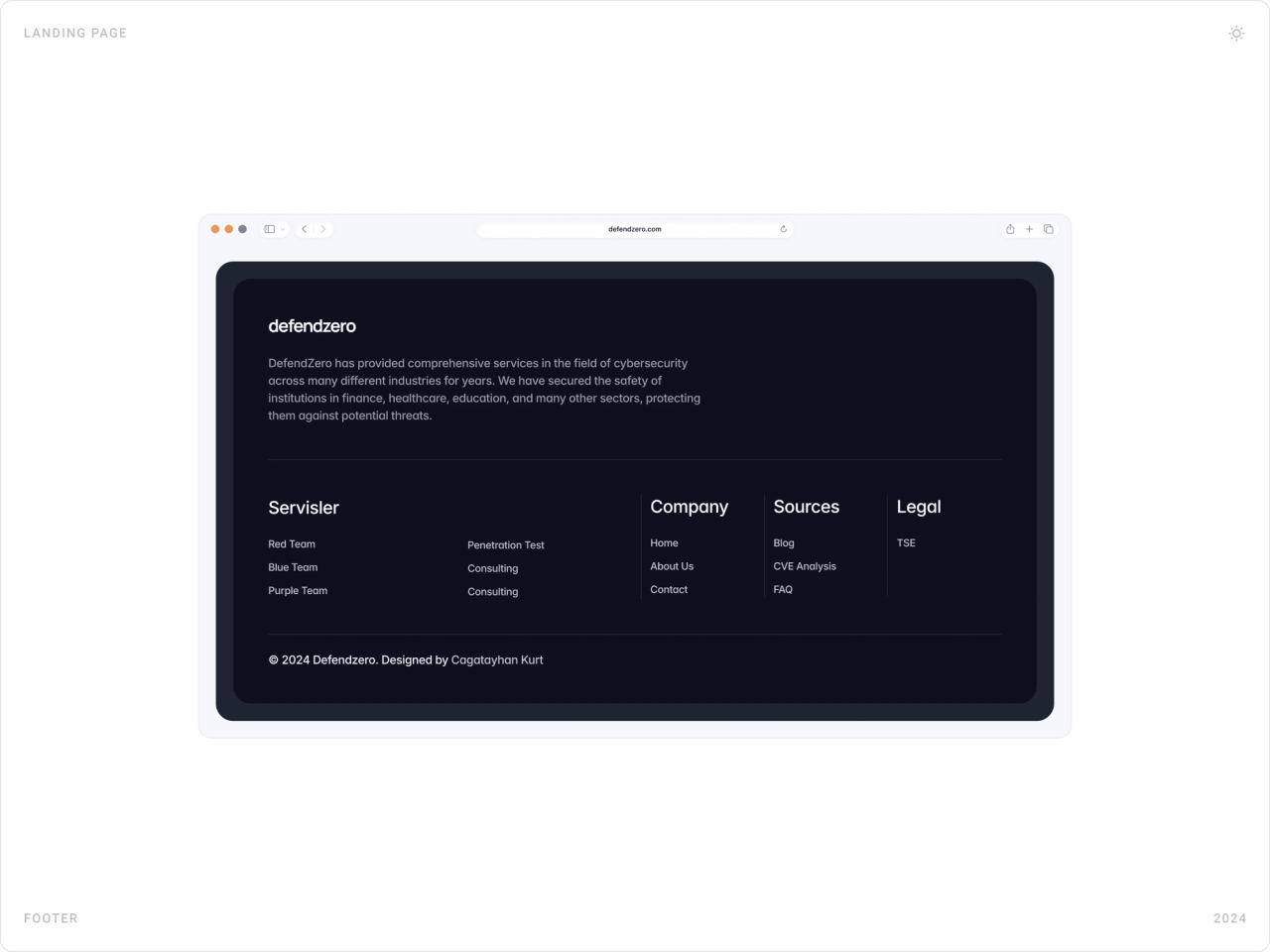
A dark blog section collects articles on topics such as zero trust, AI threat detection and ransomware, with tags and dates. The FAQ answers common questions, including the difference between Red and Blue Teams, and the footer maps every service and resource. All three are CMS-driven, so the team can publish without touching the layout.
Results
- A serious, trustworthy web presence that explains complex security services in a clear, navigable way.
- Positive feedback from cybersecurity professionals on the clarity and structure of the content.
- A performant, modular and responsive Framer build with smooth micro-interactions.
- CMS-ready components for the blog, CVE analysis and services, handed over with full CMS control in Framer.
Key takeaways
- In security, calm design builds more trust than dramatic design.
- A consistent colour per service teaches the offer faster than any definition.
- Show real technical artefacts, code, CVEs, to prove expertise.
- One strong page template lets a services site grow without a redesign.
FAQ
What is RedCyber?
RedCyber is a cybersecurity company working with government and enterprise clients. Its services include Red Team attack simulations, Blue Team defence, Purple Team collaboration, penetration testing, source code analysis and security consulting.
What did you design for RedCyber?
The company website, end to end: UX and UI design, a design system, 3D shield icons for each service, the homepage, five service pages, blog, FAQ and footer for desktop and mobile, and the Framer build with CMS-ready components.
How long did the project take?
About four months in 2024, from competitor research and wireframes to the finished Framer site and the handover.
How do you design a website for a cybersecurity company?
Lead with calm, credible design rather than hacker clichés. Give each service a clear name, a one-line promise and its own visual marker, show technical depth with real artefacts such as code or CVE analysis, answer common questions in an FAQ, and keep one obvious way to get in touch on every page.
Can you design and build a website for my company?
Yes. I work with early-stage AI, SaaS, fintech and Web3 teams on websites, product UI and design systems, and I build marketing sites in Framer. Book a call or send a message from the contact page.
Have a product to design?
I help teams turn complex products into websites and interfaces people understand in seconds. Tell me about yours.