KEOM Protocol · Case study · 4 min read
KEOM Protocol: designing a DeFi lending and margin trading dApp for crypto users
KEOM Protocol was a DeFi lending protocol on Polygon zkEVM and other networks, where users could supply crypto to earn interest and borrow against it. Over six months I designed its lending dApp, margin trading and AI assistant concepts, brand and design system, so complex financial products felt clear and safe to use.
- User Experience Research
- User Interface Design
- Design System
- Webflow Development
- Branding
- Digital Designs
At a glance
Challenge
Lending, borrowing and leveraged trading are risky and technical; the interface had to make them simple without hiding the risk.
Solution
A lending dApp, margin trading and AI assistant concepts, a rewards programme and a shared design system, refined with analytics and user testing.
Outcome
A clearer, data-informed lending platform, a responsive Webflow landing page and one consistent brand across every product.
Deliverables
- Lending market dApp
- Margin trading concept
- AI trading assistant concept
- Rewards programme UI
- Brand identity & design system
- Webflow landing page
Overview
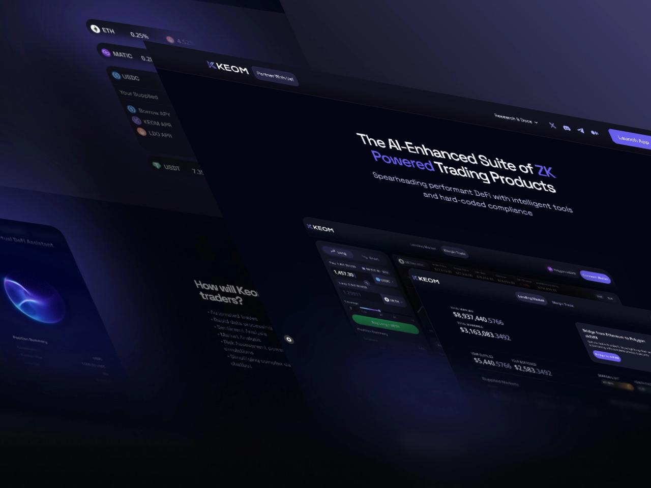
KEOM Protocol was a decentralised lending protocol that called itself “the AI-enhanced suite of zk-powered trading products”. Users could supply crypto to earn interest and borrow against it, on lending markets that ran on Polygon zkEVM, Polygon, Manta and Astar zkEVM. [2]
I worked with the team for six months in 2023 through my studio, Beew. The work covered the lending market dApp, concepts for margin trading, an AI-based leveraged market and a real-world asset market, the brand identity and design system, 3D assets in Spline and a responsive landing page that we built in Webflow.
The protocol has since been discontinued: the team stopped development after the Miden infrastructure it was building on did not reach production readiness in time. [1]
The challenge
DeFi lending asks a lot of its users: they have to understand collateral, borrow limits, health factors and liquidation before they press a button. Margin trading and AI-assisted trading add even more risk to explain.
- Complex products: lending, margin trading and an AI trading assistant had to feel simple without hiding what is at stake.
- Technical versus usable: smart-contract constraints, wallets and multiple networks had to fit into an interface people understand.
- Every screen size: dense trading data had to work on desktop and on a phone.
- Continuous change: large amounts of user data had to feed back into the design as the product evolved.
Goals
- Make the crypto lending market easy to use and accessible.
- Refine the platform with real behaviour: analytics, A/B tests, surveys and usability tests.
- Launch a responsive landing page in Webflow that works on every device.
- Explore new products in line with KEOM’s vision: margin trading, an AI-based leveraged market and a real-world asset market.
- Build one brand identity and design system shared by every product and touchpoint.
Approach
1. Put risk next to the action
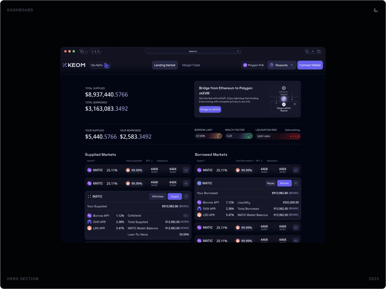
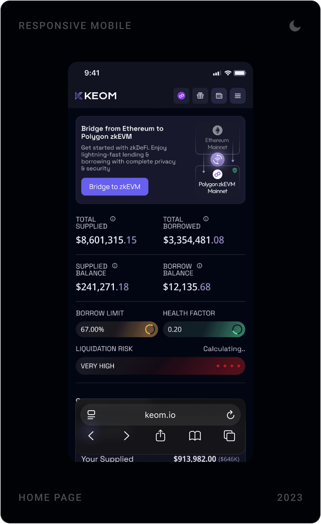
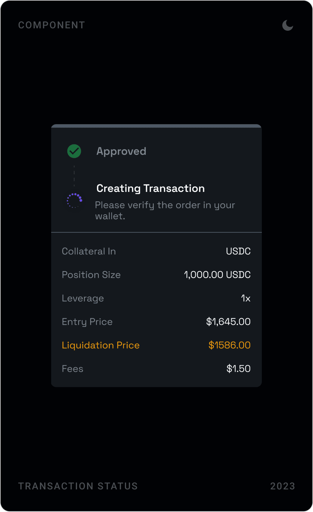
Borrow limit, health factor and liquidation risk sit at the top of the dashboard as colour-coded bars, and every position form ends with a summary that includes the liquidation price. Users see the consequence before they sign.
2. One system for every product
Lending, margin trading, rewards and the AI assistant share the same dark interface, purple accent, asset rows and components. A new product concept could be designed quickly because most of its parts already existed.
3. Let data steer the design
We watched real usage with Hotjar and Google Analytics, ran A/B tests, surveys and usability tests, and studied competitors on DefiLlama and CoinMarketCap. Each round of findings went back into the screens.
4. Mobile is not an afterthought
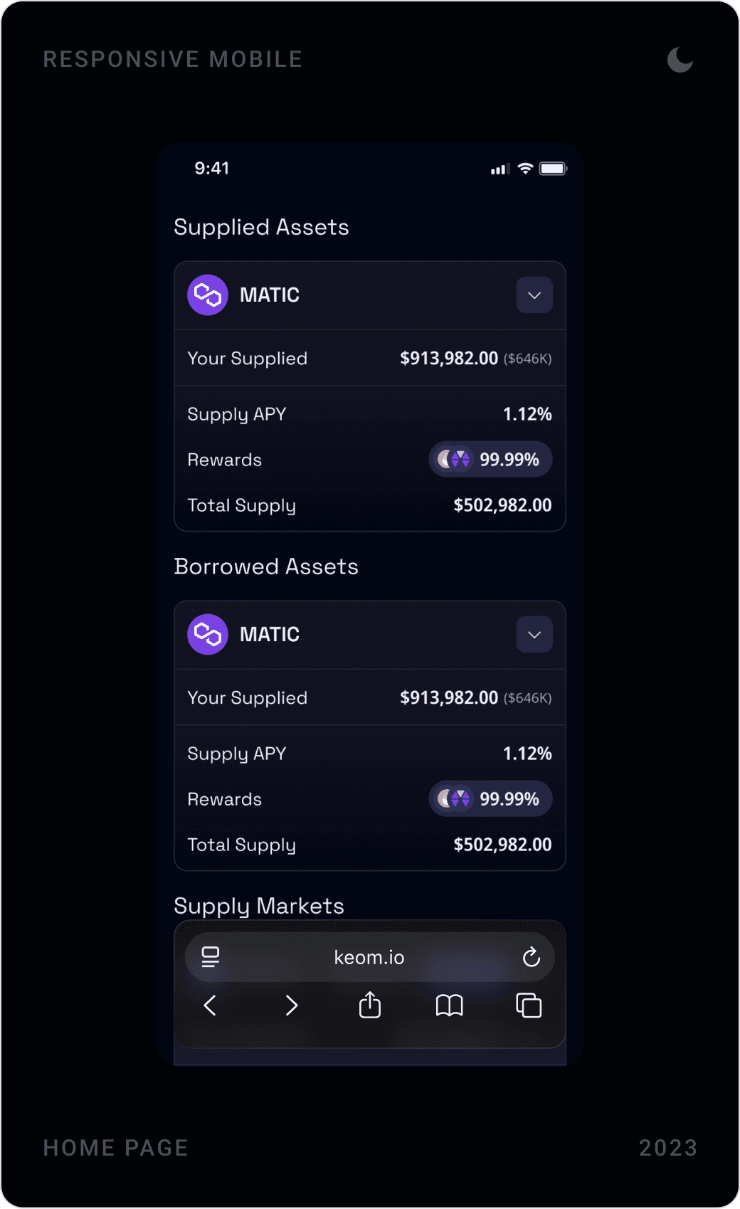
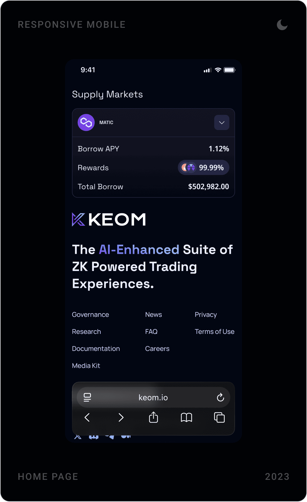
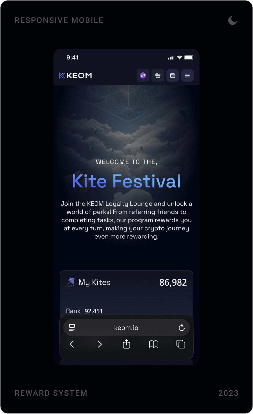
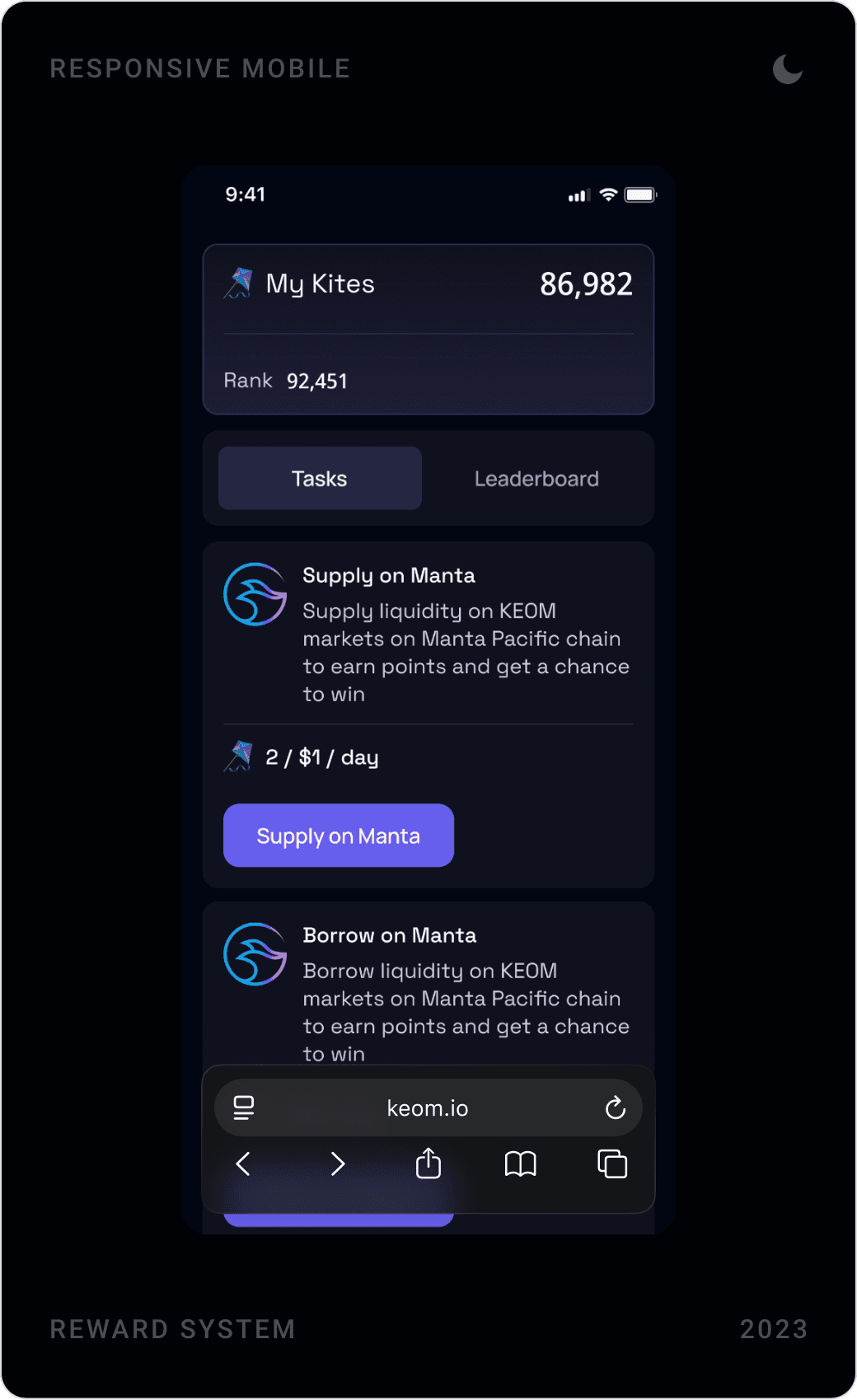
Every key flow, markets, positions, rewards, trading, was designed as a responsive mobile layout too, with the same data re-stacked for a narrow screen rather than removed.
The solution
Lending dashboard
The dashboard shows protocol totals, the user’s own supplied and borrowed balances, and the three risk bars in one view. Supplied and borrowed markets sit side by side, and a banner invites users to bridge from Ethereum to Polygon zkEVM.
Asset detail and supply/borrow
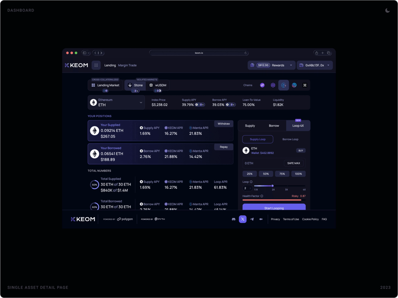
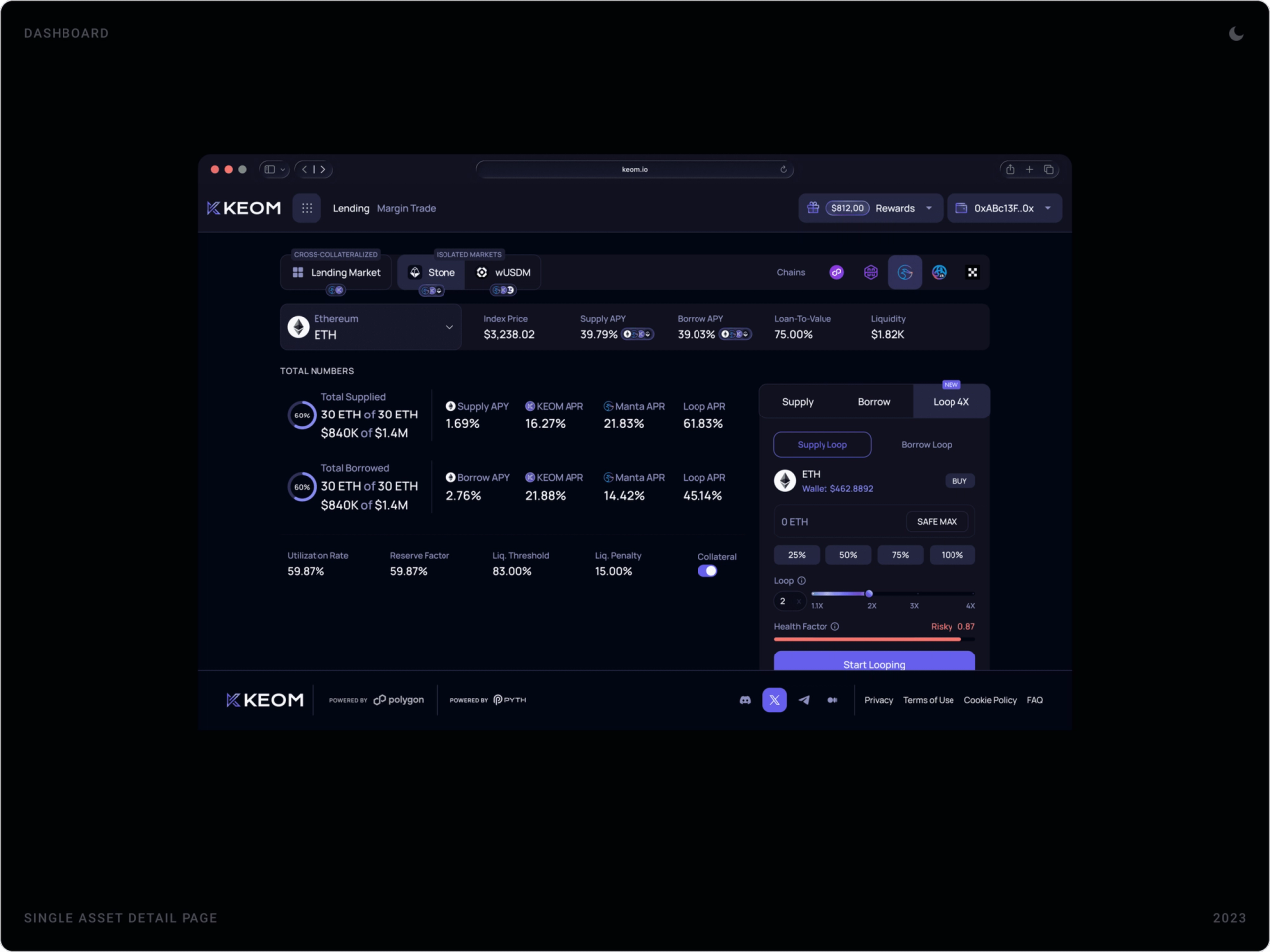
Each asset gets its own page with price, supply and borrow APY, loan-to-value and liquidity, the user’s positions and a panel to supply, borrow or loop in a few taps. A market switcher keeps lending and margin trading one click apart.
Margin trading
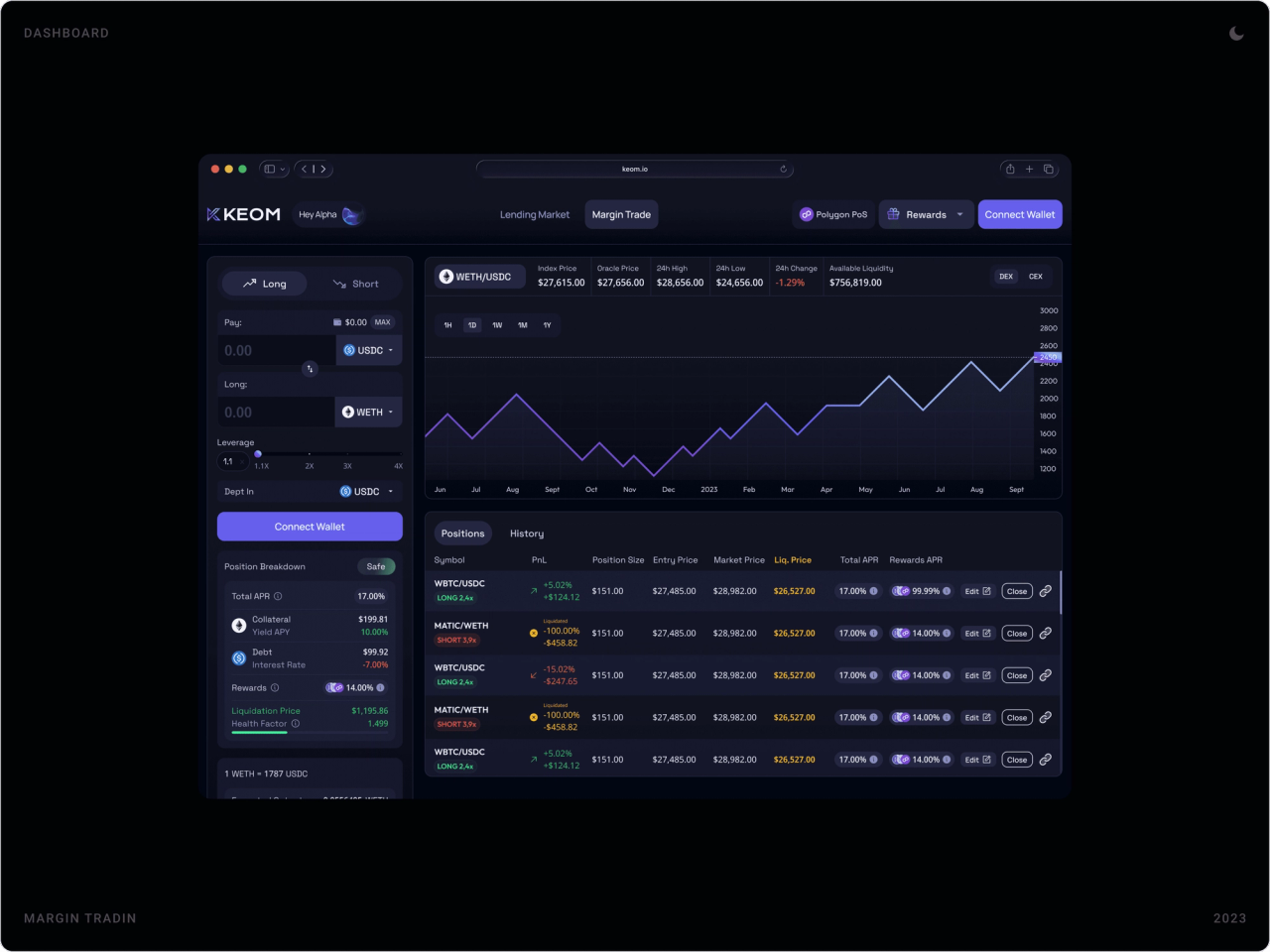
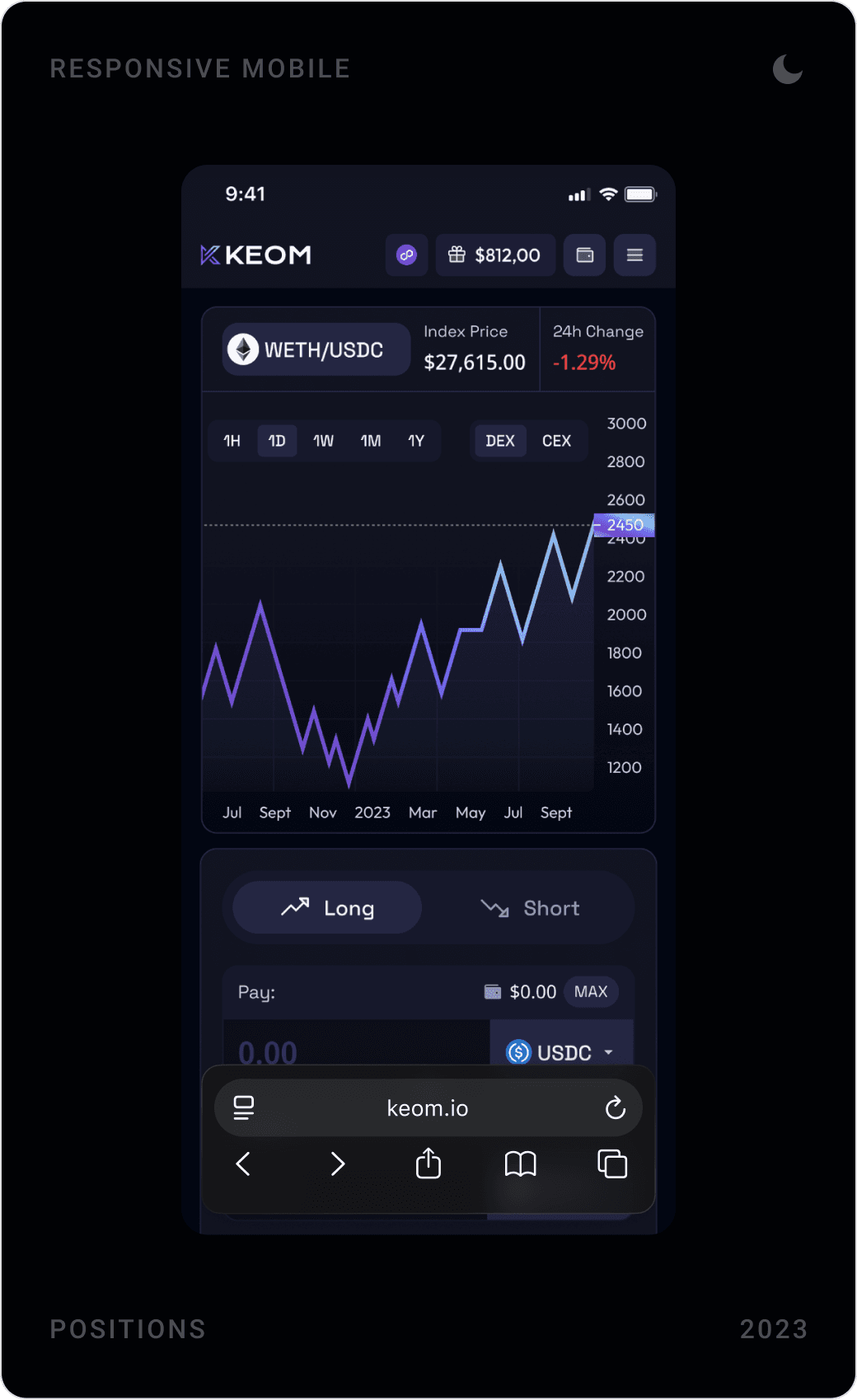
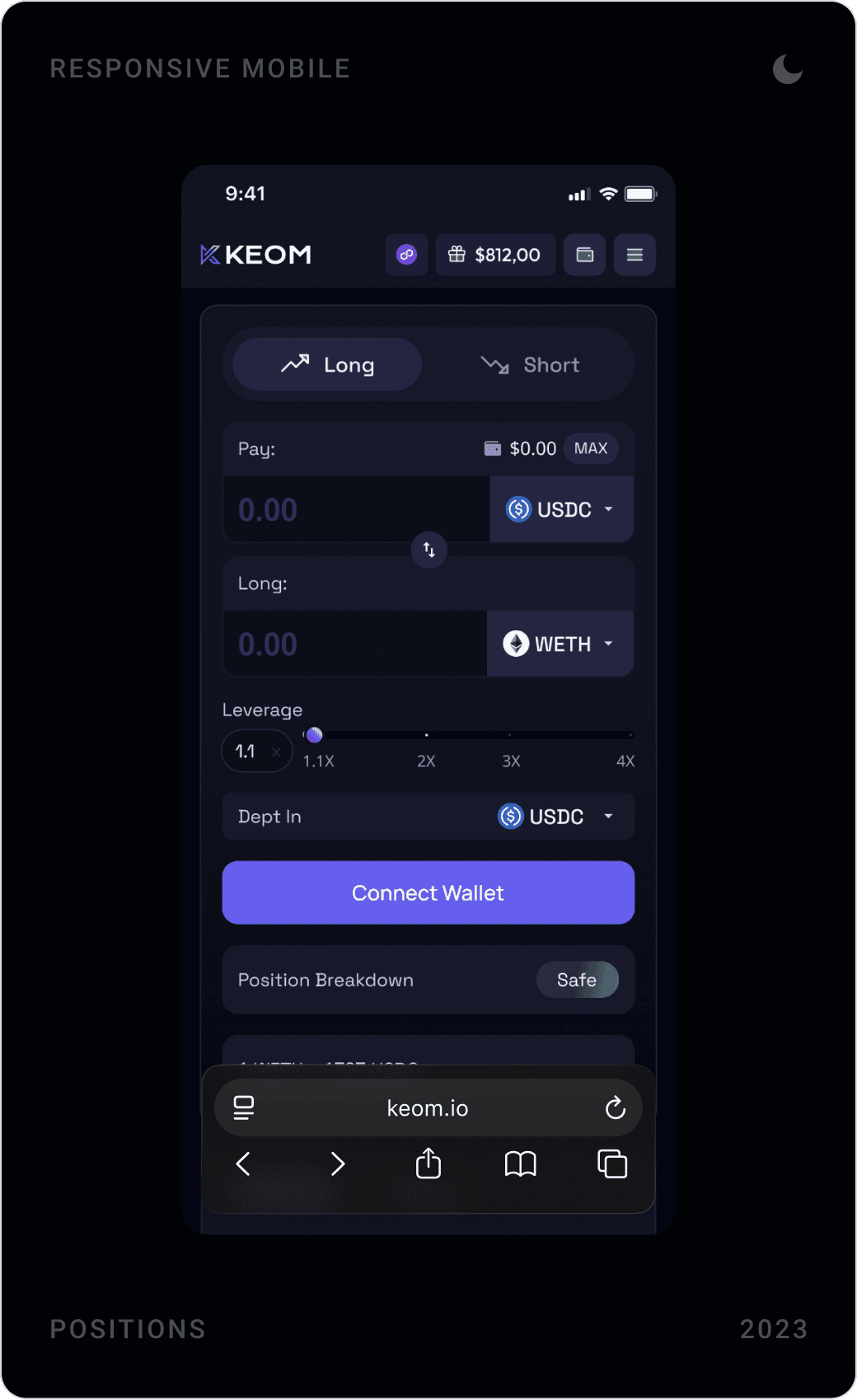
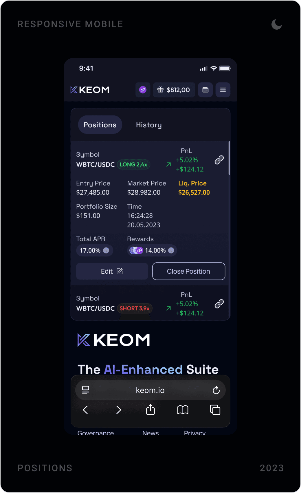
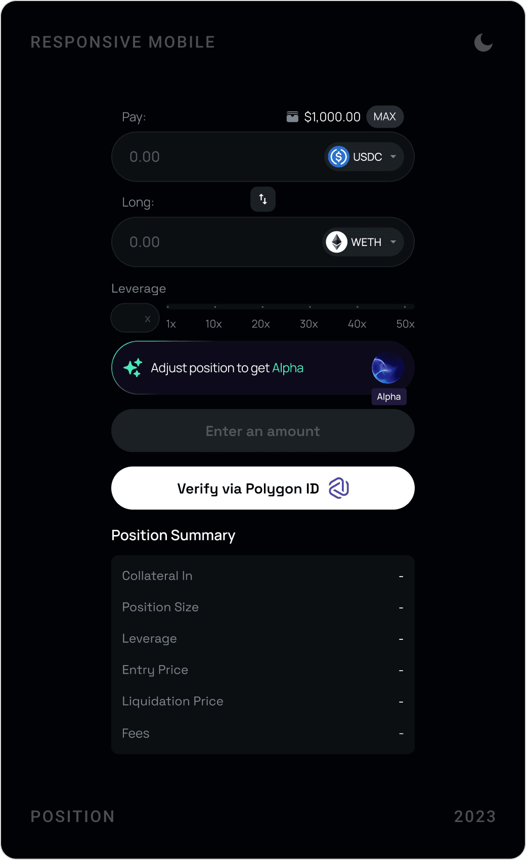
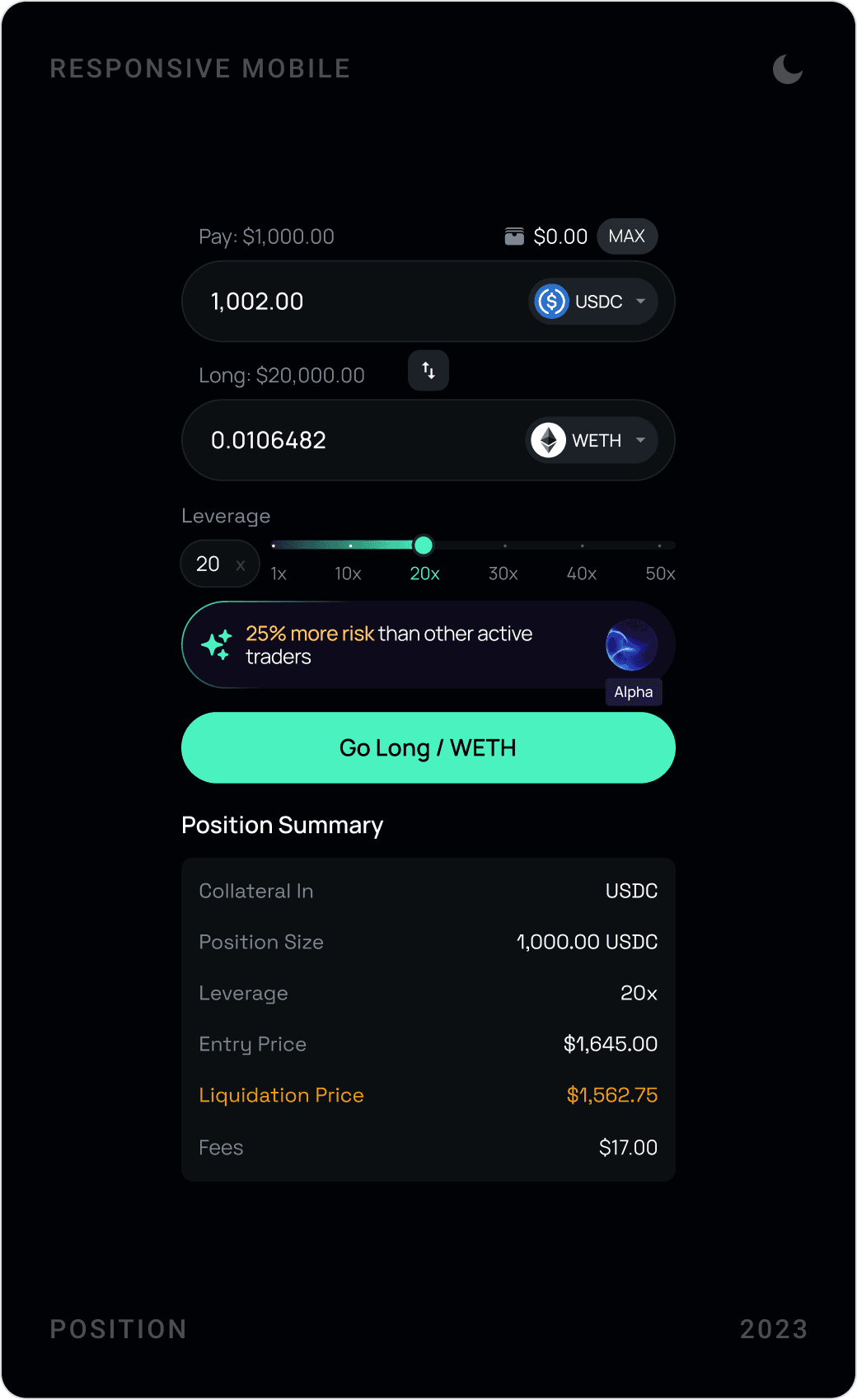
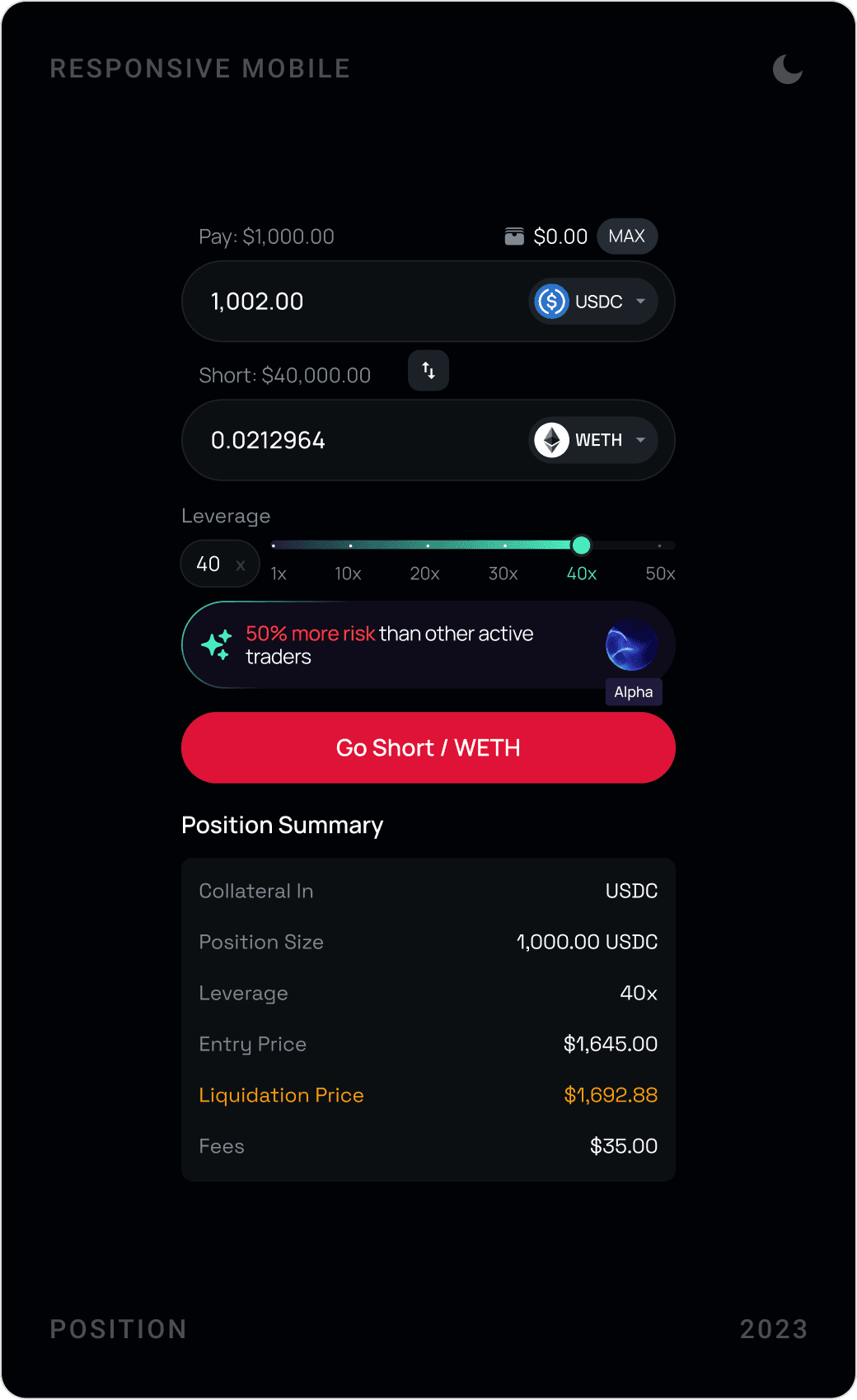
The margin trading concept pairs a long/short order panel with a price chart and a positions table showing entry, market and liquidation price, PnL and rewards. On mobile, users verify via Polygon ID before opening a position, and every order shows a full position summary first.
AI trading assistant
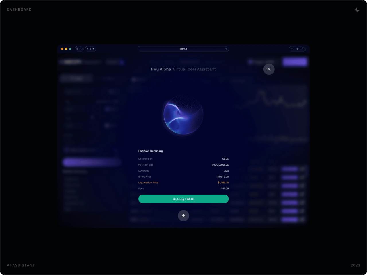
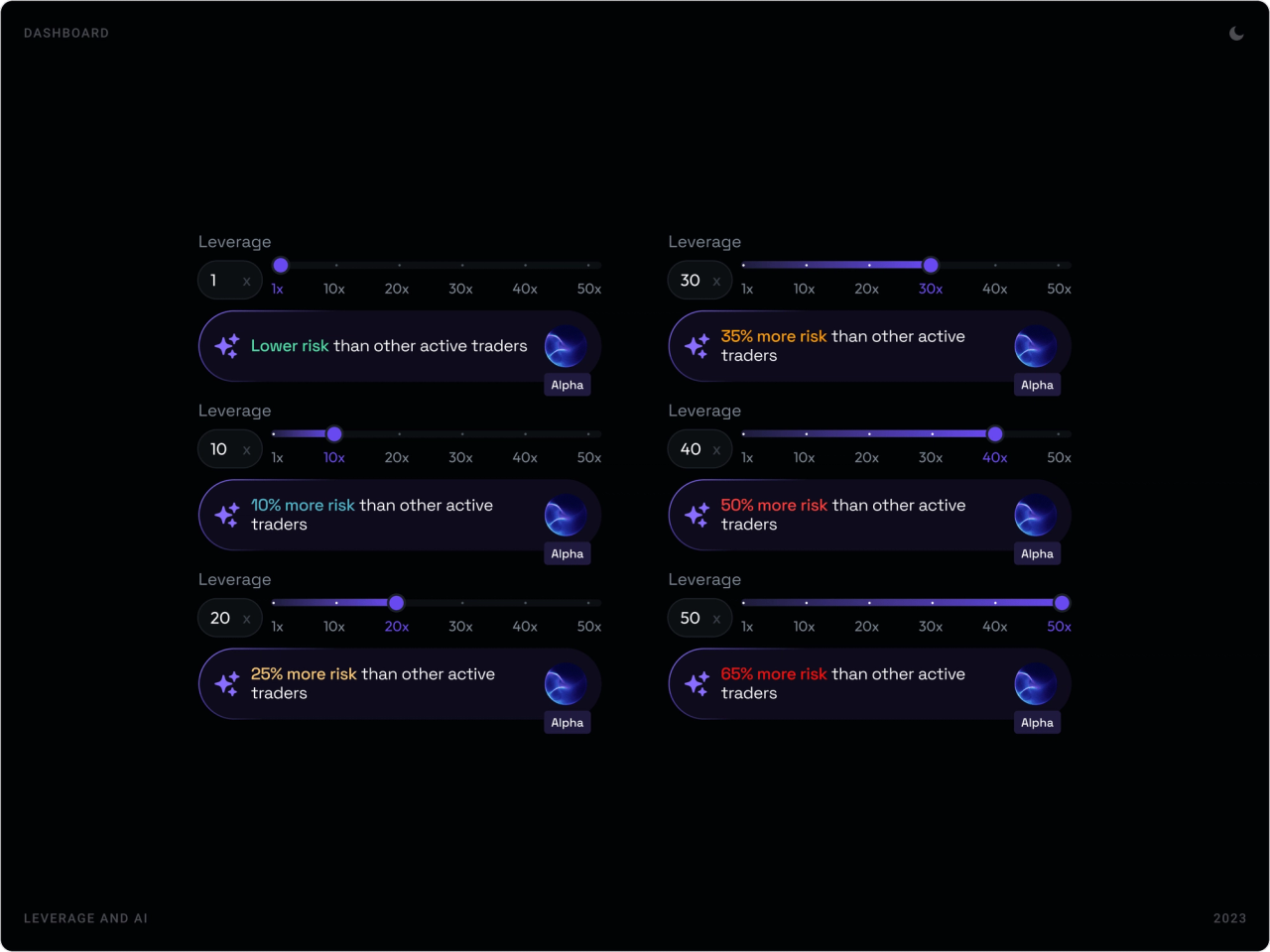
“Alpha”, a virtual DeFi assistant, was designed as a voice-style overlay that prepares a position summary for the user to confirm. On the leverage slider it adds a plain-language hint comparing the chosen risk with other active traders.
Kite Festival rewards
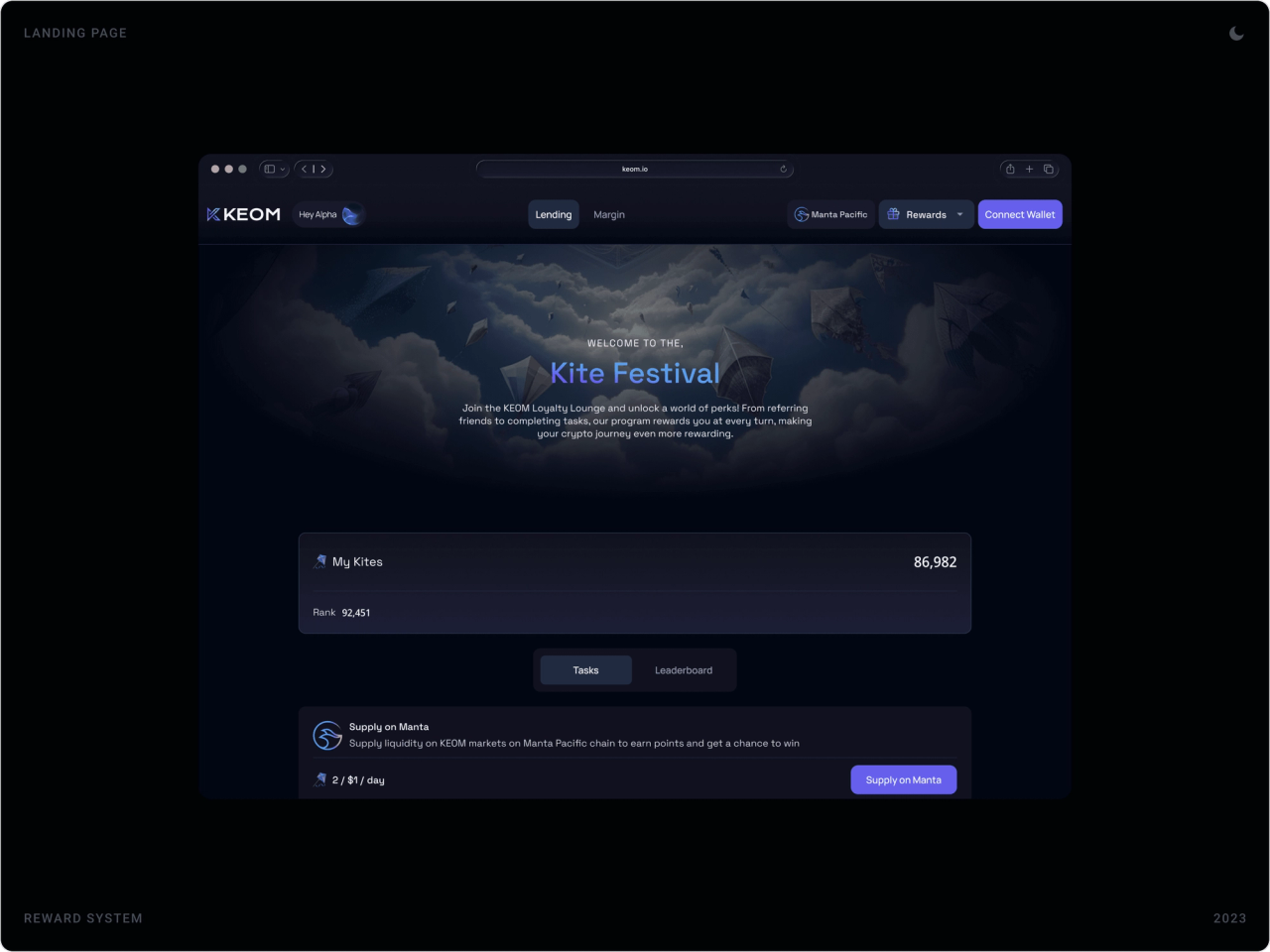
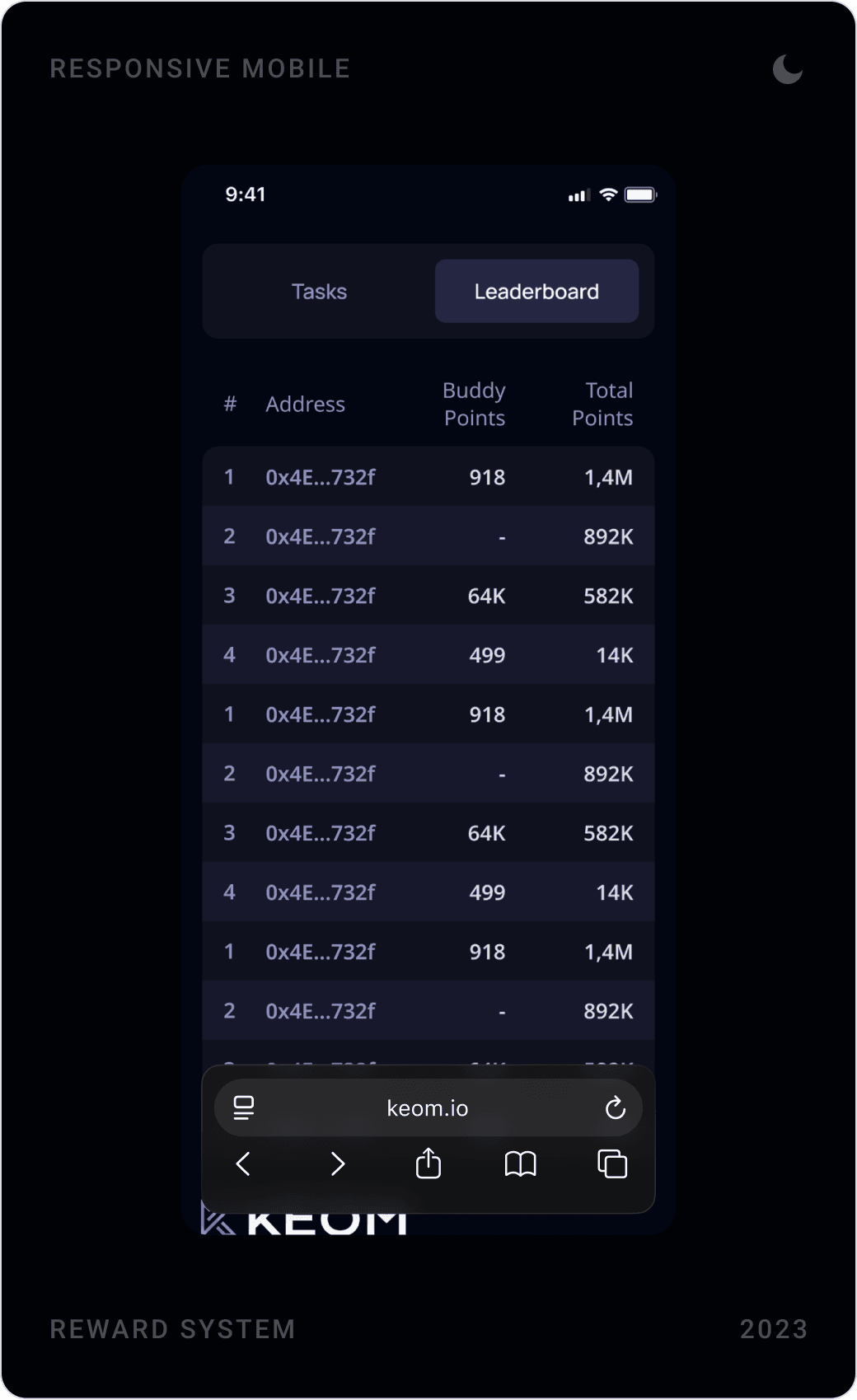
The Kite Festival rewards programme turns protocol use into tasks, supply or borrow on Manta Pacific to earn Kites, with a personal score, rank and a leaderboard of wallet addresses.
Transaction states and modals
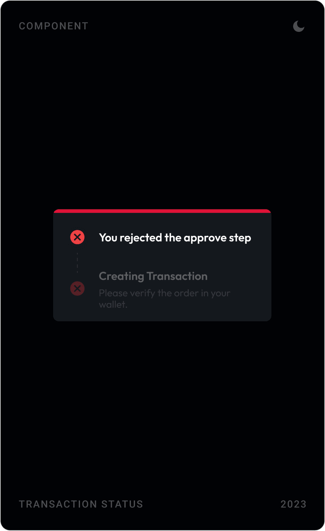
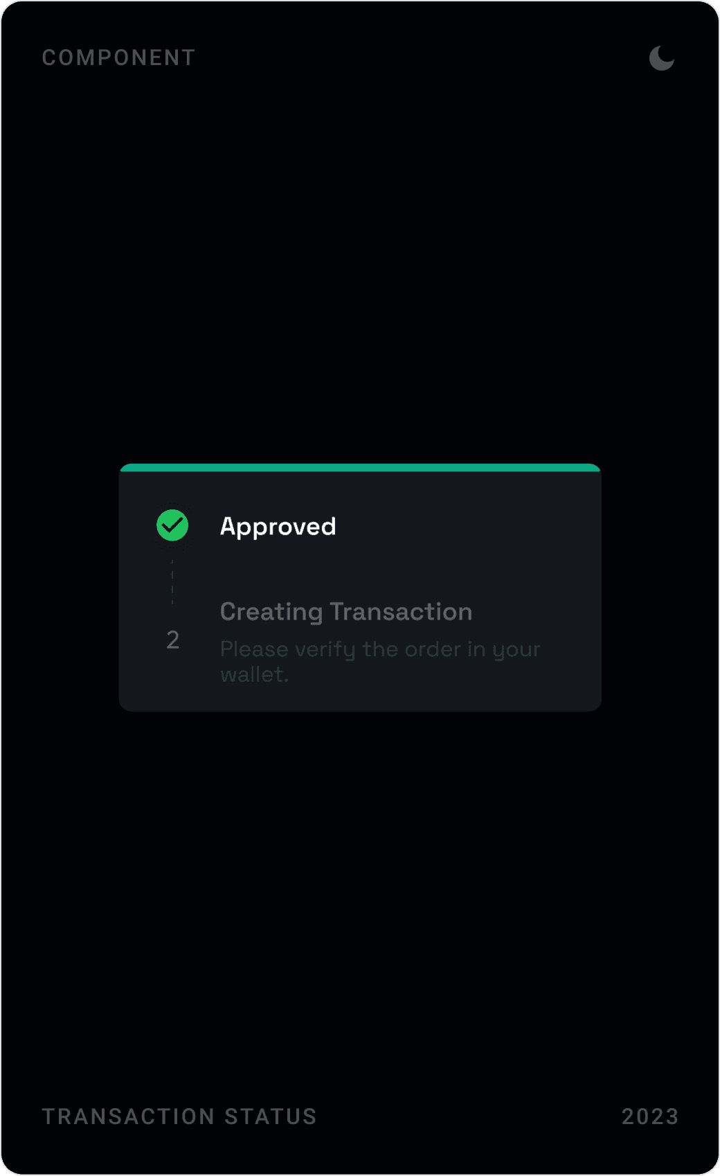
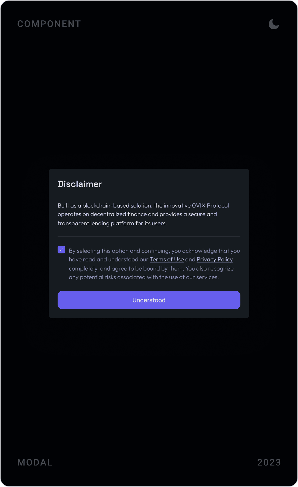
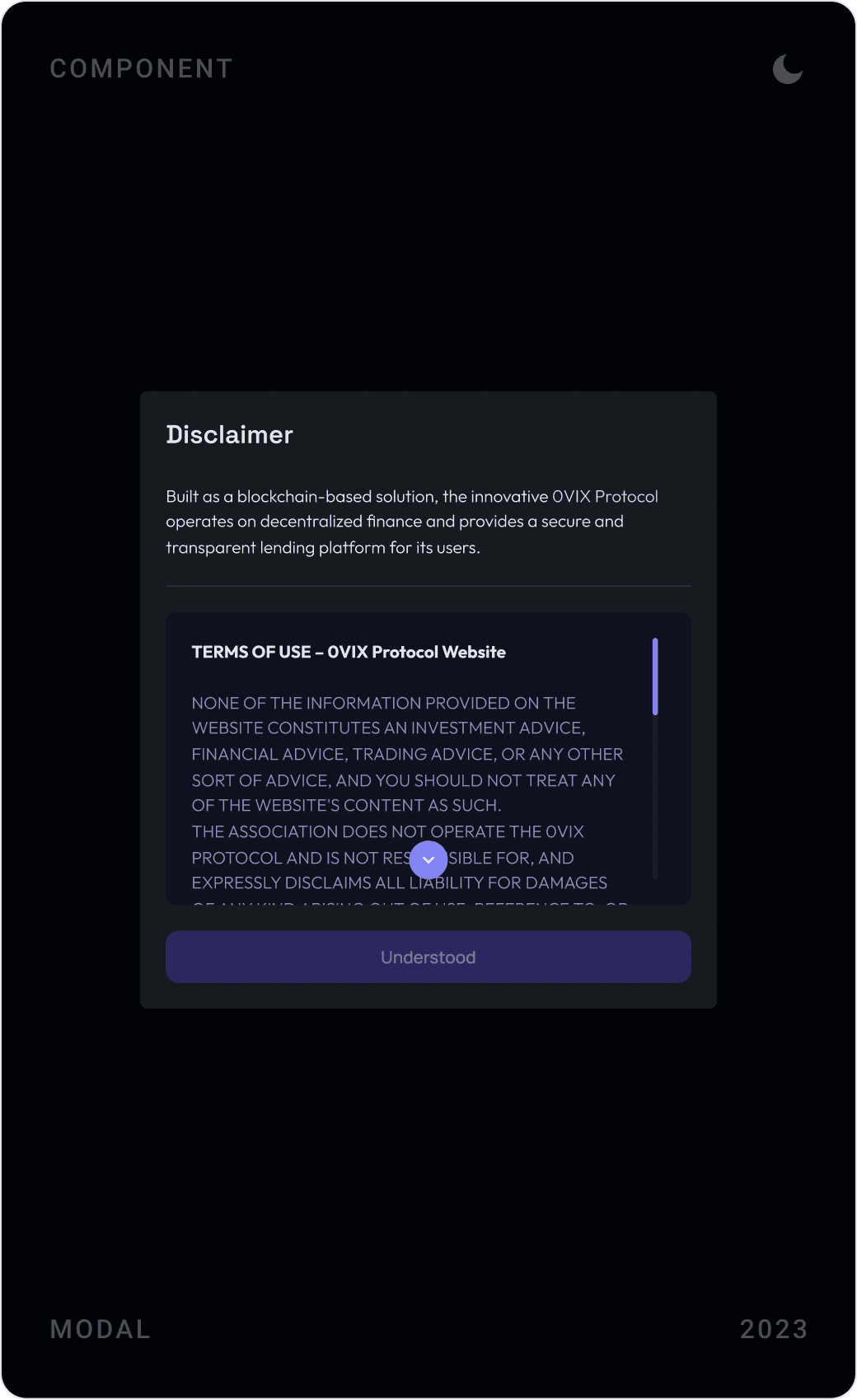
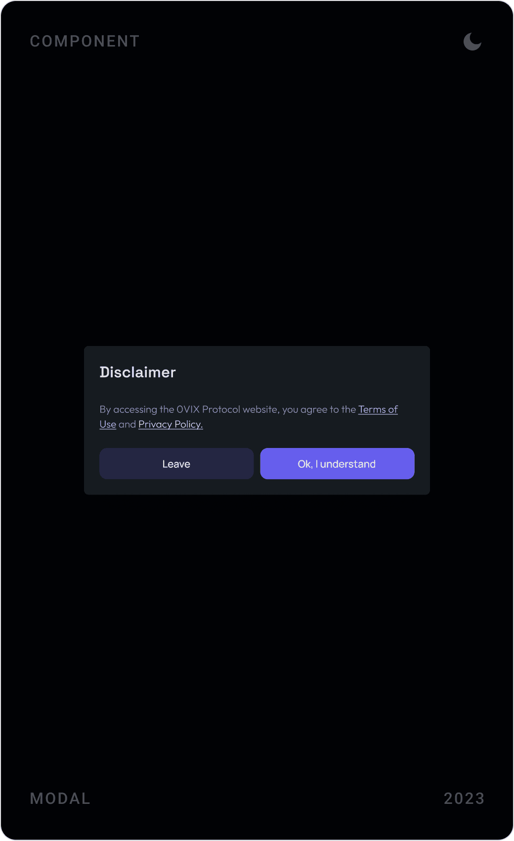
Wallet transactions are where users get anxious, so each step has its own state: approved, creating the transaction, or rejected, with the order summary visible throughout. Disclaimer modals ask users to acknowledge the terms of use before they enter the app.
Results
- A user-friendly, data-informed crypto lending platform with a clear and intuitive interface.
- A responsive landing page launched in Webflow, easy to use on every device.
- Designed and refined concepts, margin trading, an AI-based leveraged market and a real-world asset market, that widened KEOM’s product offering.
- One brand identity and design system across every product and touchpoint.
- Smoother collaboration with product, engineering and marketing, and design milestones delivered on time.
Key takeaways
- In DeFi, the most important number is the one that tells you when you lose money: keep it next to the button.
- Design every transaction state, including rejection; that is where trust is won or lost.
- A shared design system lets a small team explore new products fast.
- AI in a trading product should explain risk in plain words, not just add a feature.
FAQ
What is KEOM Protocol?
KEOM Protocol was a decentralised lending protocol that described itself as an AI-enhanced suite of zk-powered trading products. It ran lending markets on Polygon zkEVM, Polygon, Manta and Astar zkEVM. The team later discontinued the protocol.
What did you design for KEOM Protocol?
The lending market dApp (dashboard, asset detail and supply/borrow flows), concepts for margin trading and an AI trading assistant, the Kite Festival rewards programme, transaction states and modals, the brand identity and design system, and a responsive landing page built in Webflow.
How long did the project take?
About six months in 2023, working in an Agile setup with KEOM’s product managers, developers and marketing team.
How do you design a DeFi lending app that users trust?
Put the numbers that decide safety, borrow limit, health factor, liquidation price, next to every action, not on a separate page. Preview each transaction before the wallet asks to sign, show every step and error state clearly, and make terms and risks something users acknowledge rather than scroll past.
Can you design a DeFi or Web3 product for my company?
Yes. I work with early-stage AI, SaaS, fintech and Web3 teams on product UI, websites and design systems. Book a call or send a message from the contact page.
Sources
Have a product to design?
I help teams turn complex products into websites and interfaces people understand in seconds. Tell me about yours.