Spex Software · Case study · 4 min read
Spex: a corporate website for a Turkish software and cyber security company
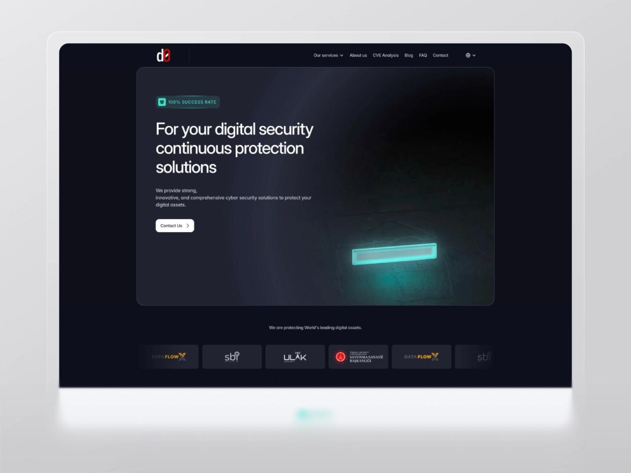
Spex is an İzmir-based company that builds custom software and cyber security solutions for organisations running critical systems. I redesigned its corporate website to move the brand from futuristic and inconsistent to clean, modern and enterprise-trustworthy, using the 55° angle of the logo’s “X” as a signature across the UI.
- User Experience Research
- User Interface Design
- Landing Page Design
- Brand & Logo Design
- Design System
At a glance
Challenge
The old website felt futuristic but untrustworthy and inconsistent, the wrong signal for a cyber security company selling to enterprises.
Solution
A clean, responsive multi-page site with a signature detail: the 55° angle of the logo’s “X”, carried into cards, corners and icons.
Outcome
A professional, enterprise-ready website with clearer navigation and a distinctive identity, designed in one month.
Deliverables
- Landing + 5–6 page templates
- Desktop + mobile
- UI design system
- 55° brand motif
- Logo & app icon
- Book-a-call flow

Overview
Spex (SPEX Yazılım ve Siber Güvenlik Hizmetleri A.Ş.) is a software and cyber security company founded in 2020 and headquartered in İzmir, Turkey. [2] It designs and develops secure software, cyber defence solutions and advanced systems for organisations in mission-critical environments, with services spanning custom software, IT consulting, server and network solutions, cyber security, AI and cloud infrastructure. [1] [3]
Through my studio, Beew, I redesigned the company’s corporate website in one month in 2025: a landing page and five to six inner pages for desktop and mobile, delivered as handoff-ready UI/UX. Beew had already designed the Spex logo, so the brief was also to turn that mark into a design system the whole site could share.
The challenge
Cyber security is bought on trust. Spex’s previous website looked futuristic, but to an enterprise buyer it read as inconsistent and amateurish, the opposite of what a security partner should signal.
- Trust: the old site felt futuristic but untrustworthy, inconsistent and amateurish.
- Positioning: cyber security for enterprises needed a more corporate, professional visual language.
- Brand logic: nothing tied the brand’s elements, especially the “X”, to the interface.
- Clarity: a responsive structure had to show services, work and credibility fast.
Goals
- Design a modern, clean, corporate marketing site, a landing page and about five to six pages, fully responsive.
- Build trust through strong hierarchy, spacing, typography and polished components.
- Create a signature system by applying the 55° angle of the logo’s “X” to UI details.
- Keep the brand consistent over time, as Spex’s ongoing design partner.
- Deliver handoff-ready UI/UX, without development.
Approach
1. One angle, used everywhere
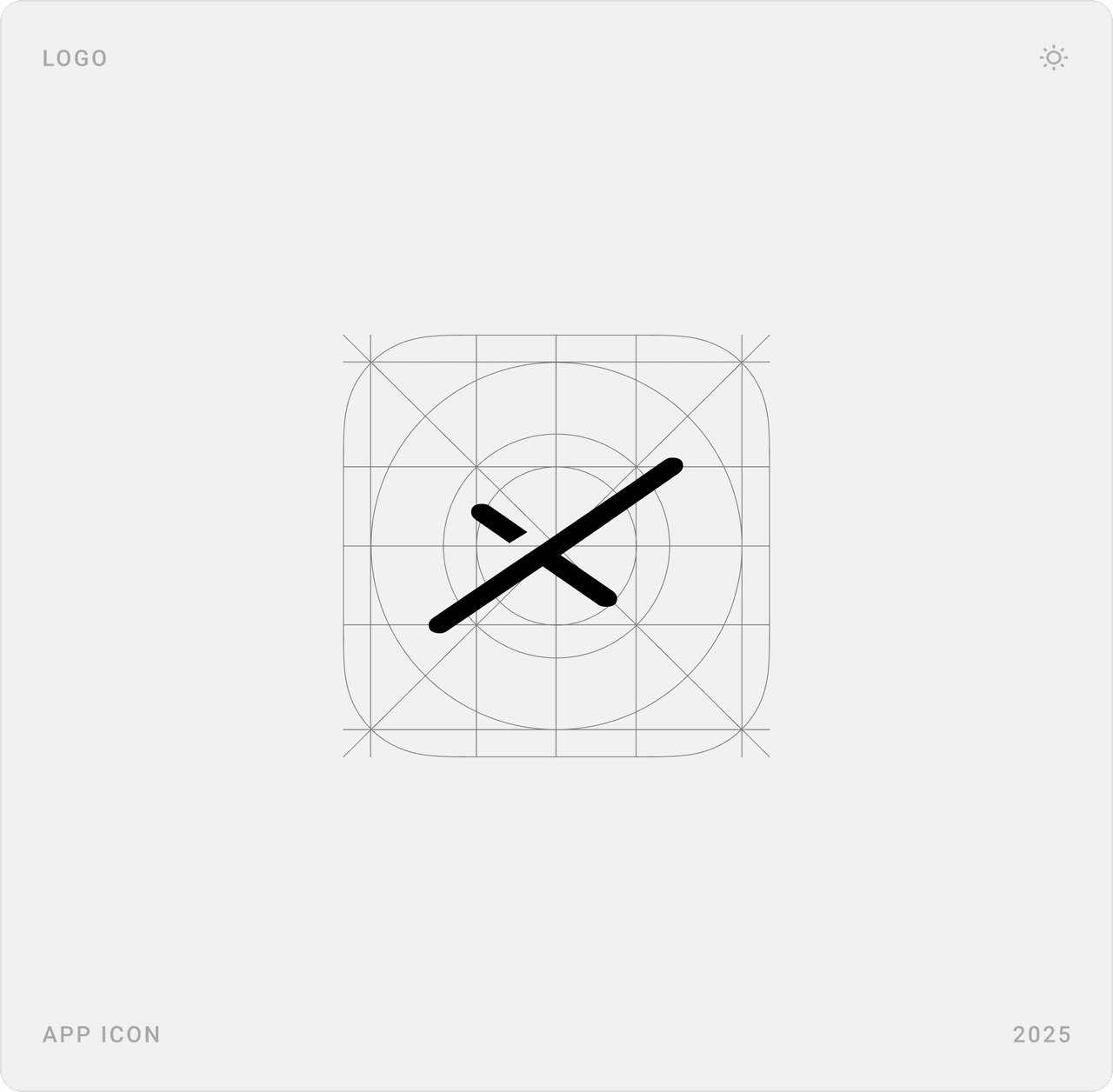
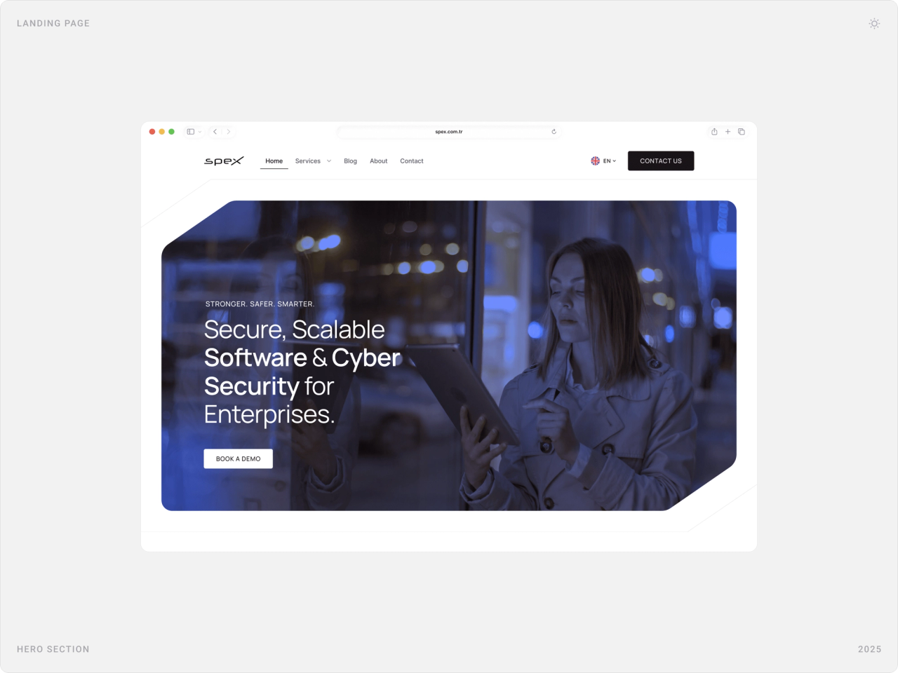
The “X” in the Spex logo is drawn at 55°. I made that angle the site’s signature: hero images, cards and frames get cut corners at the same angle, so the brand is recognisable even when the logo isn’t on screen.
2. Corporate calm over cyber clichés
Instead of neon and code rain, the site uses a light base, deep blue accents, real people at work and generous spacing. Dark sections are saved for proof, partners and client stories, so they stand out.
3. Explain services as processes
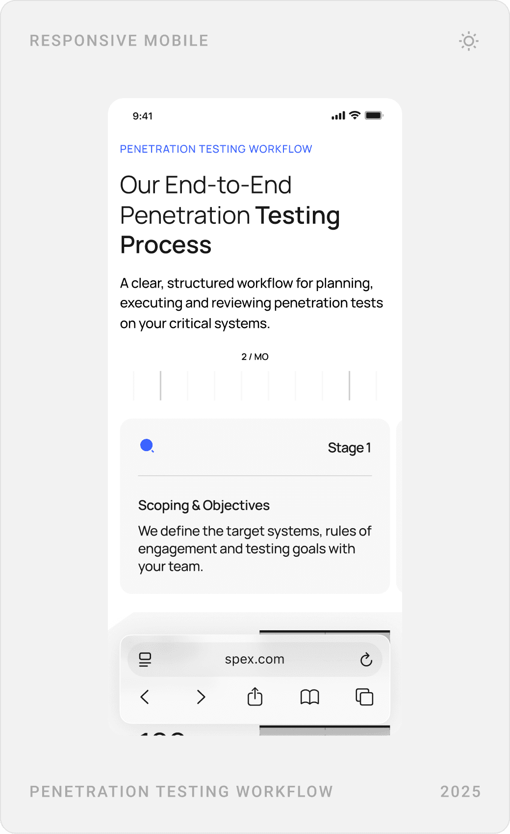
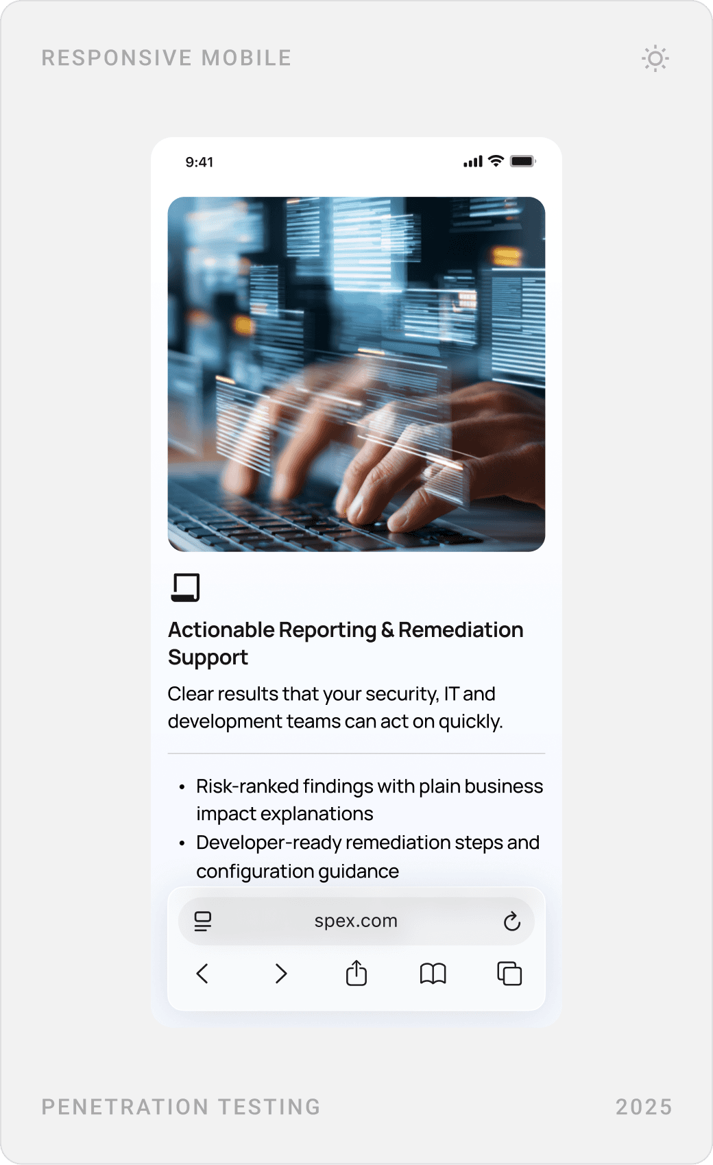
Enterprise buyers want to know what will actually happen. Service pages such as penetration testing walk through scoping, testing, reporting and remediation step by step, instead of listing buzzwords.
4. Make the next step a calendar, not a form
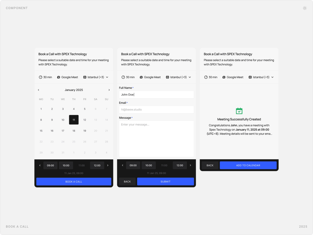
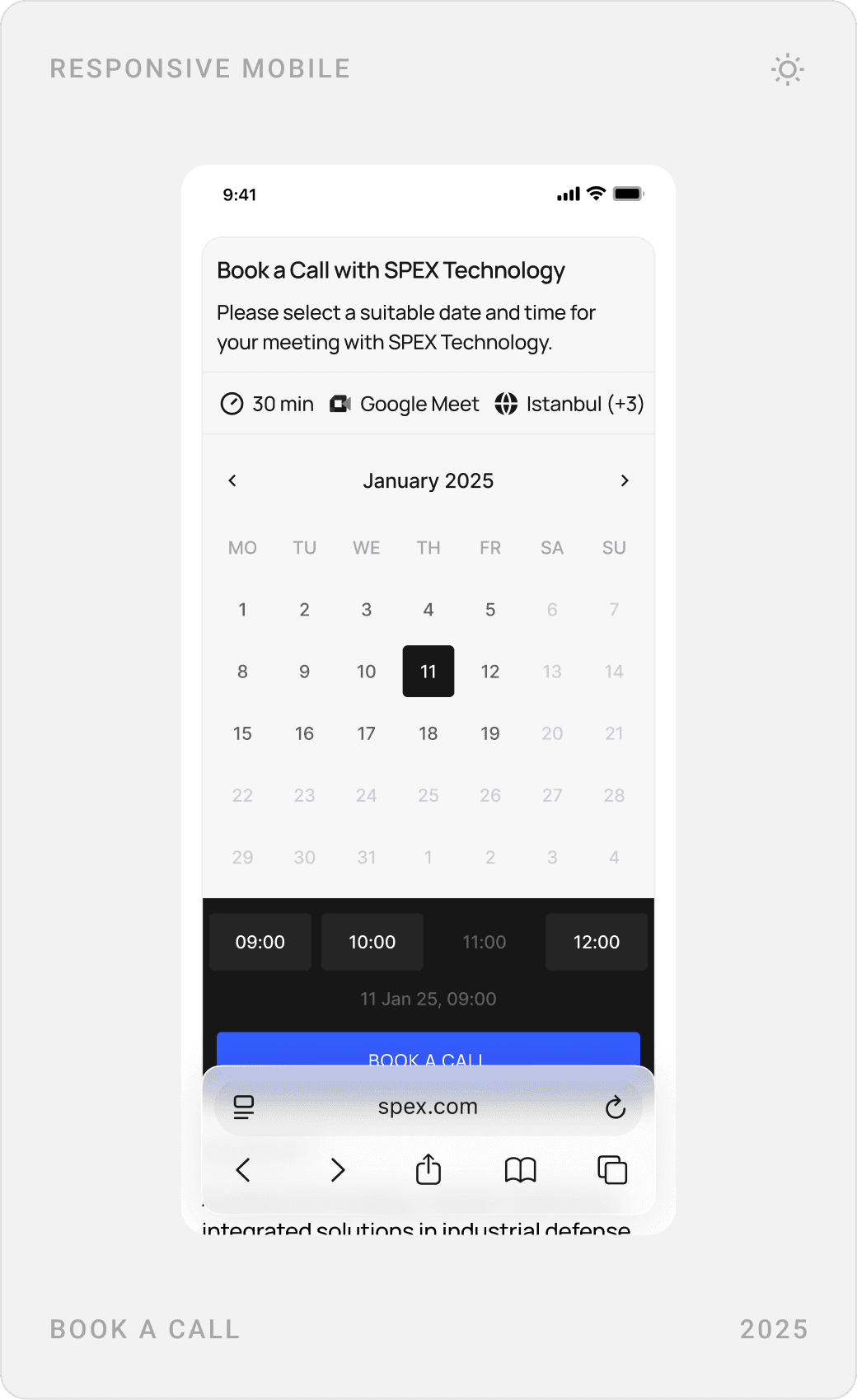
Every page ends with the same invitation to book a call, and the booking itself happens on the page: pick a date and time, add your details, get a confirmation.
The solution
The logo and the 55° system
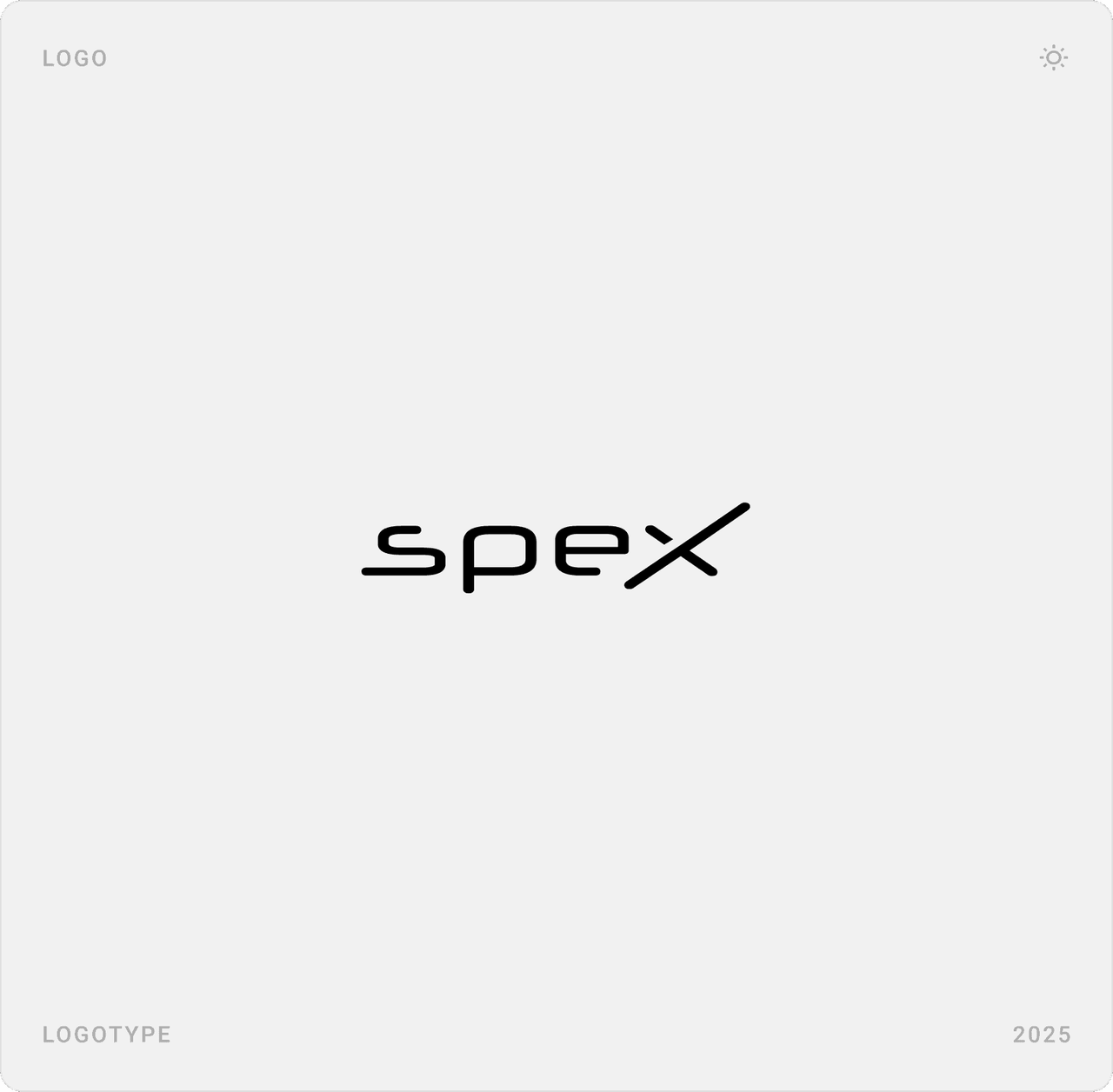
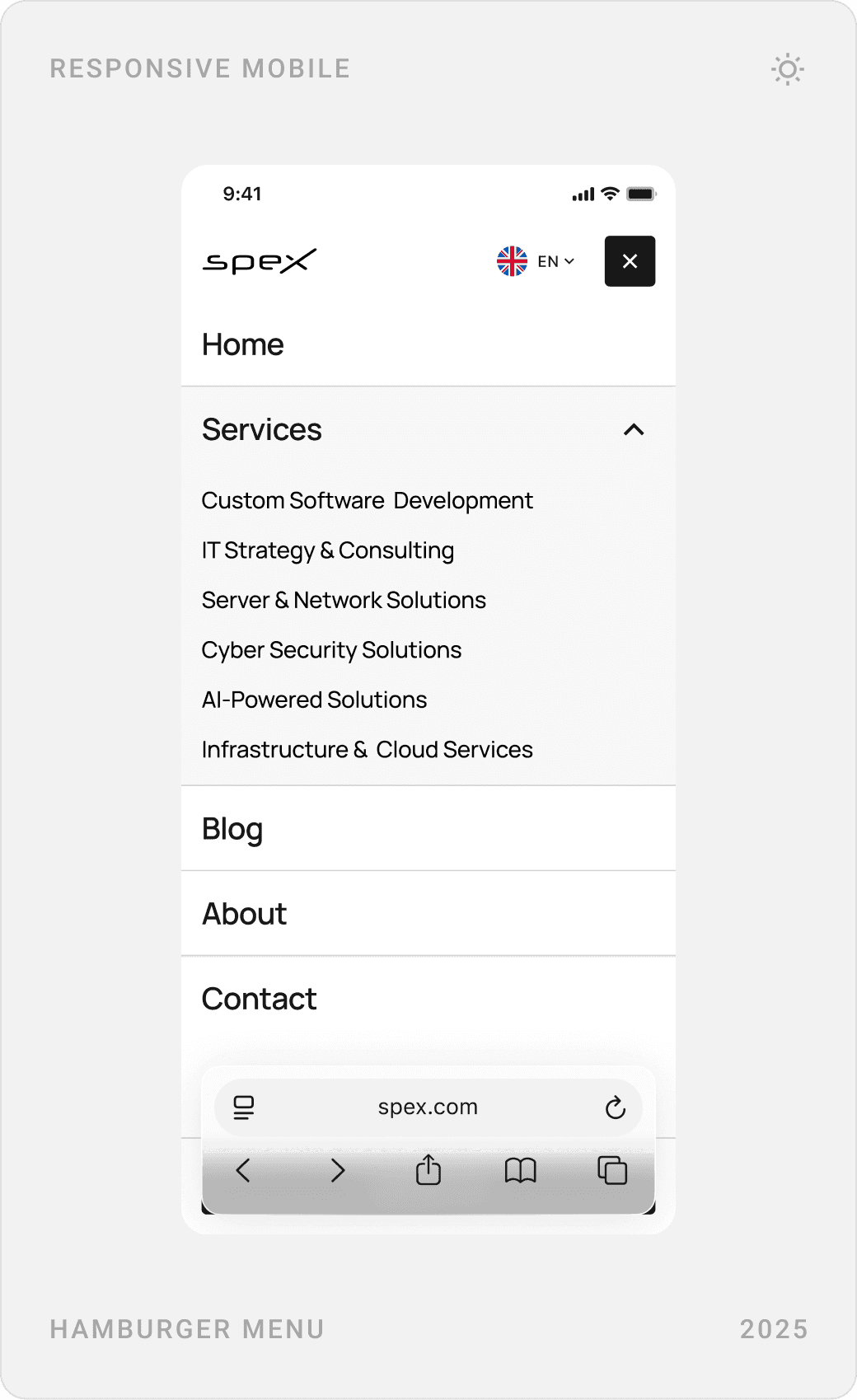
The Spex wordmark and app icon, both built on a construction grid, are the source of the system. The crossing strokes of the “X” set the angle used for corners and details across the website.
Homepage
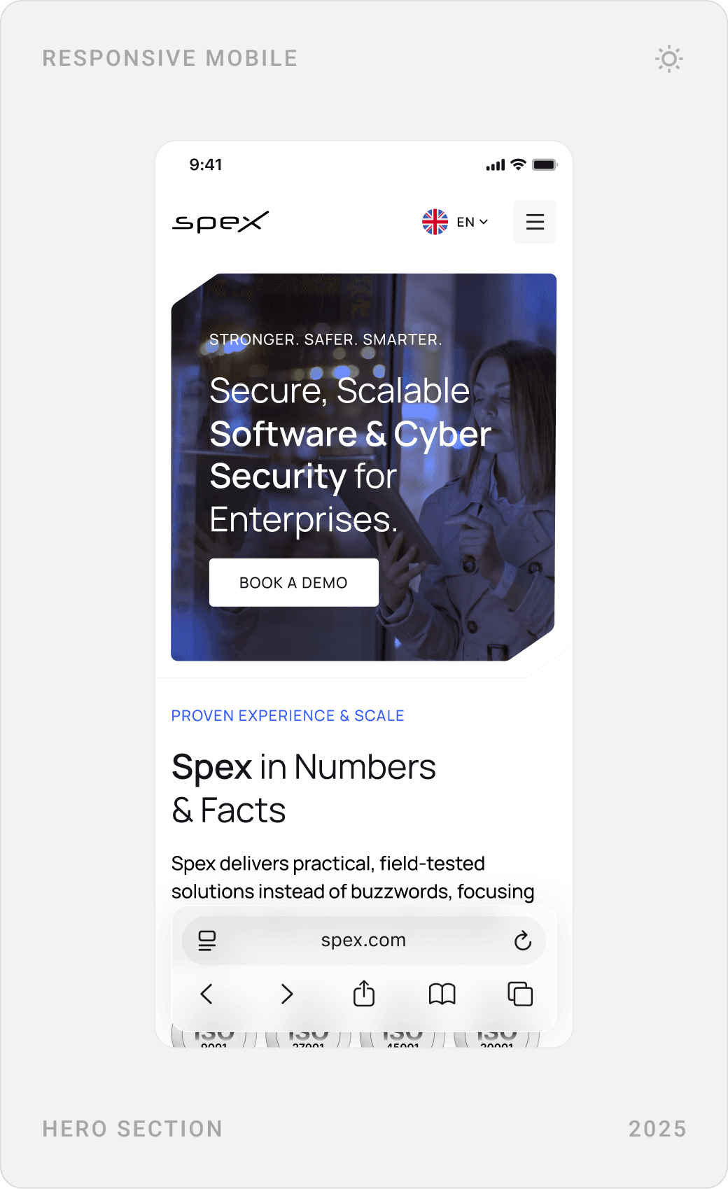
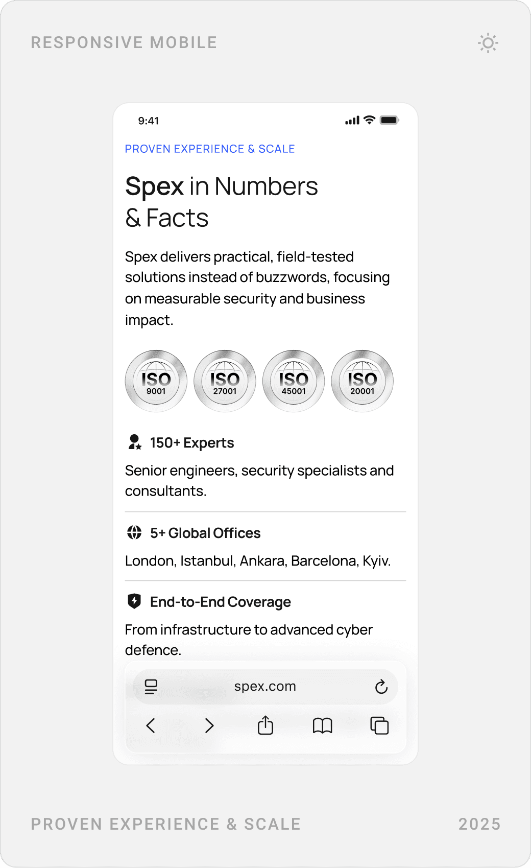
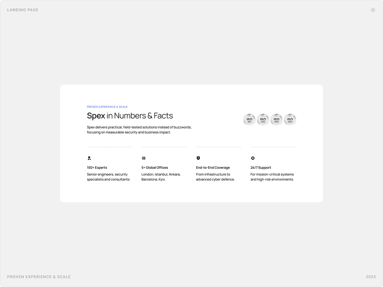
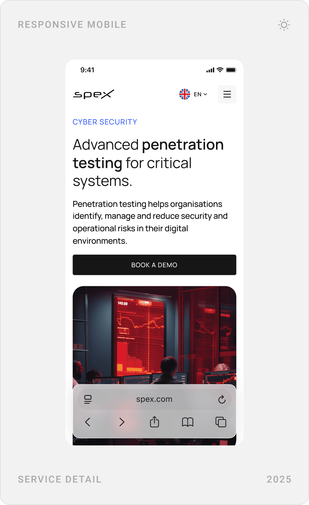
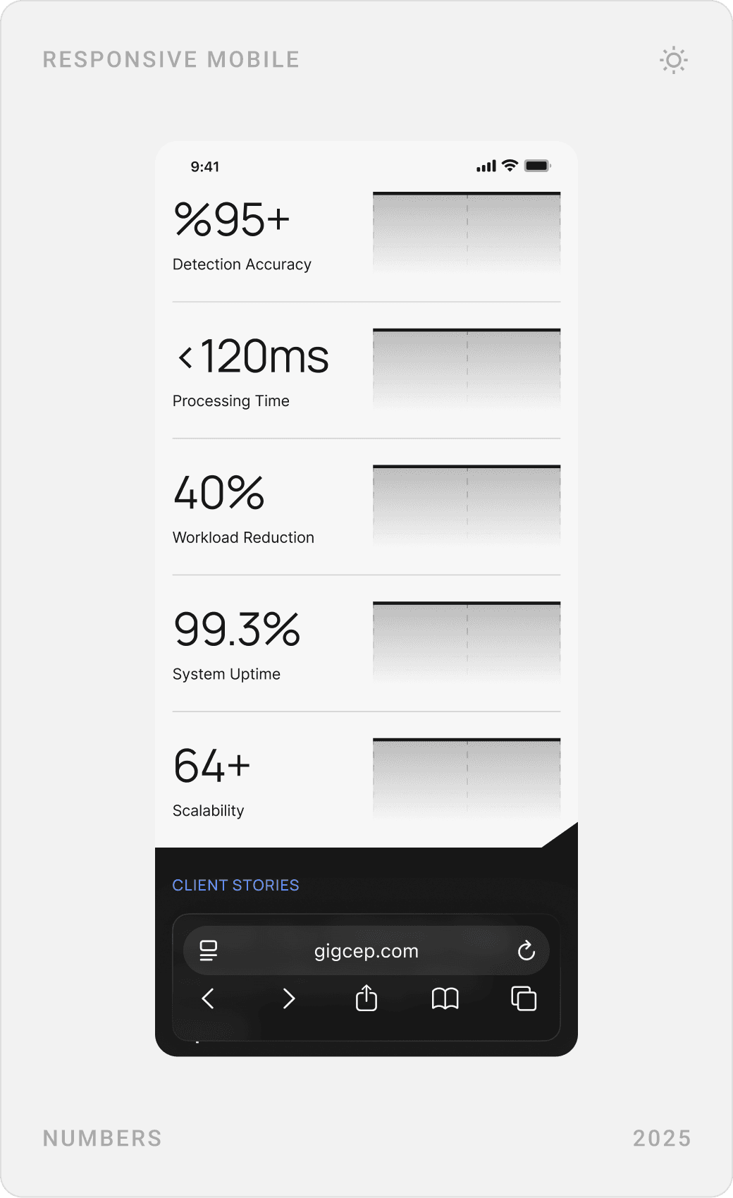
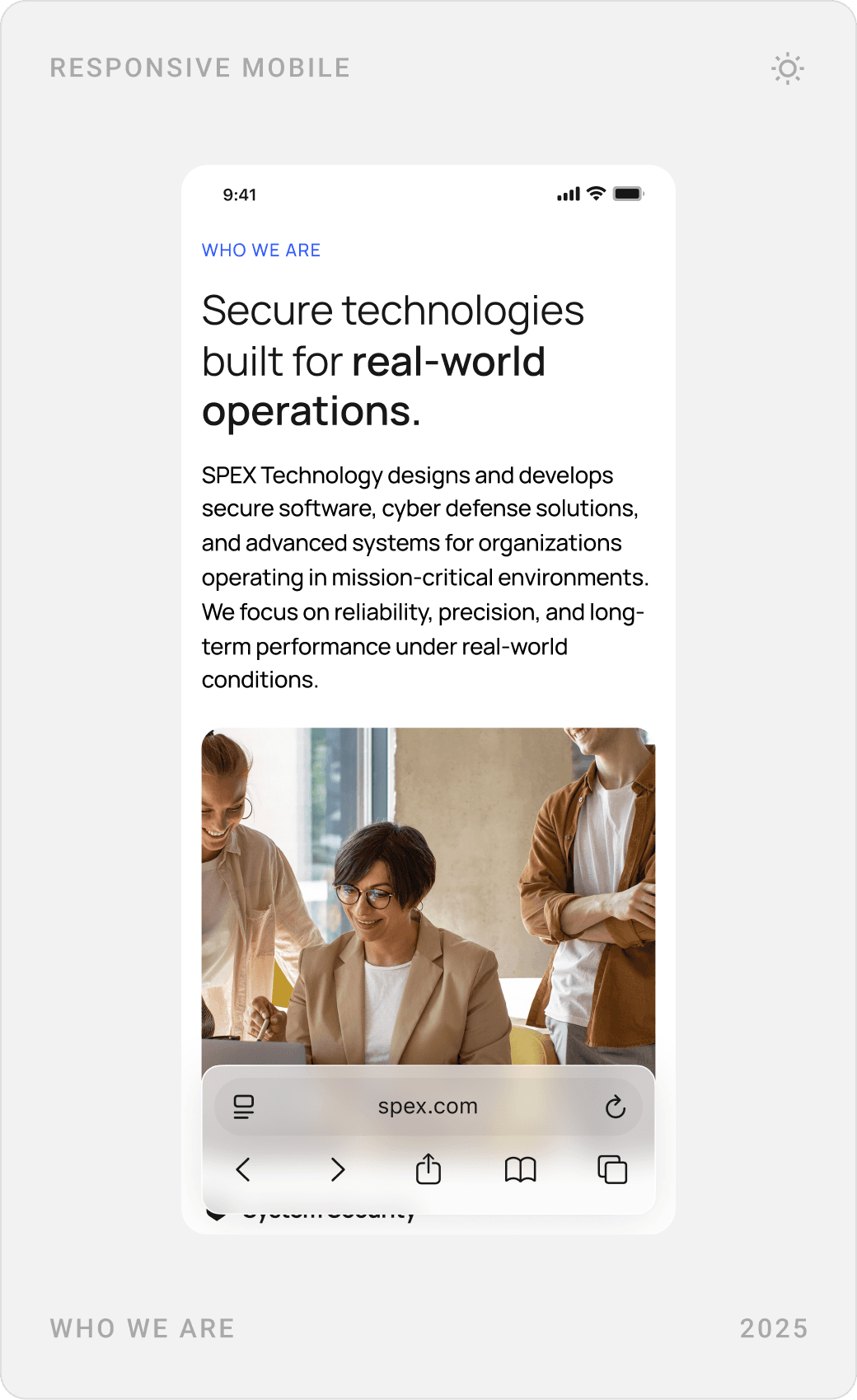
The hero says what Spex does and for whom in one line, with a single “Book a demo” action. Right below, a numbers-and-facts section gives a fast sense of scale and coverage before the services.
Services and penetration testing
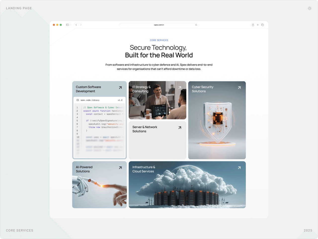
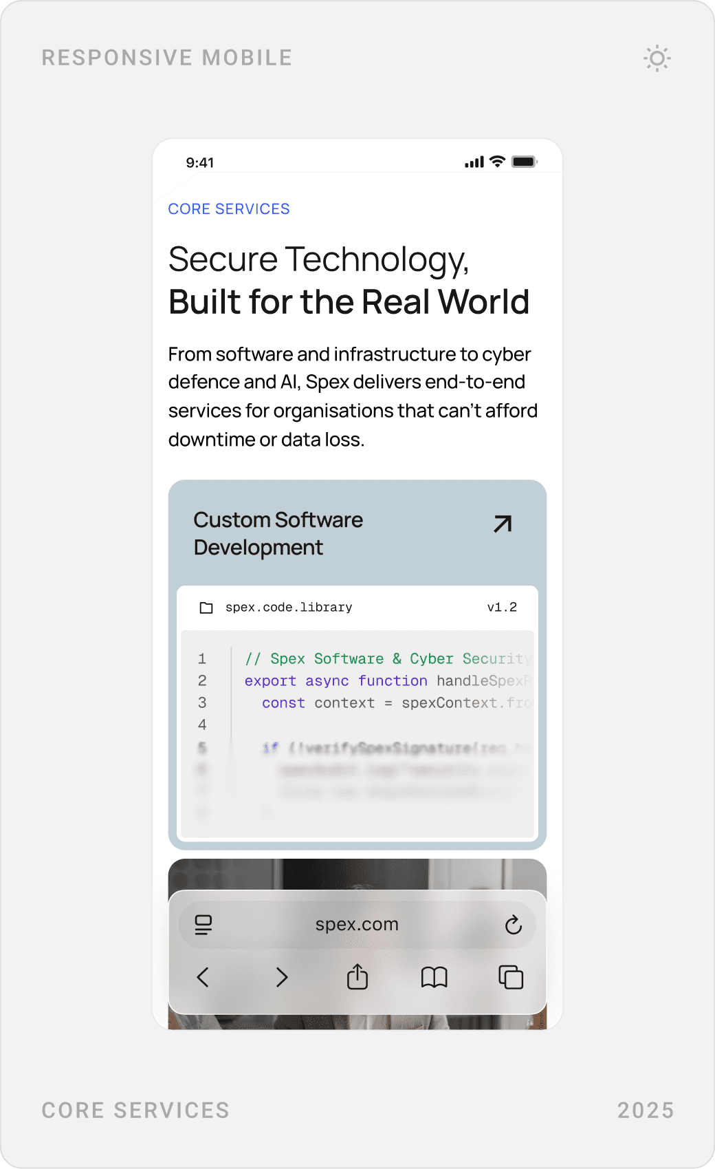
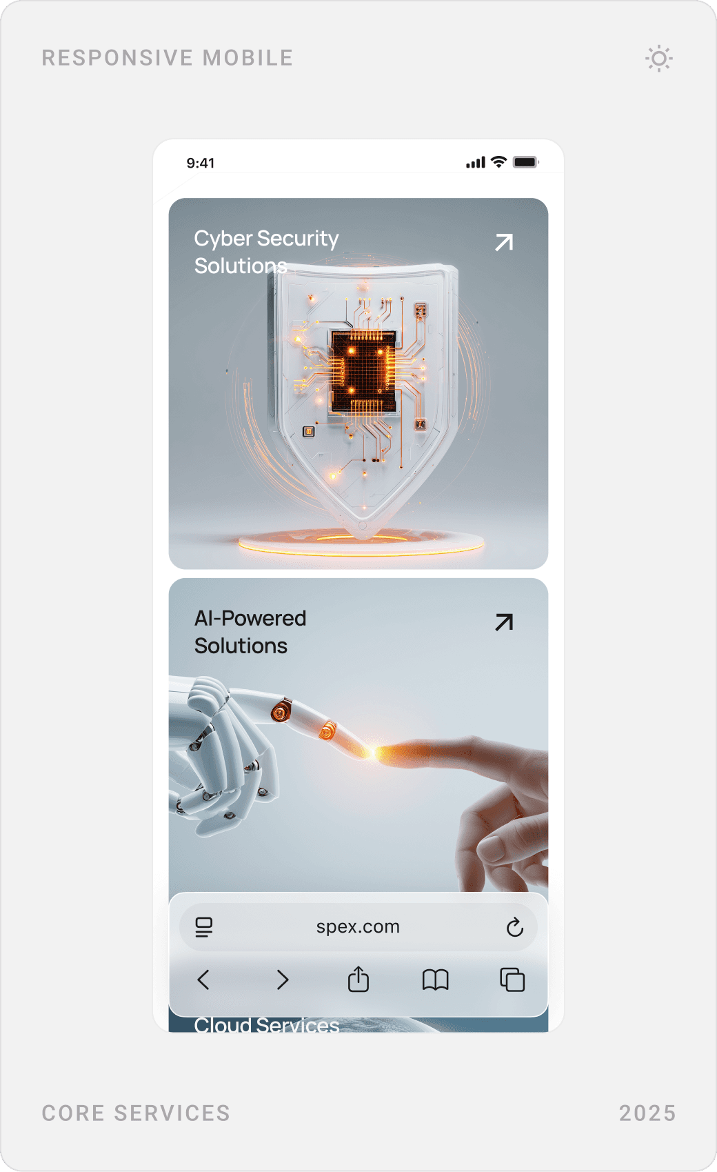
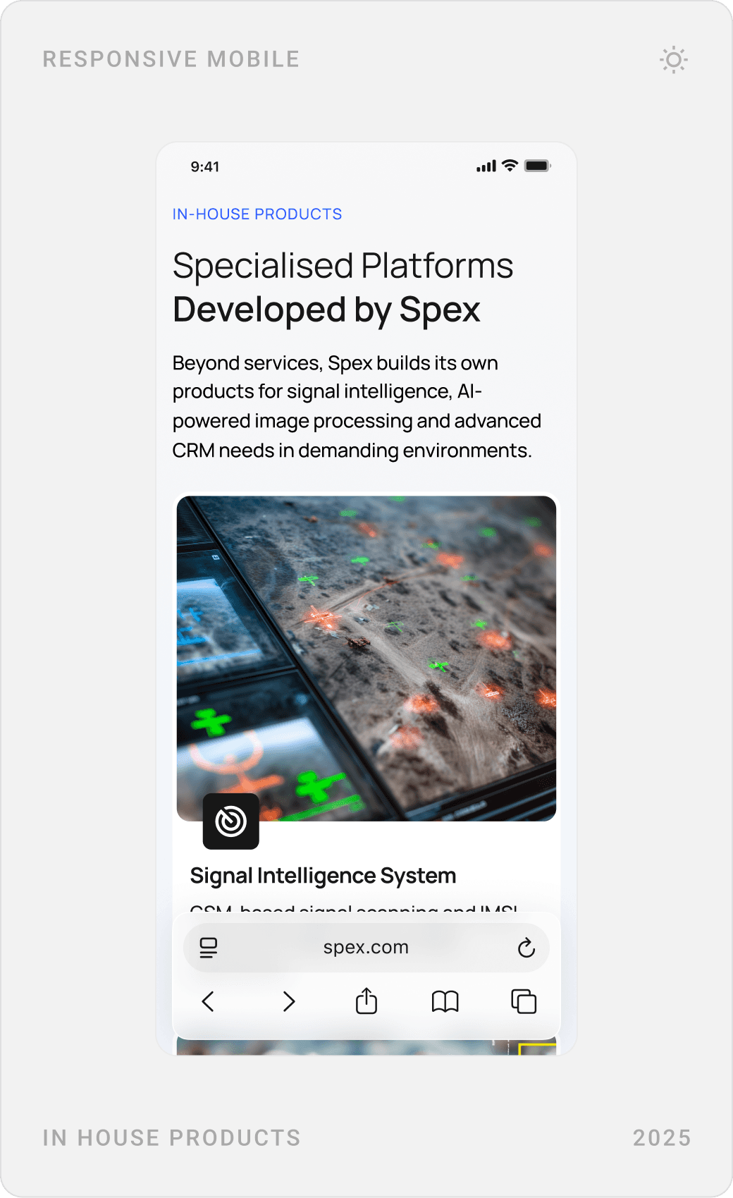
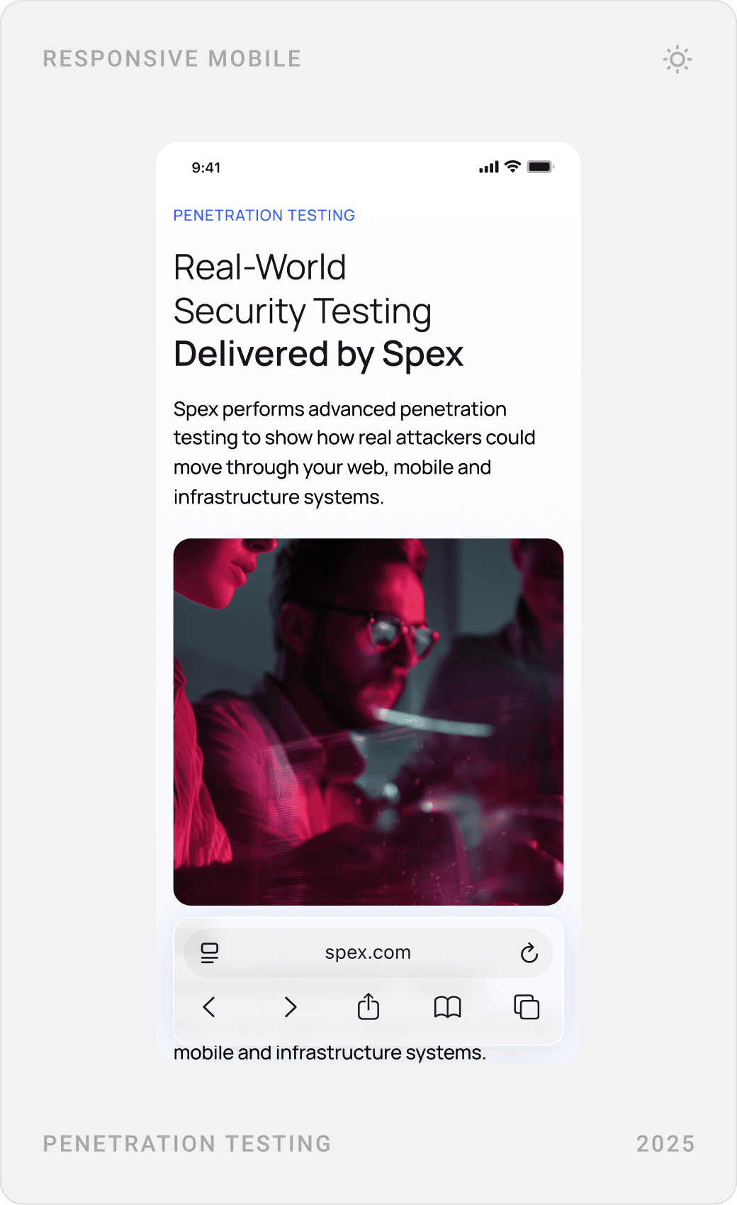
Six core services are laid out as a bento grid, each with its own visual. Service pages such as penetration testing go deeper: what is tested, an end-to-end process in stages, and the reporting and remediation support clients receive.
About, team and values
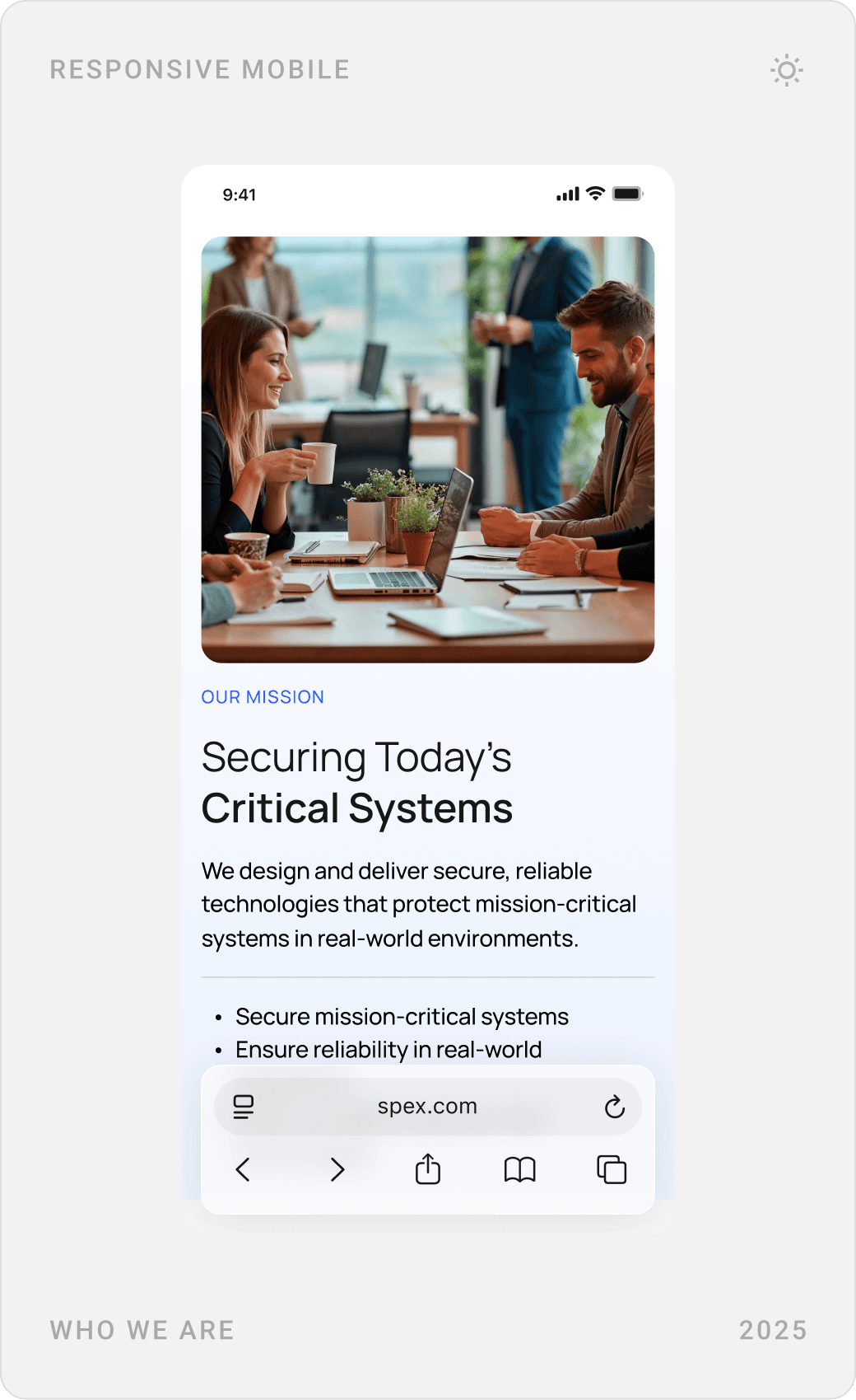
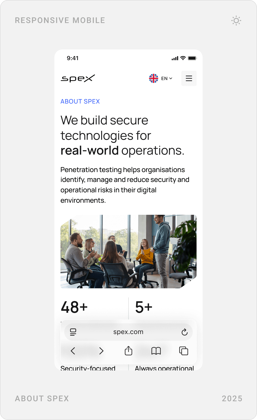
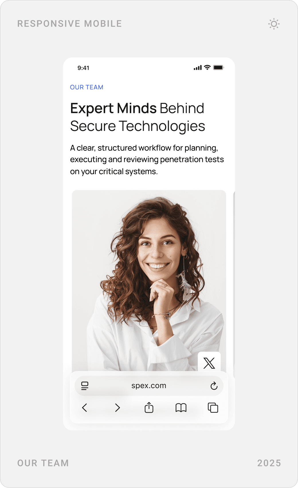
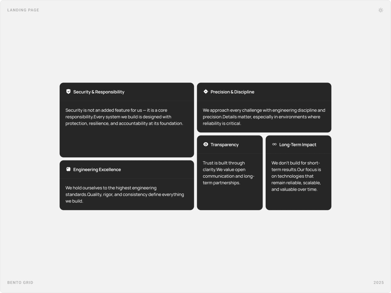
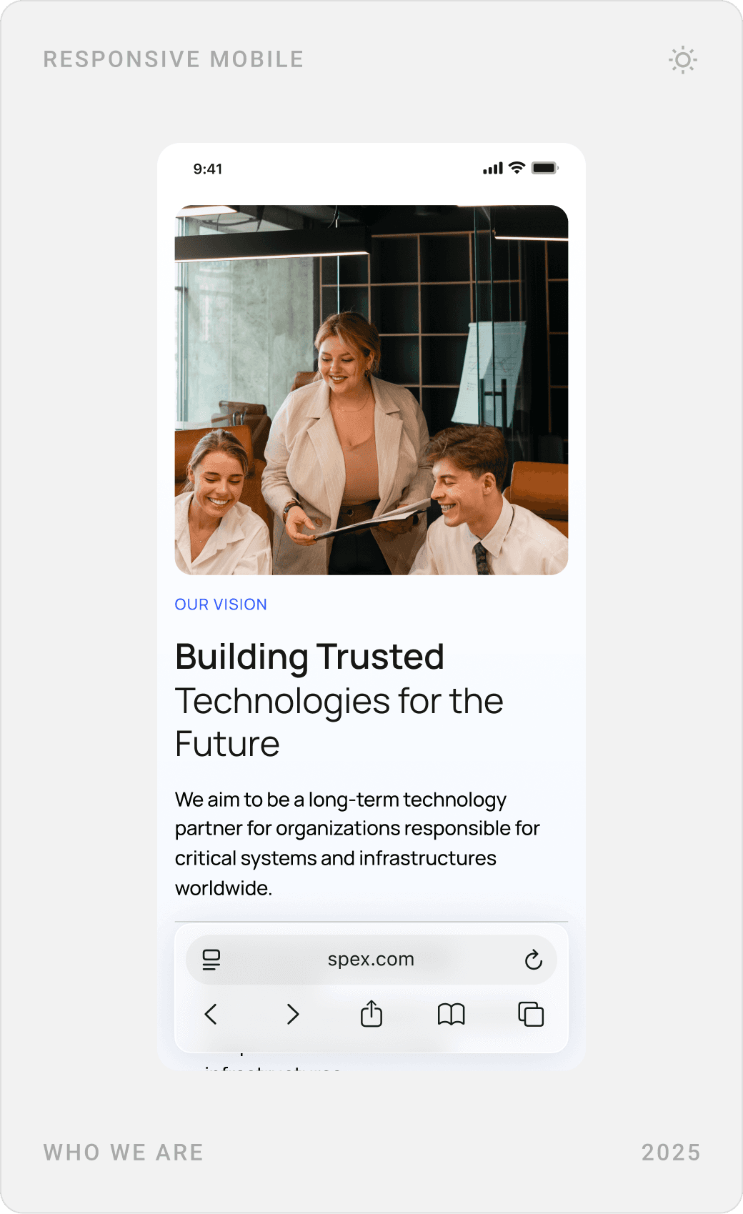
The about page introduces the mission, the people and the principles behind Spex. Values, security and responsibility, engineering excellence, precision, transparency and long-term impact, are set in a dark bento grid so they read as commitments, not slogans.
Partners, client stories and insights
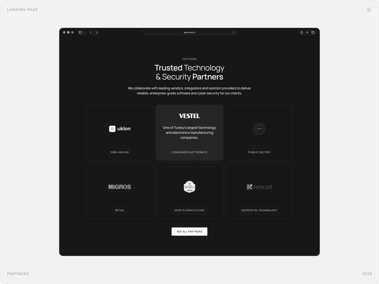
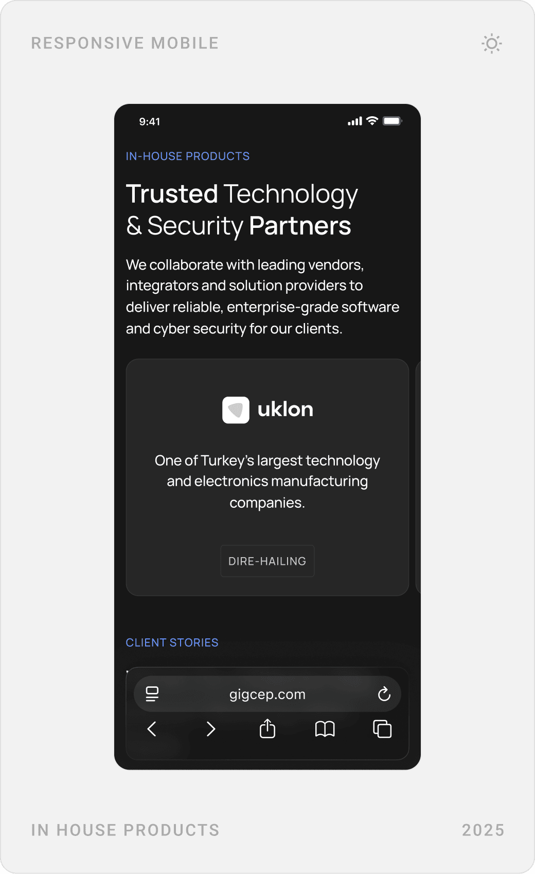
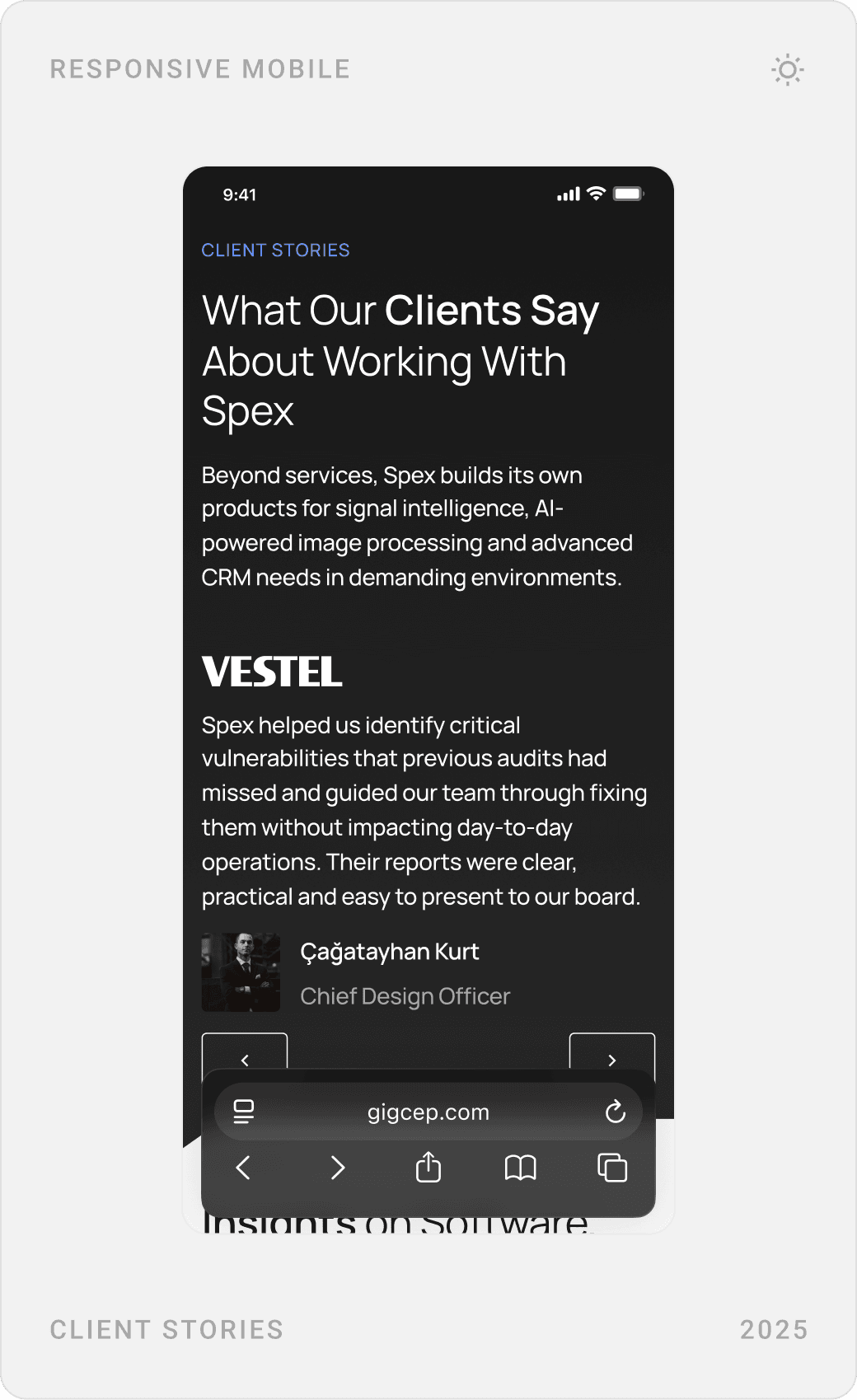
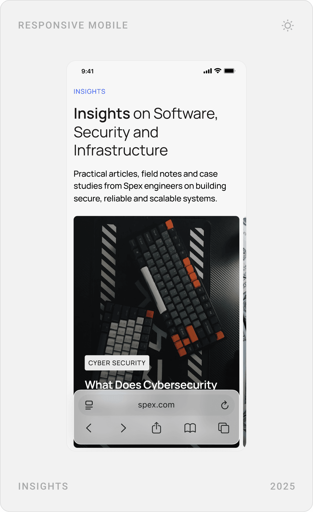
Proof gets its own dark sections: a partner grid labelled by sector, client stories with names and roles, and an insights area for articles from Spex engineers. Each one answers the question every enterprise buyer asks, who else trusts them?
FAQ, contact and booking a call
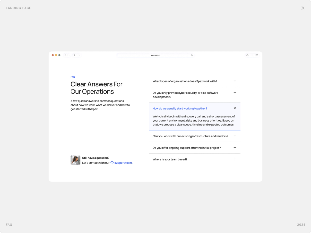
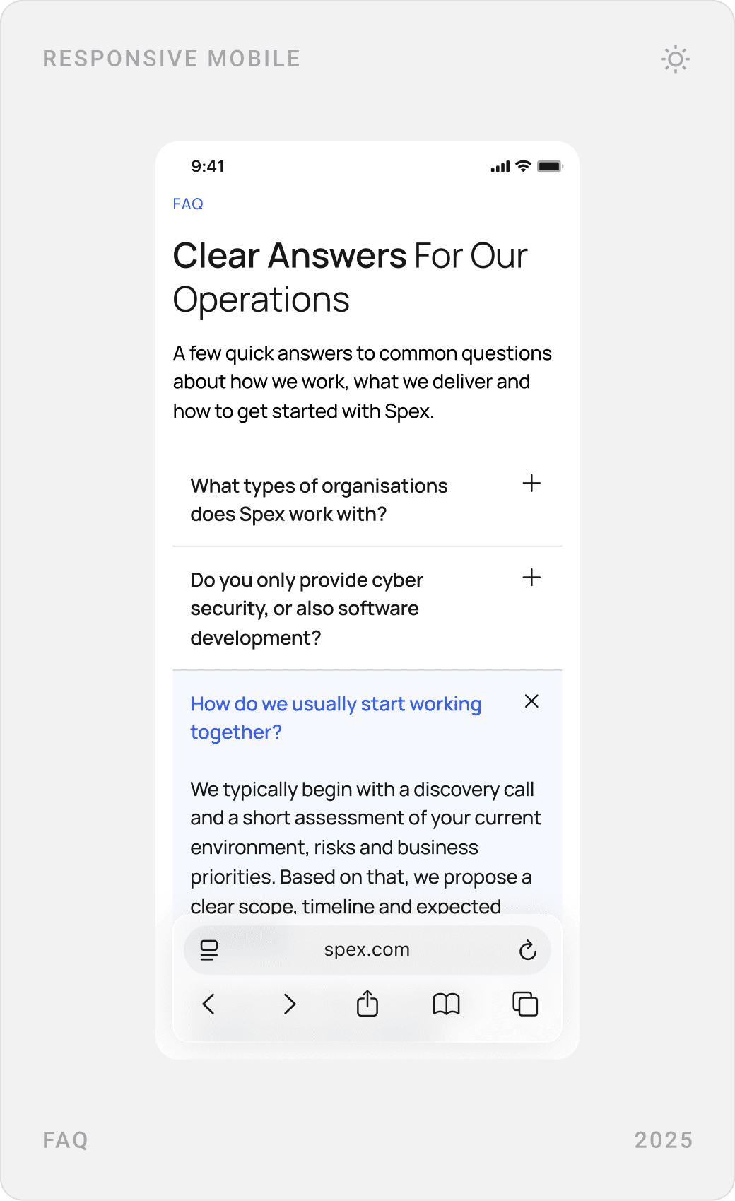
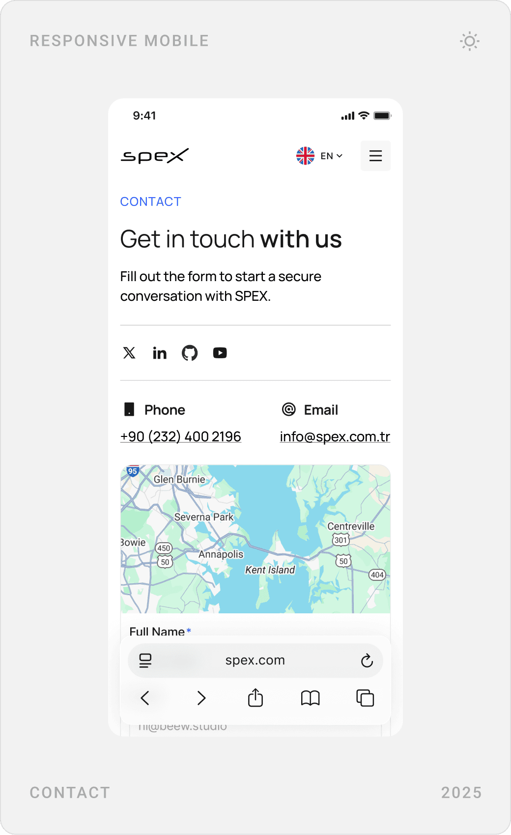
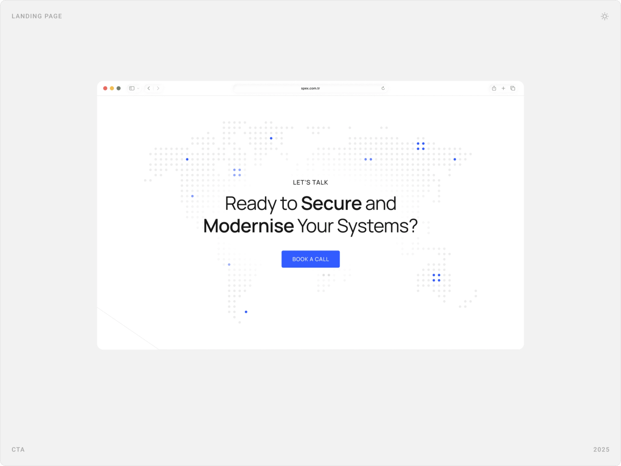
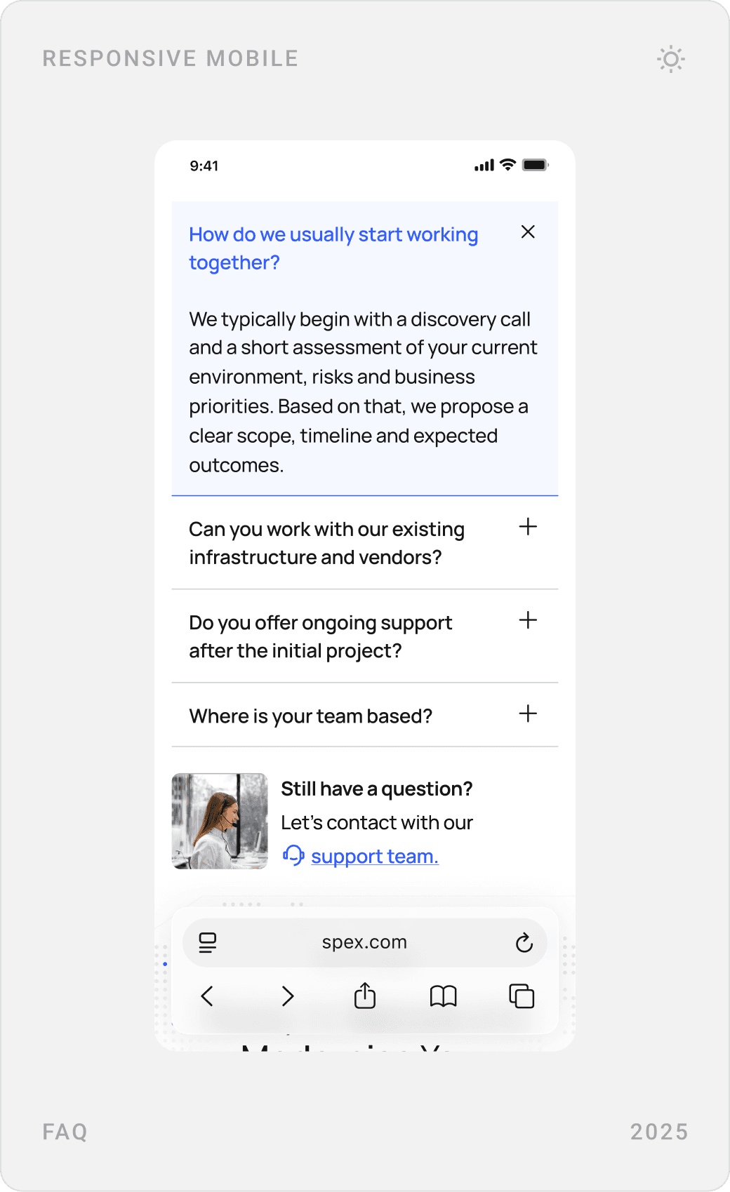
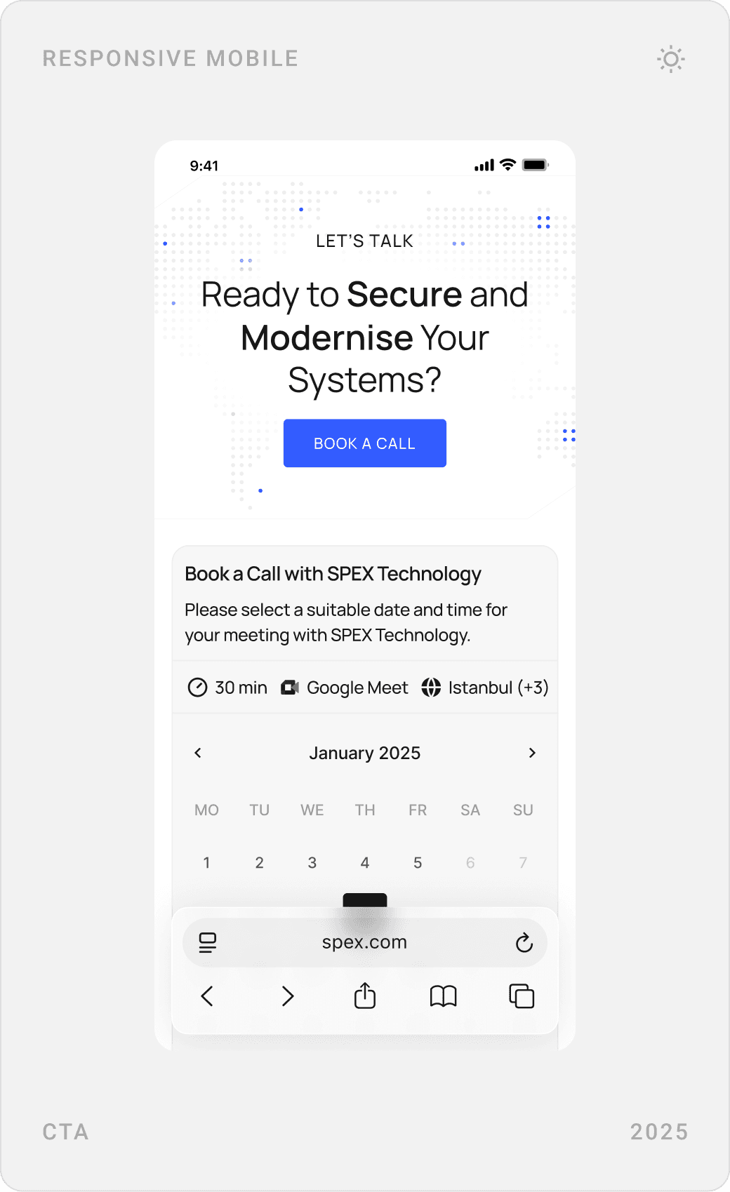
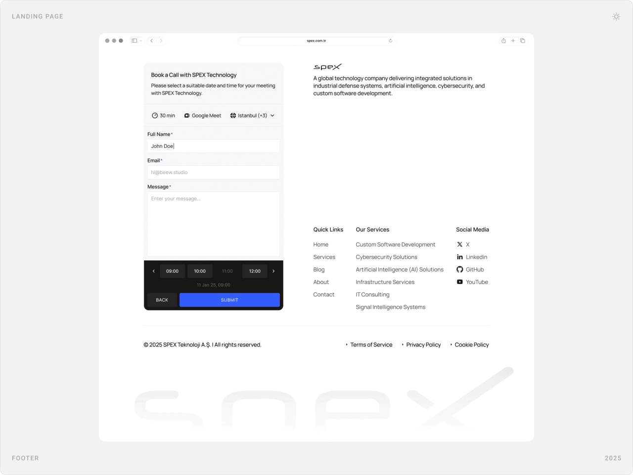
A short FAQ answers how Spex works with clients before anyone has to ask. A closing call to action invites visitors to secure and modernise their systems, and a three-step booking widget, date and time, details, confirmation, sits on the page and in the footer.
Results
- A refreshed website that looks professional, trustworthy and enterprise-ready.
- Clearer navigation and page structure for services, projects and company positioning.
- A distinctive visual identity, with the 55° motif carried through key UI elements.
- Brand continuity, with Beew as Spex’s long-term design partner since the logo.
The new site is live at spex.com.tr, in Turkish and English. [1]
Key takeaways
- A single brand detail, used consistently, beats a dozen decorative effects.
- In security, calm design reads as competence.
- Describe services as processes so buyers can picture the work.
- Put the booking on the page; every extra step loses a lead.
FAQ
What is Spex?
Spex (SPEX Yazılım ve Siber Güvenlik Hizmetleri A.Ş.) is a software and cyber security company founded in 2020 and headquartered in İzmir, Turkey. It offers custom software development, IT strategy and consulting, server and network solutions, cyber security, AI-powered solutions and infrastructure and cloud services.
What did you design for Spex?
The corporate website: a landing page and five to six inner pages (services, penetration testing, about, contact and more) for desktop and mobile, a UI system built around the logo’s 55° angle, and a book-a-call flow. My studio had designed the Spex logo earlier, so the site extends that work.
How long did the project take?
About one month in 2025, from research and structure to handoff-ready desktop and mobile designs. The scope was UI/UX only, without development.
How do you design a website for a cyber security company that enterprises trust?
Drop the hacker clichés and design like a serious partner: calm colours, strong hierarchy and generous spacing. Explain each service as a clear process, show credibility (team, values, partners, client stories) in plain sight, answer common questions upfront and make booking a call a one-step task.
Can you design a website or brand for my tech company?
Yes. I work with early-stage AI, SaaS, fintech and Web3 teams on websites, product UI, brand and design systems. Book a call or send a message from the contact page.
Sources
Have a product to design?
I help teams turn complex products into websites and interfaces people understand in seconds. Tell me about yours.